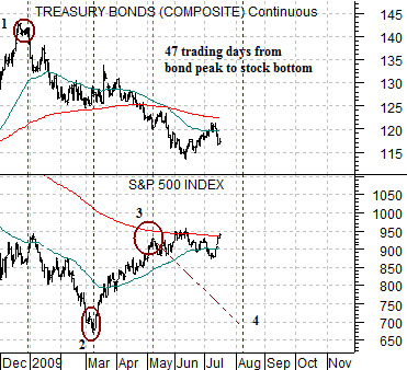
We are going to return today to a chart-based argument that showed on a number of occasions a few months back. It served as one of the building blocks for the thesis that we have held for much of the year.
The thesis, by the way, was that S&P 500 Index would bottom in March, rally for two months into May, and then make a second bottom in August that would lead into a surprisingly strong up trend.
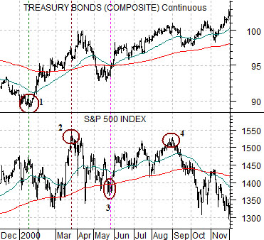
The chart below compares the U.S. 30-year T-Bond futures with the S&P 500 Index (SPX) from 2000.
The argument was that the equity markets in 2009 were somewhat similar in an upside-down sort of way to the top that the index made through 2000.
The idea begins with the low point for the bond market in January of 2000. In the face of apparently rampaging economic growth and with money flowing hard into the cyclical sectors the bond market pivoted upwards. The message was… growth is slowing. The problem was that between the low point for the bond market and the last bit of strength in the equity markets close to 8 months elapsed. If the ‘top’ for the equity market began in January with the start of falling long-term interest rates then the process did not end until August.
Below we show the current situation. The TBond futures made a clear price peak at the end of December last year which was the bond market’s way of saying… growth is starting to improve.
If the S&P 500 Index were to follow a similar path then the first low would come in March in the same way that the stock market’s peak was hit in March of 2000. In fact we went back through similar instances, counted the days, and found that if history repeated exactly the low point for the SPX would be made 47 trading day after the start of bond price weakness which suggested some time in early March.
The final piece of the puzzle still lies ahead of us although the time frame is tightening in rather rapidly. The SPX was supposed to make some kind of low during the first half of August but with the benfit of some hindsight we can see that the index is still grinding along near its moving average lines.
Equity/Bond Markets
uly 16 (Bloomberg) — China overtook Japan as the world’s second-largest stock market by value for the first time in 18 months, after government stimulus spending and record bank lending boosted share prices this year… Chinese companies account for four of the 10 biggest companies when measured by market value, according to Bloomberg data. Toyota Motor Corp. is the top-ranked Japanese company, at 25th, worth about one third the capitalization of PetroChina Co., the world No. 1.
We included the Bloomberg comments above because we are starting to see early indications of the return of the ‘absurd comparison’. When a market begins to ‘bubble’ it eventually takes prices to the point where the comparisons make no sense. We last mentioned this, we believe, around the time last year when Potash Corp. become Canada’s largest company by market value. If you have ever driven by a potash mine… you will understand that this is an unsustainable event.
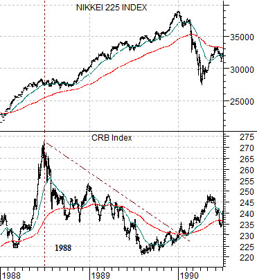
Our point today is has something to do with the ‘decade theme’. To start with we show Japan’s Nikkei 225 Index and the CRB Index from 1988 into 1990.
We touched on this point briefly on page 5 of yesterday’s issue and we intend to hammer away at it from a number of perspectives in the days to come but for now we will focus on the asset price bubbles that built into 1990 and 2000.
Through 1989 the Japanese real estate and equity markets rose to levels that were beyond belief leading to any number of ‘absurd comparisons’. The issue is not whether the Nikkei was in a ‘bubble’- we suspect that the simple fact that almost 20 years later it is still far below the highs of 1990 makes the point clearly enough- but rather how it got there.
Our thought is that it took weakness to create strength or, perhaps, that the strength began to focus so that weakness was created elsewhere.
In general the commodity markets, tech, and Asia are all ‘cyclical’ although Japan does tend to do better when commodity prices are weaker. After rising to a peak in mid-1988 following the 1987 stock market ‘crash’ the CRB Index turned lower and this divergence helped to concentrate the flow of money into Japan.
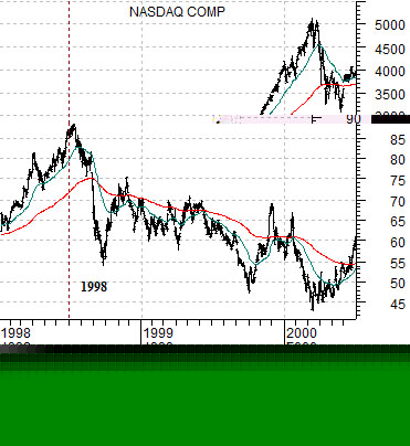
Something similar happened in 1998. At the end of the June in 1998 the stock price of Coca Cola reached a peak and turned lower. The rising trend for the large cap consumer stocks was coming to an end which helped to drive the Nasdaq through 1999. Those involved in the markets will well recall the number of absurd comparisons that popped up through 1989 as internet-based companies went public with multi-billion market caps while upstart names such as Amazon, EBay, and Yahoo rose to phenomenal valuations.
The point that we are circling is that it is 2009 and the Chinese stock market is showing rather impressive strength. Aside from not breaking to the down side the two things that we are looking for with regard to Chinese equities are… the emergence of absurd comparisons which would indicate that a bubble is forming… and one or more markets peaking in mid-2008 and remaining weaker as an offset to Chinese growth. The problem is many sectors buckled at the end of June last year and have since rallied back up to the moving average lines- similar to KO’s share price in mid-1999- so the key will likely be what happens through the next month or so of this quarter. The offsetting sectors should weaken similar to KO in 1999 and the CRB Index into the autumn of 1989.