We are going to attempt to make a case for two sectors today- tech and the major banks. As usual the journey to our point will be both circular and torturous but… that shouldn’t come as much of a surprise to our regular readers.
When the markets inspire us to build an argument the first challenge comes from trying to figure out where to start. Given that the markets have no true ‘beginning’ and instead trend in a series of cycles that create both positive and negative excesses it is not always patently obvious where the story should begin.
For today we are going to commence our little voyage with the concept of ‘offsets’. For good or for bad… this is as good a place as any to get things rolling.
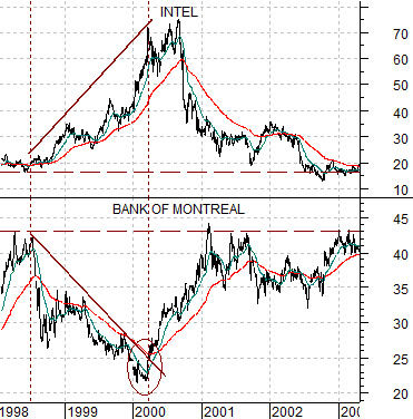
First is a chart from 1998 into 2003. The comparison pits the share price of Intel (INTC) against that of the Bank of Montreal (BMO). A U.S. tech company versus a Canadian bank.
Intel began to rise in 1998 just ahead of the Asian crisis that forced the Fed to swamp the markets with liquidity in order to avoid a crisis in the banking sector. Money flowed hard towards the tech sector and the dollar and away from the Canadian banks (which were trending with yields at this time). The end result was that the higher Intel’s share price rose the lower the Bank of Montreal’s share price declined. While one might have been hard-pressed to pick a peak for Intel into 2000 the argument of ‘offsets’ suggested that it wouldn’t stop rising until the Bank of Montreal stopped declining. Which it, did, our course in March of 2000.
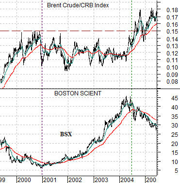
Below we show a chart of Boston Scientific (BSX) and the ratio between Brent crude oil futures and the CRB Index.
Offsets come in a number of forms. In this example the ‘pause’ in rising energy prices between the end of 2000 and mid-2004 created a window of time (along with downward pressure on yields) that cycled the markets over to a number of different themes. The share price of BSX trended upwards literally from the final peak for the Brent/CRB Index ratio in 2000 to the eventual push back to new highs in 2004.
The point is that strength creates weakness (Intel versus BMO) while weakness creates strength (oil prices versus BSX). We call this kind of behavior ‘offsets’.
Equity/Bond Markets
Bloomberg, July 21, 2011: Japan’s Nikkei 225 Stock Average rose by the most this month on optimism U.S. lawmakers will reach a deal to avoid a default on the government’s debt and after Apple Inc. (AAPL)’s profit topped estimates, boosting the earnings outlook for its suppliers… Companies whose products are used to make Apple devices rose after the California-based firm posted profit that beat estimates. Fanuc jumped 3.9 percent to 14,460 yen. Toshiba Corp. (6502), a maker of memory chips used to store songs and photos in the iPhone, advanced 2.7 percent to 413 yen.
We thought that we would start off with the comments above because it may not be intuitively obvious that Apple’s commercial success has a link over to Japan.
The argument is that we have been mired to some degree in a market trading off of offsets since 2007.
The above chart between BSX and the Brent crude/CRB Index ratio seems somewhat obvious in hindsight. If BSX was trading higher under the cover of downward cyclical pressure and falling yields then it makes sense that when energy prices strengthened sufficiently to push yields higher in 2004 that BSX might turn lower. Not only BSX, of course, but lumber futures followed by the forest products sector then the home builders and eventually housing prices and the banks.
What was NOT obvious in 2004 was that energy prices were actually going to move to new highs. We made that argument in these pages on many occasions but for as fast as the markets move at times trend changes occur at such slow speeds that they are rarely obvious in real time.
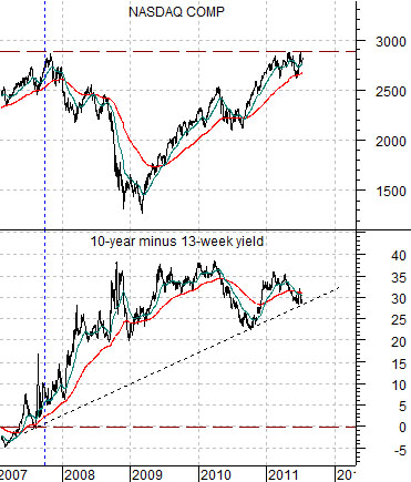
So… the idea is that the Nasdaq Composite Index is this cycle’s crude oil. The idea is that as long as the Nasdaq is trading below the peak set in 2007 there will be downward pressure on yields and as long as there is downward pressure on yields those sectors that have been trending higher similar to BSX from 2001 into 2004 will continue to do so.
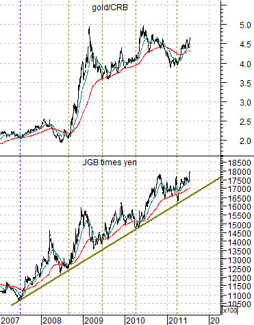
On this page we are going to show three markets or combinations that have been trending higher ever since the Nasdaq peaked in 2007. Below we show the spread between 10-year and 3-month Treasury yields while below right we have added charts of the ratio between gold and the CRB Index along with the product of combination of the Japanese 10-year (JGB) bond futures times the Japanese yen futures.
To grasp the argument you have to think of the markets in terms of three different layers. The banks represent the weakest component with the laggard banks slogging along the bottom looking for some kind of traction. The Nasdaq represents the middle ground- a strong cyclical sector that is not quite strong enough to initiate upward pressure on yields. The yield curve, gold, yen, Swiss franc, bond market, etc. represent to some degree the offsets. Markets or sectors that have been pushed higher in response to the downward pressure on yields created by the banks and the lack of upward pressure on yields- so far- from the tech sector.