The S&P 500 Index is currently mired in its longest losing streak since May ostensibly due to concerns about corporate profits. If it isn’t one thing then it is another.
We have argued on occasion that quarterly trends tend to change or pivot around the last week of the first month of a new quarter. In other words… some time later this month. This happens when investor sentiment regarding quarterly earnings is somewhat extreme. Stock market peaks can be made as money pushes into stocks ahead of robust earnings reports while bottoms are often found when money exits one stock after another on weaker earnings.
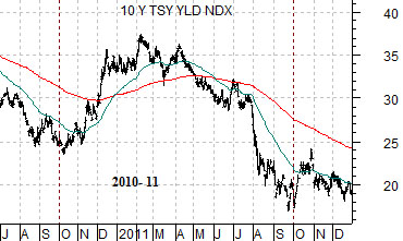
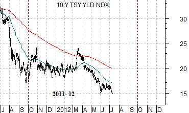
First are three charts of 10-year U.S. Treasury yields. Let’s get the bad news out of the way first today.
The ‘bad news’ is that the markets have been locked into a repeating pattern over the past few years with the peak for cyclical growth reached at the end of the first quarter and the bottom made around the end of the third quarter. This has led to six months of rising interest rates and cyclical asset prices from October through March followed by six months of gloomy bearishness from April through September.
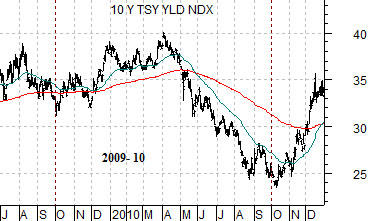
The chart below runs from July of 2009 through 2010. Yields turned higher in October of 2009 only to peak at the end of March 2010.
The middle chart runs from 2010 through 2011. It also shows a bottom for yields in the autumn of 2010 and a top in the first quarter of 2011.
The bottom chart shows the current time period. The last low point for 10-year interest rates was made in late September last year with a recovery top occurring this past March.
The point is that it feels almost as if the markets have set the automatic pilot and are determined to process all news in a negative manner. If the trend persists then we would expect to see lower yields amid a back drop of chronic negativity through the balance of the quarter. Our concern- as usual- is that this simply looks ‘too easy’ which leads us to fixate on the potential for the kind of surprise that would catch the most people leaning in the wrong direction at the absolute worst point in time.
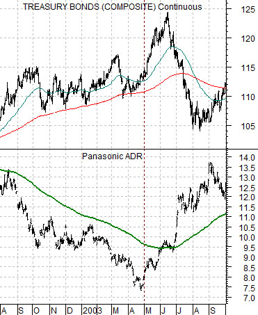
We have been using the share price of Panasonic (PC) to represent the potential for a weaker bond market. Whether this makes sense or not is open for debate.
The argument is that PC is sensitive to both the bond market and the Japanese yen. Given that the yen and bond market are trending in the same direction (i.e. higher) there should be relentless pressure on the share price of PC.
So… what does it mean when PC starts to rise in price even as the bond market pushes upwards? The example from 2003 shown at top right makes the case that if PC manages to rise above its 150-day e.m.a. line it could suggest an imminent top for long-term bond prices.
In 2003 PC bottomed and turned higher roughly six weeks (we will use this time frame again on page 5) before the cycle peak for the U.S. 30-year T-Bond futures. Given that this was the highest level for bond prices until the final quarter of 2008 it was an important slice of time.
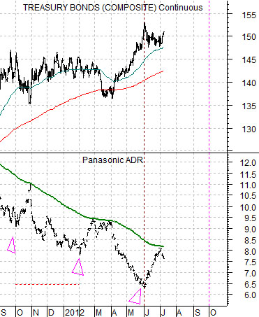
Below is the same comparison from the current time frame. Notice that PC has recently rallied up to its moving average line. Notice as well that it has done this on two recent occasions spaced four months apart (October, February, June).
The share price rose to the moving average line and has recently been grinding lower. If this is not the break out point then the next opportunity may come at the end of September.
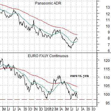
Below is a chart of PC along with the cross rate between the euro and the Japanese yen futures.
The share price rally for PC began when bond prices and the Japanese yen reached a peak. As the euro started to strengthen against the yen PC pushed higher so the key at present is whether the rally collapses only to reform in the autumn or whether the cyclical trend can find some traction within the next couple of weeks.