We have argued from time to time that economic growth is caught between the start of a recovery and the eventual picking up of the slack created by the post-recession output gap. In simpler terms it is similar to the length of time for a water skier between when the boat begins to accelerate and the tow rope snaps taut.
Our view is that we are wallowing in a trend that has favored virtually anything with positive earnings momentum, has remained neutral on many of the high dividend paying sectors, and continued to punish those names that rely on cyclical momentum. We are stuck in the ‘lag zone’.
We thought that we would attempt to put together a chart comparison to show how this might look. The idea is based on our premise that there is a 2-year lag between changes in the trend for interest rates and the impact on cyclical growth.
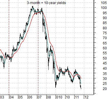
First is a chart of the sum of 3-month and 10-year Treasury yields.
Next is a chart of the ratio between Japanese bank Mitsubishi UFJ (MTU) and the gold etf (GLD).
The two charts are shifted or offset by 2 years so that yields in 2003 are placed above the MTU/GLD ratio in 2005.
The idea is that the sharp rise for yields from 2004 into 2007 helped to create the bearish cyclical pressure that pushed the banking shares lower and gold prices higher from 2006 into 2009.
The charts make the case that a normal 2-year lag should have created some traction for the cyclical trend in 2009. In fact with yields recently making new lows the positive boost would be expected to continue through into (at least) the second half of 2013.
The issue that we wonder about from time to time is what might happen when the slack in the rope is taken up. Will the MTU/GLD ratio ease gradually higher or will it, in fact, explode to the upside along with economic activity, housing prices, and banking system profits?

Equity/Bond Markets
One of our recurring arguments has been that there are (at least) two types of serious stock market corrections. The first tend to follow inverted yield curves and are associated with economic slow downs and recessions. These tend to drag on for some time. The second are typically the result of a huge shift in the direction of liquidity away from risk. Similar to the game ‘musical chairs’ one investor after another heads for the chairs in the belief that the music has stopped. Yet, as Citigroup’s Chuck Prince stated back in 2007… “When the music stops, in terms of liquidity, things will be complicated. But as long as the music is playing, you’ve got to get up and dance. We’re still dancing.”
The point is that once the panic begins to abate the key question is whether the music is still playing. The inverted yield curve in 2007 suggested, unfortunately for Mr. Prince, that the music has stopped but we are still of the belief that the band continues to play.
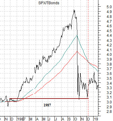
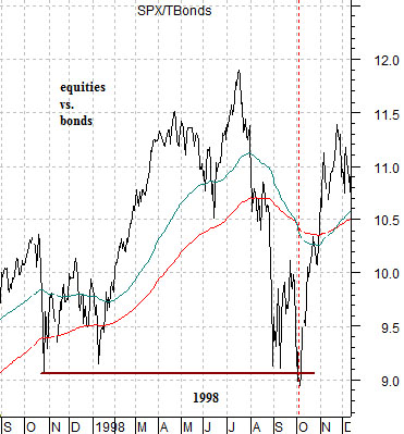
Liquidity-driven corrections tend to be fast and punishing but they also don’t last for that long. The chart just below shows the ratio between equities and bonds (S&P 500 Index divided by the U.S. 30-year T-Bond futures) from 1987 while below right is the same ratio through the 1998 Asian crisis.
The argument is that the equity/bond ratio tends to decline back to the levels approximately 12 months previous. The correction ‘knocks the top off’ of the market and then, as investors realize that conditions are not quite as dire as feared… asset prices begin to recover.
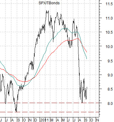
Below is the ratio between equities and bonds from the current time frame. The ratio has, more or less, declined back to the levels of the summer of 2010 which puts it back on somewhat firmer ground. The return to a more bullish trend this week suggests that a few participants are headed back out onto the dance floor.