One thing that we have noticed over the years is that when we are wrong we tend to be really wrong. No half measures for us it would seem.
We mention this because the markets are either proving or busting our thesis this month and, if history is any guide, if we are wrong we are going to have a difficult time dealing with it and adjusting accordingly. Typically we tend to create a long-term thesis and then ‘dig in’ when the markets grind against us so we thought this would be a reasonable point in time to show exactly where the stresses are showing up.
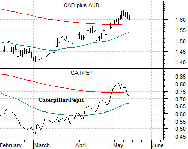
Below we feature a comparison between the ratio of the Canadian to the U.S. equity markets, the sum of the Canadian and Australian dollar futures, and the share price of steel maker Nucor (NUE).
The first point is that all three charts represent the same basic story or trend. The Canadian stock market tends to outperform when commodity prices are strong and rising and this goes not only with an upward trend for the commodity currencies but also with a rising trend for stocks such as Nucor.
Our thought is that if the markets are going to drive against us one of the first places we will see it is the Canada/U.S. equity ratio. That this ratio has returned to the highs set last year when crude oil prices were pushing above 140 suggests that equities are still very closely linked to the day-to-day action in the commodity markets.
If, on the other hand, the markets are simply doing what we have argued that they will do- rally higher into May, flatten out, and then decline into the autumn- then the best places to look are the trend’s ‘weak links’. By this we mean that leadership to the down side should come from those areas that showed the least amount of strength during the rally. Nucor, for example.
Another chart that we are following is shown below right. We compare the sum of the Canadian and Australian dollar futures with the ratio between the share prices of Caterpillar (CAT) and Pepsi (PEP). Both pushed over their 200-day e.m.a. lines this month but as of yesterday the CAT/PEP ratio was starting to show just enough weakness to keep our interest piqued.

Equity/Bond Markets
The one detail that we appreciated yesterday was the very small decline in the XOI/SPX ratio. We would prefer a large decline but, all things considered, we will take what we can get.
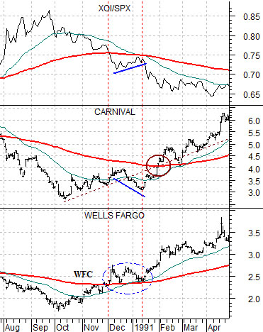
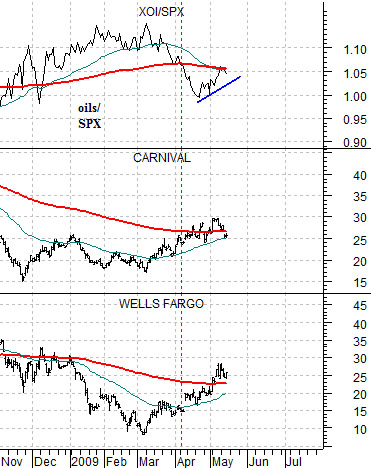
The chart at right compares the ratio of the Amex Oil Index (XOI) to the S&P 500 Index (SPX) to the share prices of Carnival (CCL) and Wells Fargo (WFC) from 1990- 91. We show the same comparison for the present time period below right.
The point is that a couple of months after the XOI/SPX ratio peaked and turned lower in late 1990 the ratio backed up to the 200-day e.m.a. line just as the 50-day was crossing down through the 200-day.
We will argue that this is exactly what the markets are doing at present. The XOI/SPX ratio has rallied back up to the moving averages lines exactly as they have converged.
It could be that this time will be different but… in a perfect world the XOI/SPX ratio rolls back to the downside (taking gold prices with it) as CCL and WFC resolve to the upside.
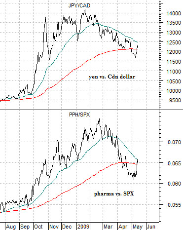
Below we show the cross rate between the Japanese yen and Canadian dollar along with the ratio between the pharma etf (PPH) and the S&P 500 Index (SPX).
From January through to the present day the yen has been chopping lower against the Cdn dollar as the markets shift back to the commodity theme. A strong commodity theme tends to result in relative weakness for the consumer and health care themes so the further the JPY/CAD declines the greater the pressure on the PPH/SPX ratio. And vice versa, of course.