The markets tend to trend quarter to quarter so, in a sense, current volatility represents traders trying to extend the trend for a few more days even as conditions deteriorate. Speaking (writing) of sense and quarters we were amused to read that discount retailer 99 Cents Only (NDN) was offering a special Lebron James-inspired discount to 75 cents ‘when you don’t have a fourth quarter’. Lovely.
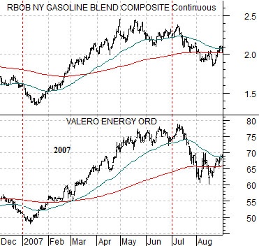
First is a chart of gasoline futures and the share price of oil refiner Valero (VLO) from 2007.
We have argued on too many occasions over the past few years that the first six months of the calendar year tends to be dominated by some kind of strong energy price theme. From year to year the theme changes as energy prices are pushed higher by gasoline, natural gas, uranium, coal, or Brent crude.
We could easily have shown a chart from 2008 because oil prices drove higher into July and then collapsed. We have chosen 2007 because it is a bit less obvious and helps to make the case that this has been somewhat of a recurring theme.
In any event… the point is that gasoline futures prices pushed steadily higher from January into July in 2007. Almost six months to the day from the bottom for Valero in January the price reached a peak in first half of July. From there the markets simply moved on to a new trend.
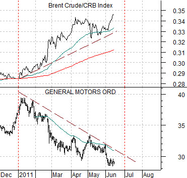
Next is a comparison between auto maker General Motors (GM) and the ratio between Brent crude oil futures and the CRB Index from 2011.
The argument is that this time around the ‘strong energy price trend’ has been driven by Brent crude oil futures and will end when Brent starts to decline relative to the CRB Index. All things considered this might happen until some time early next month.
The offset to a rising Brent/CRB Index ratio is downward pressure on the auto sector. From an intermarket point of view the trend doesn’t change on energy price weakness but instead changes when the share price of GM starts to rise in response to energy price weakness. With the markets trending quarter to quarter the thought is that a trend change may not gain much in the way of traction until new bets and positions are put on early next month.
Equity/Bond Markets
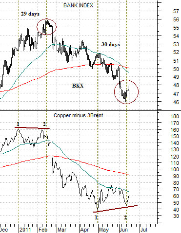
Just below is a chart that we included in the back pages of yesterday’s issue. The chart is a bit ‘messy’ so we thought we would take a quick run at an explanation.
A stronger cyclical trend tends to include copper prices rising relative to oil prices. Given that the ‘strong energy price trend’ this year has been driven by Brent crude oil futures we are using the spread between copper (in cents) and Brent crude oil (in dollars times 3).
We have explained on many occasions why we use ‘dollars times 3’ so we won’t go over it again now but the basic argument is that it puts copper and oil prices on a somewhat equal footing.
The spread between copper and Brent made a ‘double top’ in January and February. The Bank Index (BKX) peaked on the second top in February. As the spread moved lower… the banks moved lower. As copper prices weakened relative to oil prices… the cyclical trend moved lower and the bank shares declined.
From the first peak for the spread to the peak for the Bank Index took 29 trading days. This fits in our view of ‘tops’ running from 28 to 34 trading days.
The spread made a bottom at the start of May and 30 trading days later the Bank Index reached a low (so far) as the spread made a second bottom. The point is that amidst all of the confusion and chaos this chart is arguing that trend for the banks ‘may’ be making a bottom in a very similar manner to the top carved out back in February. A bullish resolution would include stronger copper than Brent prices as we move into the second half of the year.
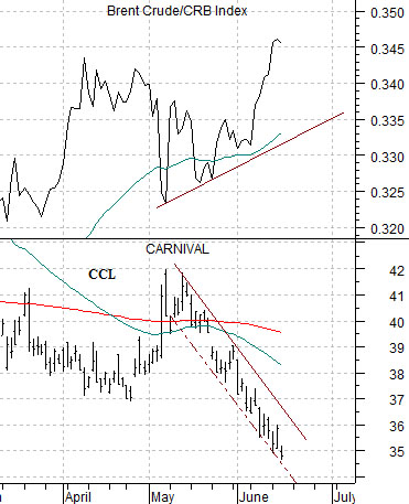
The chart below compares the Brent crude/CRB Index with the share price of cruise ship operator Carnival (CCL). CCL is trending in the opposite direction to the ratio so an upward pivot would help confirm that we have reached some kind of conclusion to the energy price trend.
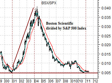
Quickly… in yesterday’s issue we argued that the ‘1’ year was quite weak ten years ago. Below is a chart of the ratio between Boston Scientific (BSX) and the S&P 500 Index. The ratio turned higher in 2001 and continued to move upwards until crude oil broke to new highs in the spring of 2004. We noticed that BSX was actually ‘green’ yesterday suggesting at least the potential for a relative strength bottom here.