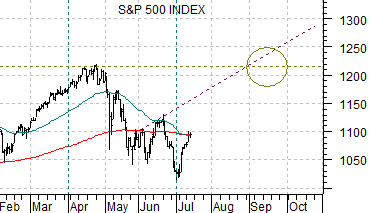
The S&P 500 Index stalled at its 200-day e.m.a. line as the rally that began at the start of the new quarter paused for reflection in trading yesterday. Given that the 50-day e.m.a. line has declined back to the 200-day e.m.a. we thought that we would start things off today by showing two fairly recent examples of similar trends.
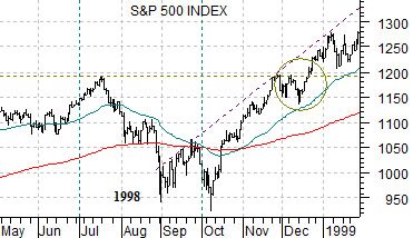
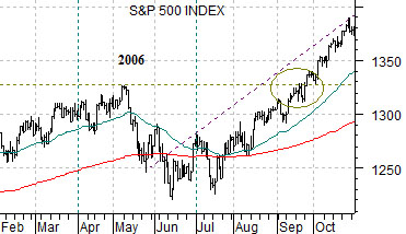
Below is a chart of the SPX from 1998. At middle right we show the SPX during 2006 while below right is a perspective from the current time period.
In both 1998 and 2006 the SPX declined through a one-quarter correction with the lows set below the 200-day exponential moving average line. Downward pressure began to subside in both instances around the time when the 50-day e.m.a. squeezed into the 200-day.
Our initial point is that for as much as one might feel that this time is different… it really hasn‘t been. At least so far. The SPX declined through the second quarter and after making a couple of breaks below the 200-day e.m.a. line the trend began to improve around the start of this month.
The next point is that based on the 1998 and 2006 examples we could see the SPX at new recovery highs as early as the second half of September. In 1998 the SPX rose through the July peak by late December and in 2006 the May highs were bested towards the end of September.
The third point is that the choppy trading through June might well have set a rising trend line for the market to rally back towards over the second half of the year.
In 1998 the recovery through September created a rising trend that the SPX returned to as it gathered momentum into 1999.
In 2006 a similar rising trend line can be drawn that the
SPX managed to catch up with during the final quarter of the year.
The argument is that unless long-term yields start to collapse to new lows the equity markets should remain surprisingly strong over the second half of the year with the potential to move above 1220 by the end of the current quarter before taking a serious run at the all time highs as we grind towards year end.
Equity/Bond Markets
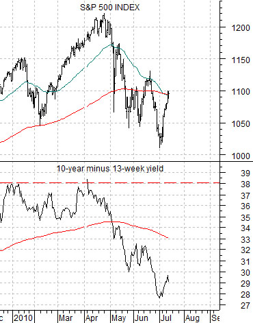
Below is a comparison between the SPX and the spread between 10-year and 3-month Treasury yields.
The argument was that the equity markets tend to unravel each time the yield spread rises to around 3.8%. The caveat would be that a more bullish outcome could follow a rise back to 3.8% for the spread IF short-term yields are ready to push upwards. We have argued, however, that short-term yields tend to rise AFTER long-term yields have risen for close to a year so- at best- we could see the Fed funds rate moving higher towards the middle of 2011.
In any event… if the yield spread is rising the equity markets should be rising as well. Once the spread reaches 3.8% we will have to seriously consider changing our positive equity markets view.
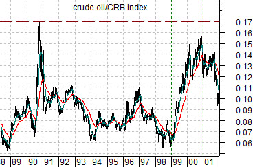
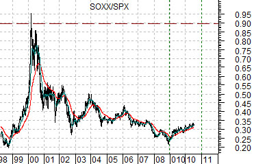
Below is an intriguing comparison. The charts consist of the ratio between the crude oil and the CRB Index from 1988 through 2001 and the ratio between the Philadelphia Semiconductor Index (SOX) and the SPX from 1998 to the present day.
The argument is that the chip stocks today are similar relative to the broad stock market to crude oil relative to the broad commodity market back in 2000.
If we take the comparison literally then the idea would be that the SOX could rise back to its relative strength peak set in 2000 by the end of this year. Even to us that seems like a bit of a stretch.
Our view is that the tech sector has the potential to show significant relative strength through the second half of the year.
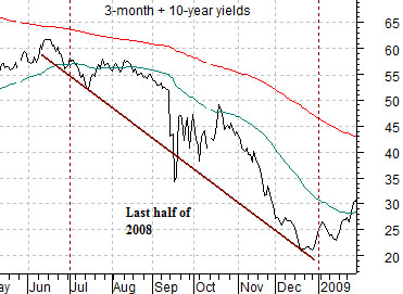
Lastly is a chart of the sum of 3-month and 10-year Treasury yields from 2008.
The ongoing argument is that the cyclical trend lags the trend for yields by two years. In other words the cyclical trend through the second half of this year will tend to reflect what happened with yields through the latter half of 2008. Given that yields were collapsing in 2008… the thesis is that the cyclical trend is going to maintain a fairly powerful tail wind for another quarter or two. Combine this thought with the SOX/SPX chart and perhaps our page 1 comment that the SPX could challenge the all time highs by year end makes a bit more sense.