Feb. 6 (Bloomberg) — U.S. stocks declined, following a five-week rally for the Standard & Poor’s 500 Index, amid concern about Europe’s debt crisis as Greek leaders wrestled with spending cuts to get aid and avert a default.
The beat goes on. Positive news on U.S. employment putting upward pressure on yields and supporting the cyclical trend only to be met almost immediately by offsetting negative news from the Eurozone.
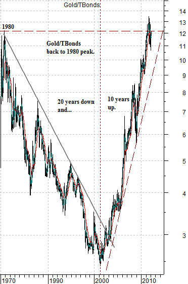
We thought we would come at the markets from a different direction today. At right is a chart of the ratio between gold futures prices and the U.S. 30-year T-Bond futures from 1980 to the present time frame.
While the chart is scaled in semi-log the argument is that following the peak for gold prices in 1980 the markets spent the next two decades driving the price of gold lower even as bond prices moved higher. This created a steady decline in the ratio between gold and the TBonds.
After 20 years of making the case that gold was irrelevant… the trend changed. Dramatically. From roughly 2001 into 2011 the gold/TBonds ratio drove back to the upside until it had returned (and even exceeded) 1980’s peak levels.
Our view on this chart is that eventually the markets get around to just about everything so the theme with the greatest upside potential probably includes those sectors and regions that have been left for dead for a very long stretch of time. In fact the greater the damage and the more intense the conviction that something simply can not rise from the ashes the more intrigued we are with the concept.
The chart argues- to us- that the decade-long bull market for gold prices was, in fact, a relative price readjustment. Gold went from around 12 times the price of the TBonds down to roughly 2.5 times and then back up to 12 times. In fact if you multiply the yesterday’s closing price for the TBond futures (142.75) by 12 you end up with a gold price of 1713 which was quite close to the intraday low for gold futures yesterday (1713.30).
Our point is that a decade or so ago we were arguing in favor of gold based on the idea that prices were ‘low’. Today that argument is no longer valid so we will, as usual, find other less obvious windmills to tilt at.
Equity/Bond Markets
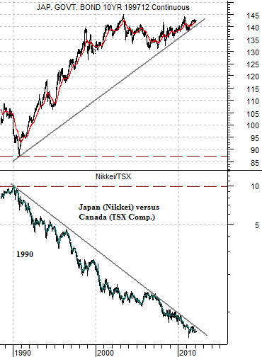
It will probably come as no surprise that we used the entire first page as a preamble to making the case once again for the Japanese equity markets. Once more into the breach, dear friends, once more…
The chart below compares the Japanese 10-year (JGB) bond futures with the ratio between the Nikkei 225 Index from Japan and that of Canada’s S&P/TSX Composite Index (TSX).
The ratio between the Nikkei and TSX has been driving lower for the past 20 or so years. Similar, we would argue, to the decline in gold prices compared to long-term bond prices from 1980 through 2000.
The key here is long-term Japanese bond prices. A time may or will come when the Japanese bond futures start to decline in price and, if all works out as expected, this will mark the start of a significant relative price recovery by Japanese stocks relative to most other equity markets.
The question is… when might this begin? Our view has been that some time around the end of 2011 would work quite nicely.
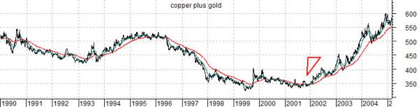
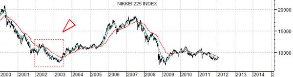
Below are charts of the sum of copper (in cents) and gold (in dollars) futures prices from 1990 into 2005 and the Nikkei 225 Index from 2000 to the present day.
The charts are offset by 10 years so we are making the argument that the shift into a positive metals trend after 20 years of weakness into 2002 would be similar in some respects to an upward swing for the Nikkei in 2012. The interesting chart detail is found in the action of the Nikkei back in 2002. This market lagged the recovery by commodity prices that began at the end of 2001. The point is that we have been looking for a somewhat ‘split’ market this year with strength developing in Japan even as the dominant theme from the previous decade (metals and energy) shows weakness over the next few quarters.