We are going to quickly run through the relationship between copper, yields, the cyclical trend, and ‘other things’ today.
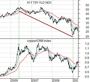
First is a chart of the yield index for 10-year Treasury yields and the ratio between copper futures and the CRB Index from 2005 into 2009.
Copper prices peaked in the spring of 2006 both on an absolute basis as well as relative to the CRB Index. With copper prices closely tied to the trend for long-term Treasury yields the peak for the copper/CRB Index ratio marked the highs for 10-year yields.
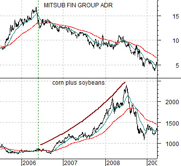
Next is a comparison between Japanese bank Mitsubishi UFJ (MTU) and the sum of corn futures and soybean futures. This chart also runs from 2005 into 2009.
The argument is that rising copper prices not only push yields higher but also reflect the cyclical trend. The leading edge of the trend or, perhaps, its most vulnerable link, was represented by both the banks and the Japanese stock market. In other words… as soon as copper prices stopped pushing the share price of MTU began to decline.
The twist is that the financial markets do not always move in the same direction- especially over shorter periods of time- as the cyclical trend. If that were the case then asset prices would have peaked in 2006. In fact there have been long periods of time when the S&P 500 Index has risen relentlessly in the face of copper price weakness simply because equities were inclined to respond favorably to lower interest rates.
An interesting example of how the markets can respond bullishly to weakness in cyclical growth is shown by grains prices from 2006 into 2008. We could also have made the case using China’s equity market but this will likely suffice.
Weakness for copper prices allows yields to decline which often leads to a rotation into a variety of new sectors. From 2006 into 2008 the markets rotated away from the base metals and into both the energy and grains sectors.
Our point is that there is nothing inherently good or bad about copper price strength and the direction of yields but when the trends change new winners and losers are created. In 2006 MTU shifted from winner to loser while grains prices morphed from losers to winners.
Equtiy/Bond Markets
We have argued that there is a lagged relationship between interest rates and the cyclical trend as well as a concurrent relationship. In other words… falling interest rates today will tend to support the cyclical trend two years into the future while cyclical stocks will tend to rise and fall with yields in real time.
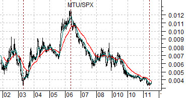
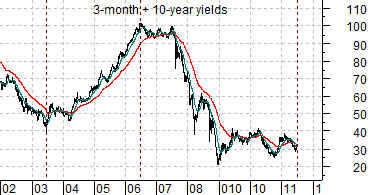
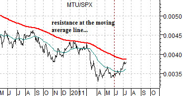
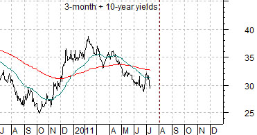
Below is a comparison between the ratio of Mitsubishi UFJ (MTU) to the S&P 500 Index (SPX) and the sum of 3-month and 10-year Treasury yields.
The comparison argues that the MTU/SPX ratio tracks higher and lower with the combination of short and long-term Treasury yields. Rising yields go with MTU outperforming the broad market while falling yields create underperformance. Fair enough.
The issue, however, is… which leads? Does the MTU/SPX ratio follow the bond market or does the bond market follow the ratio? Do we have to wait for a return to rising yields before seeing strength in the laggard banks or will strength in the laggard banks say something about the near-term direction for yields?
The charts below have been offset by a month or two. Why? Because the bottom for the MTU/SPX ratio in 2003 was made before yields reached a low while the ratio peaked in 2006 just ahead of the high point for yields.
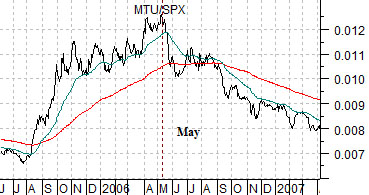
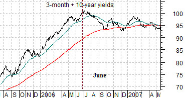
Below we show the 2006 example with the charts shifted slightly. The MTU/SPX ratio peaked in May of that year while yields reached a high in late June and into July.
Lastly we show the current situation with the charts offset once again. The point? IF the MTU/SPX ratio continues to rise through the 200-day e.m.a. line then a case can be made that the combination of short and long-term yields should be ready to swing higher later this month.