Sept. 3 (Bloomberg) — Stocks rallied, extending the first weekly gain in a month for the Standard & Poor’s 500 Index, while Treasuries and the dollar fell as better-than-estimated growth in private payrolls bolstered optimism the economy will avoid relapsing into a recession.
We don’t run the same charts two days in a row often and, to the best of our knowledge, we have never done so simply because we couldn’t think of anything else to do. Typically when we show the same perspectives on multiple occasions it is our way of emphasizing the importance of the underlying message.
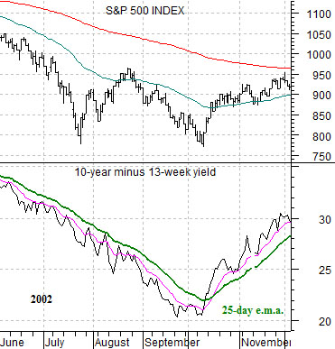
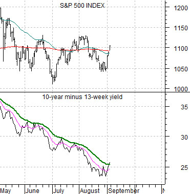
We started off last Friday showing two chart comparison anchored by the spread between 10-year and 3-month Treasury yields. The argument was that the equity markets were trading with the yield spread so the time to look for a return to a better equity markets trend would coincide with a rising yield spread.
On the yield spread we included two moving average lines. The green line was the 25-day exponential moving average while the pink line represented the 10-day e.m.a. The thought was that through much of 2002 the yield spread managed to rally up to the 25-day e.m.a. line on quite a few occasions but only pushed up through it once the core trend was changing. This marked the bottom for the S&P 500 Index in October of that year.
We have included the same two chart comparisons today. The chart below runs from June of 2002 into early December while the chart below right is from May of this year through the end of trading last week.
We grant that using the 25-day e.m.a. line is somewhat arbitrary but the thought was that we need to try to find some way to screen out yet another ‘false rally’. Given that the yield spread had popped up to the 25-day e.m.a. line on multiple occasions this year the argument is that while the SPX would most certainly rally each and every time the yield spread starts to recover (as was the case in both June and July) a true trend change leading to a longer-term stock market rise would require- at minimum- a push up through the green moving average line for the yield spread.
The point? Last week’s action was encouraging, a bit more would be helpful, but we have yet to see a rise in the yield spread beyond what was witnessed on numerous occasions over the past three months.
Equity/Bond Markets
We are not sure whether we have beaten this particular point to death but, if not, it is likely a close thing. However… since the 2-year lag serves as the foundation for our views we can’t think of anything more important at this juncture. The end result is that we are going to return to the same two charts that we ran on the second page of Friday’s issue.
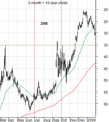
We will dispense with the tedious explanations. The idea is simply that the SPX- representing one of the facets of cyclical growth- is supposed to trend with the (upside down scaled) sum of short and long-term yields with a lag of 2 years.
As mentioned in past issues the 2-year lag was supposed to be a general road map instead of a specific timing tool although it has worked quite nicely give or take a month so far this year. If we had taken it literally we could have made the argument that cyclical growth would rise through the end of the first quarter of 2010 and then sag sharply through the second quarter only to build a bottom through the summer leading into a surprisingly strong trend into the end of the year.
The point? Regardless of what the markets do today, this week, or through the balance of the quarter our view is unlikely to change. We will err on the side of cyclical growth through into early 2011.
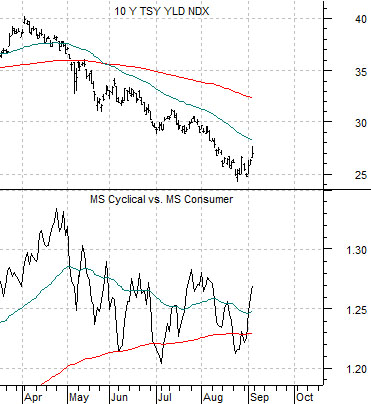
If the stock market represents one facet of ‘cyclical growth’ then where should one focus within the stock market? Below is a comparison between 10-year Treasury yields and the ratio between the Morgan Stanley Cyclical Index and Consumer Index.
The argument is that once yields start to recover the ‘cyclical’ stocks should rise relative to the ‘consumer’ stocks. For good or for bad we remain interested in ‘tech’ (Intel, Cisco, Microsoft), energy users (Ford, Carnival, airlines), banks (Citigroup, Wells Fargo), and, for reasons that we can’t quite explain… Japan (Panasonic, Mitsubishi UFJ).