There is always the chance that the current time period represents an unprecedented and wholly unique situation with regard to the markets. There is always the chance that what has happened before will not happen again. But… on the off chance that this is not true we thought we would return today to the topic of yield spreads.
With the recovery now well into its third year (marked by either the peak for bond prices at the end of 2008 or the bottom for equities in March of 2009) it would be only natural to wonder whether it is too late to get in on the game. After all… many stocks are already trading at lofty prices so this is clearly not ‘the bottom’ yet at the same time many sectors are still wallowing around near the lows suggesting that this might not, in fact, be ‘the top’. Let’s view this from the perspective of the yield curve.
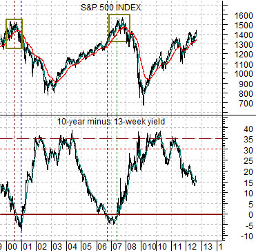
Below is a chart of the S&P 500 Index (SPX) and the spread or difference between 10-year and 3-month U.S. Treasury yields.
The argument is that the SPX peaks around the time that the yield spread inverts. This does not mean that stock prices can not decline in the interim but the end of the cycle tends to occur when the yield spread moves below the ‘0’ line.
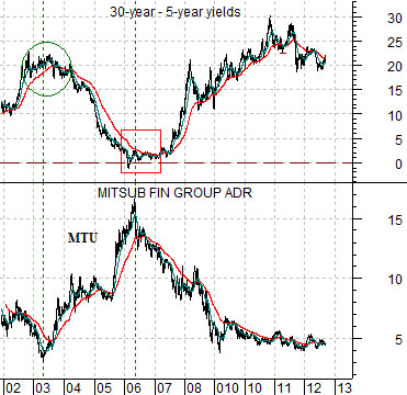
Below is a comparison between the difference between 30-year and 5-year Treasury yields and the share price of Japanese bank Mitsubishi UFJ (MTU). We are using MTU to represent the kind of stock that turns higher at the ‘cyclical pivot’ The pivot comes when long-term yields begin to rise- an event that tends to take place a year ahead of the start of serious central bank credit tightening.
The last cyclical peak took place in 2006 as the spread between 30-year and 5-year yields moved down to the ‘0’ line.
Our point is that while we may be some distance from the start of the recovery it is also likely that the we are some distance from the end of the bullish trend. To get from here to there we still need to see shorter-term yields rise until they are close to or above long-term yields. If we keep firmly in mind that it took three years (from 2003 into 2006) of cyclical strength to invert the yield curve the last time around we should take some comfort in the notion that the inevitable periodic corrections will represent entry points on the long side for the forseeable future.
We will get into the details on page 5 but the premise would be that the markets are nicely- even precisely- set up for some kind of bond price pivot following the conclusion of today’s Federal Open Market Committee meeting. Our ‘lean’ is towards lower bond prices but there is definitely the potential for a significant price change in either direction.
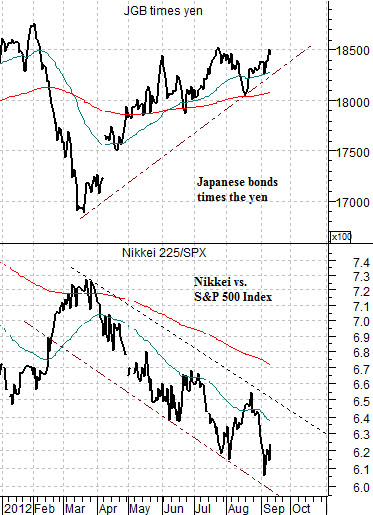
Below is a chart of the product of Japanese 10-year bond futures times the Japanese yen futures along with the ratio between the Nikkei 225 Index and S&P 500 Index.
The argument is that on a cyclical pivot bond prices AND the yen should move lower. If, as, or when this takes place the tendency is for the Nikkei to rise relative to the SPX. We have the set up and are now awaiting some sort of starting point.
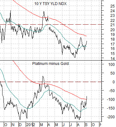
Below we feature 10-year Treasury yields and the price spread between platinum and gold futures.
When yields are rising the price of platinum is stronger than the price of gold. When yields are falling gold prices are stronger. Simple stuff. The spread between platinum and gold has been rising over the past few weeks suggesting that there is ongoing upward pressure on yields.
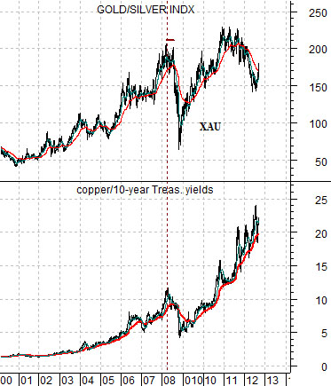
Below is a chart of the Philadelphia Gold and Silver Index (XAU) and the ratio between copper futures and 10-year yields.
In a rising interest rate environment copper prices do better than gold prices but… the trend for the gold mining stocks tends to reflect the trend for copper prices discounted by yields. In other words metals price weakness (falling copper prices) is a negative as well as rising long-term interest rates. To date the copper/yields ratio is still tracking higher which tends to lead to a rising trend for the gold mining sector.