At the risk of beating the topic into the ground we thought we would take yet another swing at the ‘which way are yields trending’ intermarket theme.
Our view (once again) is that one has to have a sense of both the longer-term trend for yields as well as the shorter-term trend. Why? Because the short to intermediate-term trend for yields sets the tone for relative strength within the equity markets while the longer-term trend represents what can happen when a stretched bond market runs into a markets-related crisis.
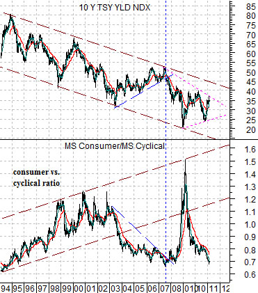
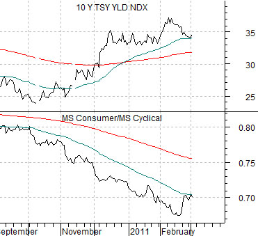
Below is a chart of 10-year Treasury yields and the ratio between the Morgan Stanley Consumer Index and Morgan Stanley Cyclical Index.
The longer-term trend for yields is still ‘lower’ as each peak and bottom for yields is made at ever lower levels.
The short to intermediate-term trend appears to be ‘higher’ after yields hit the channel bottom at the end of 2008. The rising trend may continue until the channel top is finally reached some time later this year or into 2012.
The chart argues that over the longer run when yields are trending lower the consumer stocks will actually tend to do better than the cyclical stocks. In other words the consumer/cyclical ratio will resolve to the upside.
The problem is that when yields are rising ‘within’ the channel the trend within the equity markets will reverse with the cyclical stocks outperforming. Such was the case from 2003 into 2007. Note that once yields reached the channel top in 2007 the consumer/cyclical ratio exploded to the upside until it had returned to the top of its original rising channel.
The point is that in the here and now the cyclical stocks are doing better but we only have to look back as far as 2008 to see what can happen once yields stop rising and start to decline.
The next chart below shows that even in the very shortest of terms a decline in 10-year yields will tend to create a rising trend for the consumer/cyclical index. Such as most certainly the case last month as 10-year yields faded down from 3.75% to 3.4%.
Equity/Bond Markets
We have what we hope will prove to be a bit of chart-based inspiration to add to the mix today.
One of our recurring themes has to do with the 2-year lag between the trend for interest rates and the cyclical trend. In other words a significant trend change for yields will tend to show up in cyclical asset prices with a lag of about two years.
Through the end of last year we kept the pedal to the metal- so to write- with respect to the cyclical trend. The argument was that the rapid decline in short-term and long-term U.S. yields through the second half of 2008 was helping to drive cyclical asset prices higher over the final six months of 2010.
But… what about 2011? And… how does this relate to the sector that we term the ‘laggard banks’?
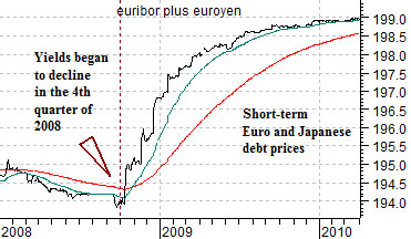
One of the problems associated with the advent of the Eurozone and the European Central Bank (ECB) is that the trend for short-term European and U.S. yields has started to diverge. In other words while short-term U.S. interest rates began to rise in mid-2004 we did not see a turn higher for short-term European yields until the end of 2005. Conversely when U.S. short-term yields began to decline in 2007 short-term European yields continued to rise until the fourth quarter of 2008.
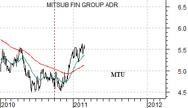
Just below is a comparison between… the sum of 3-month euribor (European short-term debt prices) and 3-month euroyen (Japanese short-term debt prices) and… the share price of Mitsubishi UFJ (MTU).
The arguments are as follows. First, the combination of European and Japanese debt prices did not begin to rise until the fourth quarter of 2008. Second, Mitsubishi UFJ is part of the cyclical trend and represents the broader theme of ‘laggard banks’. Third, if there is a two-year lag between changes in yields and cyclical asset prices then the upward pivot for the laggard banks in the fourth quarter of 2010 may well be a lagged reaction to tumbling European and Japanese yields in late 2008.
The point is that European and Japanese yields are lagging U.S. yields and the European and Japanese banks are lagging the recovery. If the trend continues then 2011 looks like a good year for the laggard banks theme.
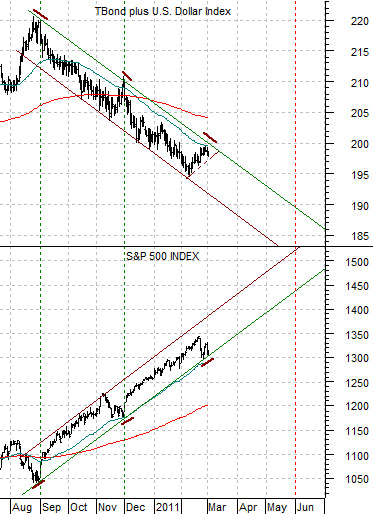
The next chart compares the S&P 500 Index with the sum of the price of the U.S. 30-year T-Bond futures and the U.S. Dollar Index (DXY) futures.
This is an intriguing comparison for a number of reasons. The chart suggests that the SPX is driving higher on bond and dollar weakness. As long as bond prices are trending lower (strong cyclical trend) and the dollar is slowly weakening (supporting commodity prices) the SPX appears set to continue to rise within the nicely defined trading channel.
The correction into late February marks the third channel bottom test spaced three months apart with lows at the end August, November, and now February. If history were to be kind enough to repeat (assuming the sum of the TBonds and DXY continues to decline) then the next serious test of the trend should come some time during the month of May. Sell in May and go away?