Bloomberg, Dec. 20, 2011: Stocks rallied, with the Standard & Poor’s 500 Index rebounding from its lowest level of the month, and Treasuries fell as U.S. housing starts topped economists’ estimates and German business confidence unexpectedly grew.
We are always suspicious of trading on Tuesdays. It will probably come back to bite us in the you-know-what but there just seems to be something about Tuesdays that leads to sharp counter-trend price action.
The question is… what that ‘the turn’? What that the start of a sustainable recovery for cyclical asset prices? The answer, of course, is that we have no idea even though our sense is that sentiment is bearish enough to support an ongoing recovery.
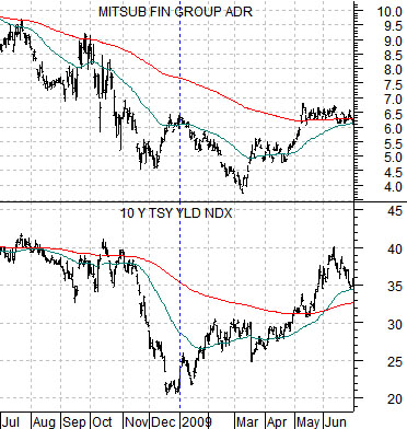
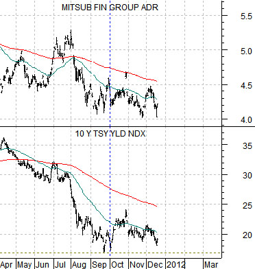
The chart below compares 10-year U.S. Treasury yields with the share price of Japanese bank Mitsubishi UFJ (MTU). We are using MTU to represent the ‘laggard bank’ theme that has been putting downward pressure on the capital markets this year.
The chart is from July of 2008 through June of 2009. It includes two events. First, the low point for 10-year yields in December of 2008. Second, the ‘pivot’ higher for MTU in March of 2009.
The argument is that once yields reached bottom at the end of 2008 a couple of months passed by before the markets realized that growth was starting to improve. In other words there was a period of time after the low point for yields when MTU’s share price trended lower until it finally snapped back to the upside.
Below we feature the same chart comparison. This time around we are looking at the time frame from April of 2011 to the present day.
The argument is that yields bottomed a couple of months ago. This may not have been obvious yesterday as 10-year yields pushed back towards the lows but as long as a case can be made that we are already passed the worst point for yields then we have to at least consider the possibility that the equity markets are in the same kind of ‘lag’ that took place during the initial quarter of 2009.
That grinding noise that you might be hearing relates to our changing gears without the benefit of a clutch. We are going to shift our focus away from the thesis that we have been working on so that we can return to an argument that we have made on many occasions over the past number of years. With apologies.
The argument relates to the 2-year lag.
The equity markets are one of the sectors that are involved in the cyclical trend. From cycle to cycle the cast of characters changes but, in general, we tend to use economically sensitive markets such as copper, tech, and even the banks to represent what we term the ‘cyclical trend’.
The cyclical trend relates to the bond market in two different time frames. There is a definite relationship in real time as falling yields go with slower growth. This has been particularly evident in recent days as yields and equities have fallen in tandem.
There is another relationship, however, that seems to work quite nicely. We call this the 2-year lag.
If you have ever heard the term that the Fed is ‘pushing on a string’ then you have encountered the lag between changes in the direction of yields and the eventual impact on growth. When the Fed eases credit and lowers interest rates the stock market does not explode to the upside because it takes a certain length of time for monetary policy to work through the system and into the real world. Our view is that the ‘certain length of time’ is close to 2 years.
The argument is that 2 years AFTER yields start to trend higher growth begins to slow. 2 years AFTER yields start to decline growth starts to improve.
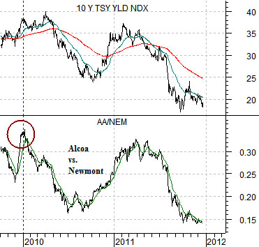
So… below is a chart of 10-year Treasury yields and the ratio between Alcoa (AA) and Newmont (NEM). We realize that we are reaching somewhat with this one but our intention is to show that a case can be made that yields started to decline at the very start of 2010.
The AA/NEM ratio goes with the cyclical trend. It tends to move quite closely with yields. The ratio peaked at the start of 2010 and has been trending lower for almost exactly two years. Fair enough.
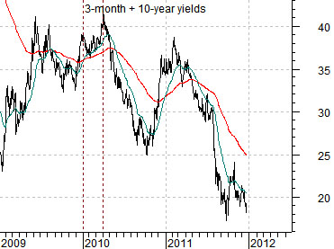
Below we have taken a chart of the sum of 3-month and 10-year Treasury yields from 2009 to the current time frame and are comparing it to the ratio between the Bank Index (BKX) and S&P 500 Index (SPX) from the start of 2011. In other words… we are attempting to compare the trend for yields in early 2010 with relative strength of the banks as we push into the start of 2012. Thus… the 2-year lag.
The argument is that yields peaked some time between the end of 2009 and the completion of the first quarter of 2010. The 2-year lag argues that this will create a positive cyclical trend close to 24 months later. The argument would then be that the rise in yields through 2009 was responsible for the weakness exhibited by the markets during 2011.
The point? We can make a case for a much stronger trend starting as early as today but extending out through the end of next year’s first quarter.