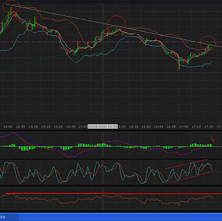
 Many, many people will advise against the use of the one-minute chart. And there are plenty of good reasons for such advice, the main being that the one-minute chart has tremendous amounts of noise, is choppy, and encourages overtrading. I agree with all of those points. I would never recommend trading solely from the one-minute chart unless you can mentally compress it into a five or fifteen minute chart (yes, you’ll receive an edge from this madness). If you think of every five or fifteen candles on the one minute as a single candlestick, then you can obtain the same level of perspective (which provides stability and less noise) while still being able to see how those candles on the five and fifteen minutes were formed. On this chart it is much easier to see the descending support on the one minute than the five or fifteen (I took the screenshot two weeks or so ago and do not have the five or fifteen). I nearly always give the benefit of the doubt to the larger trend, but sometimes it is nice to see what the underlying trend is in order to supplement your knowledge of the five, fifteen, or longer trends.
 This next chart is full of all sorts of patterns, as well as a sample of a hedging strategy (I wrote a little about this several posts ago). The main patterns are the double tops that form at least twice. One thing to look for when determining tops or double tops is the RSI. While the RSI can theoretically stay above the 70 point for an extended period of time, on the longer timeframes it typically reverts to the mean (50) fairly fast. Shorting near the peaks, or after the RSI fails to make a new high can be profitable or at least a nice compliment to an already solid system.
The more I have been playing with RSI the more I appreciate it. For more information of the empirical nature, check out The Dogwood Report and Woodshedder and more specifically Dogwood’s post Wealth-Lab Developer 5.1 Experiment” and Woodshedder’s post “Depressed Relative Strength: Bulls Have the Edge”.


