

We often hear discussed when a major index hits a new high and any mention of confirmation typically revolves around the Advance-Decline Line. This measure of breadth simply looks at the number of stocks that are rising or falling, it doesn’t tell us where the underlying stocks are in relation to their own 52-week highs or lows.
However, there is one chart that does show us this and it’s a chart I don’t see discussed very often.
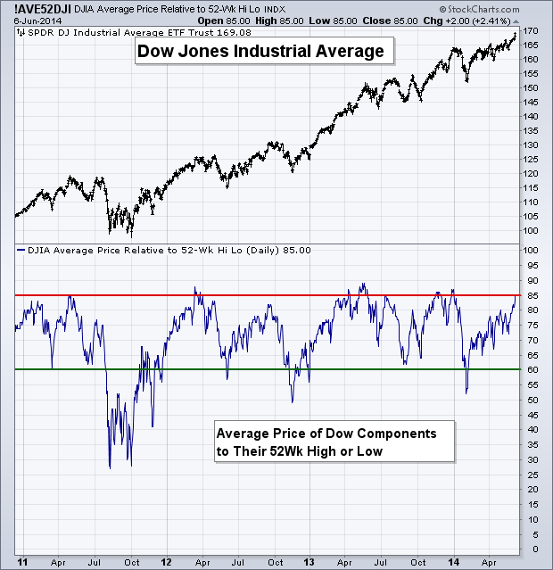
The data series in Figure 1 is one created by Decision Point, and looks at the individual components of the Dow Jones Industrial Average (DIA) and where they sit relative to their respective 52-week highs and lows. If a Dow component is at a 52-week high then it receives a value of ’100,’ if it’s at the middle of its 52-week high and low then it receives a ’50,’ and so on. The below indicator then takes the average of all 30 Dow stock’s values.
As you can see, when this figure has broken above 85 we’ve seen the bulls take a break from driving the train and stock prices see a period of decline. The most recent example of this was at the end of last year before the 6% drop in January. We also saw this indicator peak before the small drop in 2013 and before the corrections in 2012 and 2011. Looking at where we currently stand, on Friday’s close the Dow components had an average value of 85%, right at our mean-reversion threshold. Does this mean things have gotten overheated and may require a cooling-off period? Maybe. As with all indicators that are built to give a heads up to a potential period of mean-reversion, price confirmation is key.
Disclaimer: The information contained in this article should not be construed as investment advice, research, or an offer to buy or sell securities. Everything written here is meant for educational and entertainment purposes only. I or my affiliates may hold positions in securities mentioned.

