
This is a chart of the ratio of two commodities, both priced in dollars. That means the dollar is taken out of the equation leaving just real market meaning behind.
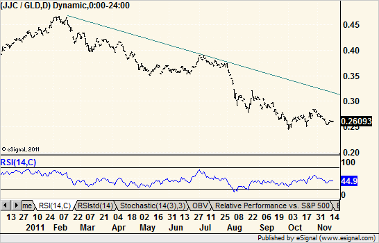
The copper ETN divided by the gold ETF shows a solid decline all year. It’s meaning is that the metal linked to economic growth is underperforming the metal linked to fear and hedging. And that is not a good thing for the economy down the road.
True, there is some rally room to the trendline but with ratios you should give them a little leeway when it comes to patterns and lines. Just one more bit of evidence to put on the bearish side of the ledger.

