
The startling graphic below shows the change in debt outstanding by sector as a percentage of GDP over the past 30 years. This data was compiled by the good folks over at EconompicData, and we think it provides some excellent insight into just how deep a hole the federal government now finds itself.
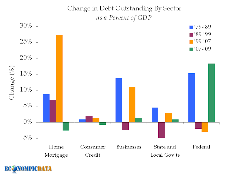
Of course, the massive rise in Home Mortgage debt during the housing bubble can take its fair share of the blame for the new growth in Federal debt, as the Federal Reserve bought literally trillions of dollars worth of mortgage backed loans in order to stabilize the credit crisis that followed the collapse of the housing bubble. The Federal Reserve’s balance sheet has just now begun to shrink but the damage has likely been done, as it now sits at $2.262 trillion (down only .5% from its record high). With the federal debt jumping from 36% to 55% in just two years, there is very little doubt that higher taxes are on the way.
Perhaps the most remarkable thing to me about this data is the relative lack of change in the amount of consumer credit debt outstanding. Consumer credit has pretty much grown in line with the economy, if you discount the home equity loans of yesteryear. It was our impression that consumer credit would have grown much faster than the economy.
Hat tip to Econompic for the enlightening graphic.

