.png)
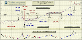
I found this on my hard drive the other day, and I thought I would share it. If you go to the site mentioned on the image, you’ll find an even more recent chart showing the current decline of the S&P500 P/E ratios (not yet below 10).
This chart will hopefully give you an idea of where the current market stands. There have been “double tops” before that have not signaled the end of the market, something pointed out every now and then by the doomsayers. Also, there are other times where we have dipped below the outlined consolidation levels. While the chance for a Great Depression like dive exists, I personally think we’ll get some movement towards the upside as soon as P/E ratios dip below 10. According to the data I find at Shiller’s website, the S&P500 P/E ratio is about 12 as of March 3, 2009. In order to get real bullish sentiment, I think we’d need to fall to ~7 or so. We could fall lower, but that level 5-8, is probably as good as it will get for buyers.
Then again, the doomsayers could be right: the United States could just burst into flames.


