
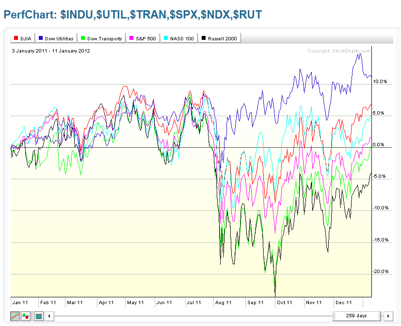
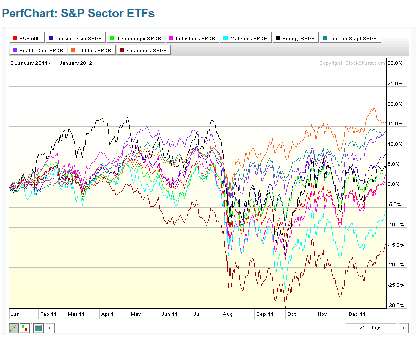
The following graphs/charts (courtesy of www.Stockcharts.com) depict percentage gains and losses in the Major Indices and Sectors during several periods since the beginning of January 2011.
The first two charts show price action from January 3rd, 2011 to today’s close. Prices topped in July of 2011 and bottomed in September.
The first…

