 Admittedly, the ETF Rewind service’s greatest strength is also its weakness: a tremendous amount of information in a very compact presentation. Okay, maybe too much information for some.
To address this issue, earlier this month I began incorporating a proprietary composite scoring system for all 200 or so tracked ETFs using many of the nightly spreadsheets’ key heuristics as presented in the service’s introductory video series. I call the resulting scores ‘ETFRanks‘. As discussed below, the ranks appear to be strong selection criteria for active investors using an intermediate time-frame.
Rank Construction
Here is a brief overview of the factors included in the calculation of the ranks:
- Long-Term Trend
- Intermediate-Term Trend
- Relative Strength
- Risk-Reward Profile
- Oversold/ Overbought Oscillator State
- Relative Volume/ Liquidity
To achieve a rank of 10, the most ‘bullish’ score, an ETF would have to be strongly and consistently upward trending on both an absolute and relative basis, and be at least slightly oversold on a very short-term basis.
Cross-Sectional View of Market Status
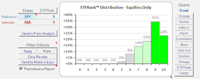
Each night I create a histogram of the resulting ranks for all the equity-based indices, like so:
The modality of this chart provides me with a strong sense of overall market status. Note how the markets’ recent pullback within an environment of upward strength has pushed many of the ETFs into the highest scoring quintile. Also, it is abundantly clear with the strong rightward skew how preternaturally strong this market has been. Lastly, it is also a good touchstone against which to compare any individual ETFs of interest. In the future, I will make note of any major changes to the modality of this chart in my weekly ETF Rewind summary.
Out-of-Sample Performance
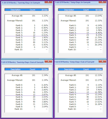
As a first-pass test of the out-of-sample efficacy of the ranks, I ran the scores for all the ETFs as of twenty-days ago, and then again as of sixty-days ago. The upper panels of the chart below show the backward looking/ in-sample performance of the ranks as of the date of those runs for the two periods on the left and right hand sides, respectively:
The forward, out-of-sample performance for the same ETFs as ranked in the upper portion of the chart another twenty- and sixty-days out is shown in the lower sections of of the respective panels. As you can see, the relative out-performance/dispersion of the higher ETFRanked securities held up admirably.
This has been a very trendy period, so I will grant that I need to conduct the same type of testing over a far greater sampling for a thorough evaluation. However, I strongly suspect the ETFRanks will hold up very well.
[See alsoHome of Mrkt Metrics]


