
Over the years I’ve used a chart that tries to measure how offensive or defensive the market feels. Colleague Boris Simonder introduced me tot eh concept and I’ve been using readily available ETFs to calculate my own version. The idea is that when tech and cyclicals are in the lead the market feels good. And when healthcare and staples are in the lead, the market does not feel so good.
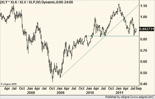
Here is the look over the past few years. Looks like a giant head-and-shoulders sitting on its neckline. At best, it is a break of the long-term trend t the downside.
Look back at the 2008-2009 bottom. This indicator set a higher low while the broad market set a lower low. A bullish divergence.

