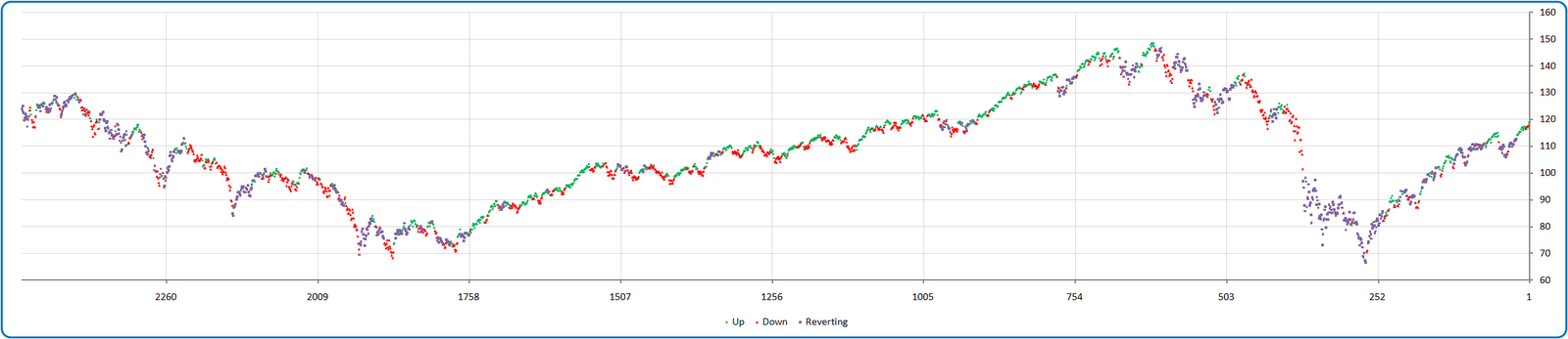
Most of you are familiar with painting the tape using the direction of the linear regression line-of-best-fit as an indication of trend. That’s a good start, this analysis ups the ante a notch by measuring how unusual the standard error of the estimate is relative to that line.
Okay, don’t get freaked out by the Stats-101 reference! It’s simply a measure of how accurately the predicted trend line is fitting the actual price series! In this case, we are referencing that accuracy level relative to historical norms to decide whether we are in fact in more of a mean-reverting versus a trending environment. Think of it as a “third state”.
The color key below employs a smoothed monthly look back period with up-trends in green, down-trends in red, and mean-reversion oriented periods in purple. I expect that this concept could be advanced significantly with further study, but here is a first graphical look at the idea going back ten years using the S&P 500 (SPY) as inspiration: