Monday 3 May 2010
Not a Chinese proverb!? Ah, but we digress.
What do we now know, and why may this be an interesting time? From “China”
to England we go in pursuit of a Holmesian deduction. Sherlock Holmes would
look at all the evidence, and from it, he would draw his conclusions. Our single
source of information comes from the charts, those much maligned, so often
misused lines that tell a true story. Charts are like braille. Everyone knows what
braille is, but you have to know how to read it in order to understand it.
So, here goes the blind leading the blind.
The best first start in approaching a market is to define and know the trend.
The trend is the path of least resistance. [“The Path Of Least Resistance” is also
a book, written by Robert Fritz in 1984, about learning to become the creative
force in one’s own life, an apt description for what we endeavor to accomplish in
reading charts and knowing the trend.] What is equally important about knowing
the trend is identifying the time frame under consideration.
As an aside, for those who want a fast answer to where price is going, you will
have to seek out another analyst who serves up conclusions du jour. We are of
the mind that if you do not know how you got to where you are, you will never
understand how you will get to the next level, and we see this as an interesting
time that can lead to a lower level.
The larger time frames, weekly and monthly, [there are others], are more
controlling for a trend because they take more time to change and turn. Most
participants in futures markets do not look beyond a daily chart, and often focus
on intra day activity. The trend of an intra day move can be at odds with a daily
trend, and have no bearing on a weekly or monthly chart. This is why it is critical
to know the trend of the time frame in which you are trading, and also to know
the trend of the next higher time frame. A potential breakout on a daily chart
could be important resistance on a weekly chart. Buying a breakout on a daily
chart without knowing the weekly chart resistance can prove costly.
Many of you, if not most, may already know this, but repetition is never wasted
in understanding how and why markets work.
We recently stated that the intra day trend was already down, and the daily
trend was still up, but on the cusp of turning.
[see S & P – Great Example Of Changing Information, second paragraph]. We
are going to start with a monthly chart, two time frames higher from the daily,
because it has reached that “interesting” stage, and if the analysis is on point,
the S & P is headed much lower in the weeks ahead.
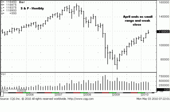
For us, the monthly chart stands out like a Cape Hatteras lighthouse. The last
bar on this chart provides many important clues. Given that the larger time
frames are more controlling, the implications of potential change on a monthly
chart are significant in the impact of the lower time frames.
The first clue is the position of the close. It is under the mid-point of the range.
What that tells us is that the sellers won the “battle of the bar.” Where price
closes on any bar shows which force between the buyers and the sellers was in
control. If price closes mid-range, it is a stand-off, neutral, and the importance
would lie in the location of the bar. What we can now deduce is that after an
entire month’s effort, sellers were the winners, and they won the battle not only
in an up trend, but at the highest level price has reached since the March 2009
low.
The second important clue is the size of the range. It is the smallest range
since the February low. Why is that important? After the previous two much wider
up bars, the smaller April range says that buying was spent. Buyers did not have
enough force to extend the range higher. That is also due, in part, to the fact
that sellers were more in control, not only in meeting the efforts of the buyers,
but overcoming them, as well, which is why the close was on the lower end of the
bar.
Most chartists love to draw lots of support trendlines, use relative strength,
moving averages, etc, etc… which are all measures using past tense information,
and trying to impose it on present and future tense activity. It makes no sense…
except for the ones who try using it. What keeps “technical analysts” using these
indicators is that sometimes they work! We prefer using the logic of present
tense activity as a gauge for what the market is likely to do next. Past tense
activity is important, but when in context of what the present tense information
is conveying as a result, in a continuum.

If we are reading the logic of the last monthly bar correctly, the monthly trend
may have difficulty in going higher. If that is to be the case, then the weekly
chart should buttress that evidence. Next chart.
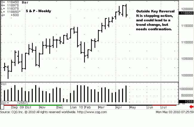
We are always of the belief that there are no accidents. Here, the last bar on
the week just past, the culmination of the last week of the month, is an Outside
Key Reversal bar, [OKR]. We have discussed OKRs in the past. One occurs
when price make a higher high than the previous bar, [in this instance, in an
uptrend], a lower low than the previous same bar, and often, but not always, a
lower close than the previous bar. Here, we have all three, including a lower
close. OKRs can often be the stopping and reversal of a trend. That may be
the case, developing here, but we now need to see confirmation in the weeks
ahead.
What makes this OKR more significant is that it is on a higher time frame chart,
the weekly, which, as we all now know, is more controlling in influence on a trend.
We already applied some logic to analyzing the monthly chart, and the
conclusion drawn finds support in this next lower weekly time frame. Looking
for harmony in the time frames under study helps to solidify the analysis. We
will stop here, lest this become more of a treatise and less of an analysis of the
S & P market.
It was important to establish what the higher times frames are saying, beyond
the daily charts, because it means that drawing a logical conclusion as to where
price could go is in keeping with the past development, up to the present tense.
The conclusion deduced from the logic of the information provided from the
charts is that price could go as low as this past February lows, the 1040 level.
The validity of that potential will be determined by HOW price reacts to the next
important support area, 1150, the January highs.
This is our overview. Now we all get to watch how the daily time frame unfolds
in a supporting role. As we indicated from our last analysis, we are now short the
S & P, at the 1187 area, near the lows, but we had to see confirmation that 1195
support would fail, and then look to sell a weak rally, which did not happen,
hence the lower entry level.
There is some work being done on the blog, and access may not be available
for a short period. Apologies for any inconvenience.


