Sunday 25 July 2010
The most important piece of information one can have is knowledge of the trend.
While that statement can be viewed as Technical Analysis 101, it is equally true for
the most advanced of trading, and that is because the trend is a principle that
applies all the time in all time frames. Forgetting this seemingly simple bit of
information can be costly.
In the last article, mention was made that a trading range is a nemesis for trend
trading. [See S & P – A Trading Range – Nemesis For Trend Trading, click on
http://bit.ly/cbOEXN, and note the second to last paragraph, for the market is still
at this phase…no ending action to the current rally.
The trend is important in the time frame being traded, so a quick review of the
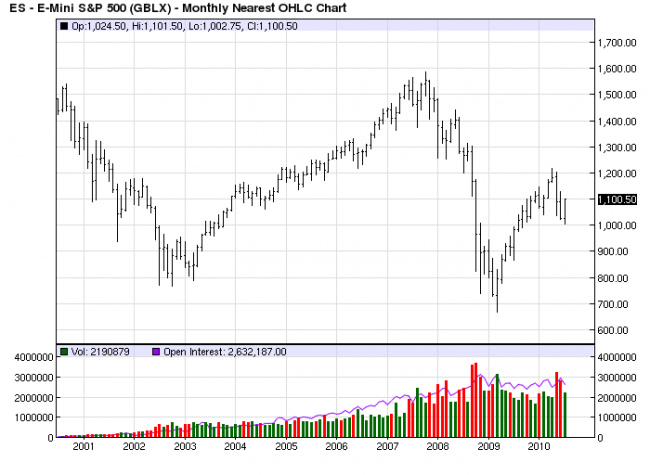
trend over the various time frames. Monthly: Down. Price failed on a small range
monthly bar, indicative of an inability of buyers to extend the range higher. Price
failed just above the half-way retracement point and at the July 2008 low. Lower
highs and lower lows = down trend.

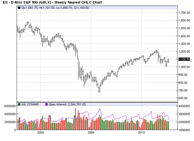
The weekly chart is a more detailed version of the monthly, and it shows how
price has broken a previous low for the first time since the March 2009 rally
began. The biggest clue that the March 2009 rally is one within a down trend is
the length of time it has taken to retrace to the 50% area, and the bar ranges
are so much smaller than the previous down bars, including the recent failure
from April. The bars have gotten decidedly larger on this break. Trend down.

Adding the above two charts was an afterthought to the next two, so the charts are
from a different vendor, which does not really matter, other than as an explanation
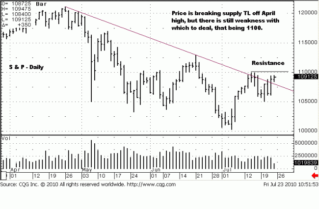
for the difference. Here is where the current analysis begins. The trend is clearly
down here, after a series of lower highs and lower lows.
There is a supply trend line connecting the April – June highs that has been
broken. As an aside, these kind of trend lines are not that significant for us,
although many analysts put a lot of emphasis on them, often to their detriment.
There are more important price levels to be gleaned. Even though the trend line
has been broken, there is still some resistance at 1100, and again at 1130, the
mid-June failed rally. Both are more important indicators of resistance than the
identified supply trend line.
The devil must have been a technical analyst, too, for the devil is in the details
of the charts. The details are important, for they tell the market’s “story.” For
now, that story is muddled, and that is a simple fact. Not everything in the market
is as clear as many would like, but exercising patience and waiting for that clarity
will pay off. Eventually, market activity will become clearer.
Price is in a trading range, defined by the April high and July low, and there is
another trading range within, defined by the 1100 high and the last low near
1050. The next chart will show yet another smaller trading range. What can be
said about these trading ranges is to leave well enough alone until they come to
a resolve, and they will. THAT is when an opportunity can present itself with a
higher level of knowledge than is available right now. In a trading range, the
level of knowledge is low.
The half-way points on the monthly and weekly charts, from the April high to July
low is 1109. That is considered resistance. From the daily chart, with the current
rally evolving, there does not appear to be any ending action. Until there is, we
can expect the rally to continue. There are three possibilities to expect from here:
up, down, or more sideways. What else can any market do?
Continuation up is the most likely scenario, but the question is, how much
higher? The market has to deal with the immediate resistance at 1100, and
Friday’s close puts price right there. This daily chart was printed earlier in the
day, so it does not show that price closed at 1100. Next resistance is the 1109
level, just mentioned.
What will be important from Monday is to watch HOW the rally continues, and
HOW it approaches the 1109 half-way mark, IF it does. We do not know that,
yet. If the intra day rallies are wide ranges to the up side with increased volume,
1109 may not hold, and 1130 becomes the next target. Of course, there can be
a brief rally above 1109 that fails and closes lower, and that becomes another
story.

Yet more detail from a 180 minute chart, or three hours. It cuts out a lot of
“noise.” Here you can see the trading range within the other trading ranges,
defined by the 1100 high and the 1080 area. Oops. This chart does not show
the current trading range detail. Let us add one more, the 60 minute. The
current trend on this 180m chart is either a trading range, or down, so make it
questionable.

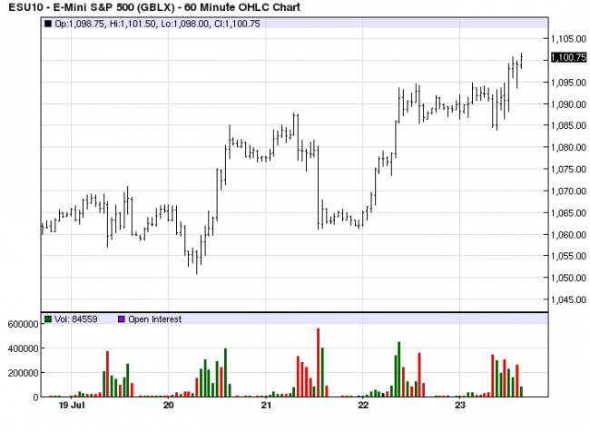
Here you can see the smaller trading range, within all the other trading ranges,
between 1095 and 1085. For now, it has resolved itself by closing higher, but we
are comparing a relatively much smaller time frame when compared to the larger,
more controlling monthly, weekly, and daily time frames. While the 60 minute
time frame trend is up, it has too much opposition to rely on it. Use it more as
a timing tool.
The point to be made is that the charts are not showing clarity, so wait, or the
devil may get you.


