Saturday 10 October 2009
Has POMO lost its magic, or will manipulation win again?
[POMO = Permanent Open Market Operations, the Fed lends money into the
banking system for the express purpose of supporting the stock market.]
[There is a reason why Goldmand Sachs stock has been one of the strongest
performers, bottoming months before the general market.]
This artificail stimulation has born a substantial market rally since March 2009,
revived certain government-bailout stocks that were on life support, all while
the US economy is languishing and the public have seen their “wealth”
dissipated. There is a disconnect between the stock market rally and the
dwindled worth of most people’s 401ks/IRAs/portfolios. If the economy is
strugging, businesses barely surviving or going out of business, how can there
be such a robust stock market rally? The unprecented running of the Fed
printing presses pumping out fiat Federal Reserve Dollars and the use of
POMO seem to best answer why the government-backed entities are feuling
this otherwise enigmatic rise.
Rather than learn from the lessons of the irresponsible bank lending practices
involving the granting of mortgages to anyone who could fog a mirror, and the
use of derivatives by Lehman Bros, AIG ilk, the Fed has taken pages from
those practices and implemented their own form of irresponsible financial
largesse to make it look like the emporor really is wearing clothes. The might
of the Fed deep pockets is prompting most everyone to look the other way.
One day, the voice of someone saying the obvious will prompt a stampede to
avoid yet another clamity in the making, and excuses will once again be
forthcoming, “How could this have happened?”
Fear, greed and denial is the short answer.
What does all of this have to do with charts? It is one of the few ways that
makes sense to explain the ongoing anomolies occuring in a no-supply-hardly-
any-demand rally. When the character of the internal structure of the market
keeps flashing warnings, and then rallies as if the warnings were never given,
it is very difficult to have conviction in something that goes against technical
“common sense,” for lack of a better way of expressing it.
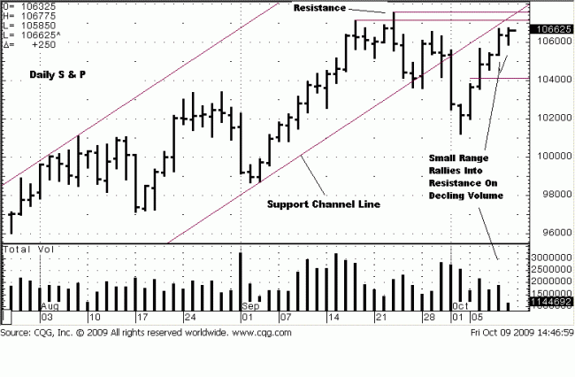
Since the 23 September high on the daily chart, there were seven lower closes
during the next 8 trading days. The last three of those days were on the
highest volume of three consecutive down days since the March lows, and price
declined under the previous swing high established in August, all red flags and
signs of internal market weakness. The results?
The market produced a five day rally on declining volume and smaller ranges,
more signs of internal market weakness. Friday’s close rallied to the highs for
the day and week. The only question is, will the POMO influence carry the day
next week, or will usually reliable warning signals stop this weak rally, just
under the previous resistance highs and allow the market to undergo at least
a “normal” market correction?
The high from 21 September is still the high for the cash market, but was
exceeded two days later in the futures with a failed probe. A horizontal line
drawn across the first high shows where the most important resistance is.
Price broke the up trend support channel line decisively, with a wide range
down on heavy volume, a sure sign of sellers winning an important battle at
a support area. While price has since rallied, it has not regained the support
trend line, also not a positive sign.
A few observations that are red flags can be made about Friday’s activity.
The range is small, a sign that buyers were too weak to extend the range
higher, volume was lower, [the daily chart does not show full volume for the
day until the next trading day], and price closed right at the top of the range.
Is that important?
Normally, yes. Everything just described occurred just under resistance where
one would expect exactly this kind of market activity. The close right on the top
can mean exhaustion, a “stuffing”-type of close that leads to a turn around after
such a weak retest. Normally.

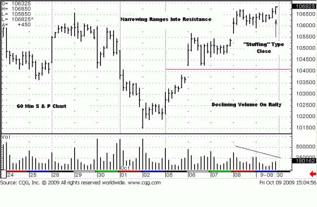
We show this “stuffing” close on a 60 minute chart. [The intra day chart reflects
day session trading only.] It can be seen that the last few small-range rallies
were also gaps up, and these gaps, occurring at the top of a rally and not
extending higher, can be exhaustion gaps, which fits right in with the “stuffing”
close. This is not “The Little Engine That Could,” a children’s story where
everyone hopes and cheers for the struggling little engine to make it over the
mountain top as it huffs and puffs. This is an adult fairy tale that masks a
scarier outcome resulting from all the POMO-induced huffing and puffing that
has failure written all over it. The monthly trend is down. The daily trend is up,
but…
…it is just a matter of time.
Charts tell a story. We just told ours. Maybe it should have started it with,
“Once upon a time…”


