
 Any trader with a charting package and more than two weeks of experience is well versed in the shortcomings of simple moving averages attendant to their significant noise and lag. While they certainly have their place in the trader’s arsenal, the first areas to trade up to for more reliable trend identification are exponential and weighted moving averages. These may significantly reduce the lag factor. However, their perennial memory can be a problem in its own right, as addressed in this previous Market Rewind post (includes Visual Basic code for you “uber geeks”).
A Better Alternative?
But can we do better than these solutions? Certainly! If you haven’t discovered it yet, the Hull Moving Average (HMA) provides a significantly better fit to price with minimal delay by taking price changes out of time space using a weighted squares methodology.
Its primary weakness can be overshoot, although there may be clever ways to reduce this that I may explore at a high level in later joint posts along with David Varadi of CSS Analytics. Speaking of which, here is a neat little “easter egg” for subscribers to his DV indicators Service. An undocumented feature of the included Microsoft Excel plug-in is the HMA! The user defined function is accessed like so:
In the S&P 500/SPY charts below, I have used that feature to demonstrate how an HMA of the same periodicity [10] as a REMA (my modified exponential moving average, also included in the package), can be used as a strong visual clue of sustained trends:
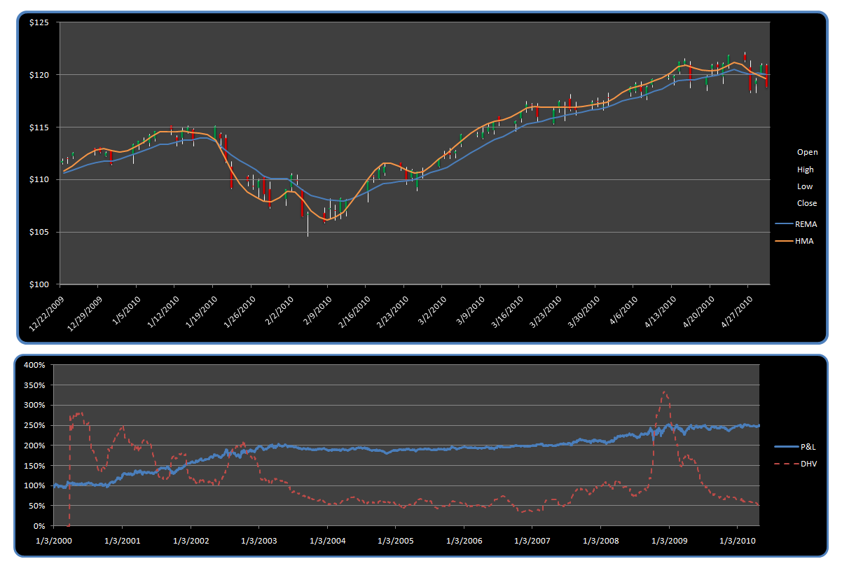 As shown, the faster yet smooth nature of the HMA can be used as a visual trend indication relative to the slower REMA, with crosses above signaling a bullish trend, and crosses below a bearish one. Note, however, this is just a visual clue for sweet spots in the middle with the described approach working better on less than daily time frames.
Fading the Trend
Indeed, when the market is in its usual cycling phase, daily bar HMA slope reversals generally make a better fade, as shown in the frictionless equity curve presented in the second chart. As fodder for further research, also note how I have overlayed a chart of Historical Volatility of the fade system’s equity curve. Another mean reversion versus trend indicator?
All data and indicators for these charts were generated with the DV plug-in. It’s a remarkable tool including over two dozen of CSS Analytic’s proprietary technical indicators and systems (disclosure, I assisted with the programming).
Never Investment Advice

