Two weeks ago, we looked at the possibility of a Canadian housing bubble, and saw that Vancouver looked particularly bubble-icious in terms of new inventory. This is often a good indicator, as builders in a free, capitalist society should only overbuild if they are getting a strong price signal to do so. But of course, it is possible that builders are just irrationally overbuilding for some reason (e.g. government stimulus, tax credits, expectations of price increases etc.), so it does make sense to look at more metrics than just new home inventory before concluding that there is a price bubble.
The ratio of house prices to income levels is another useful metric for judging how expensive houses are relative to a historical standard. Canada-wide, this ratio is elevated, but perhaps not dramatically so. Recall from last week, however, that there is considerable variability with respect to housing data within the country. It, therefore, makes sense to look at this ratio for specific regions in order to identify trouble spots.
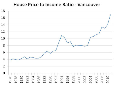
Considering Vancouver has the highest house prices in the country, it makes sense to start there. Consider the house price to income ratio* in Vancouver over the last 35 years:
That is a scary chart. For this ratio to be back in line with its levels of just 10 years ago, prices will have to fall by 50% or incomes rise by 100%…which of those is most likely? The former. Though this ratio can continue to rise for a while, with cheap money funding further asset purchases, it can’t go on forever. At some point, it seems very likely that some heavy pain will be felt in this region.
* Income used is “average family income” as per the Statistics Canada CANSIM database. House prices are “detached residential average sales prices” as per REBGV


