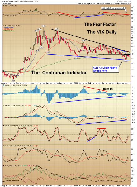
The daily chart of the VIX (see the second chart down) has a bullish falling wedge with a bullish divergence on the MACD. There is also a divergence between the 60-minute chart of the S&P 500 and the 60-minute chart of the VIX (see the first chart down). That leds me to believe that the VIX will begin to rise, which will increase volatility. Remember the VIX is a contrarian indicator and moves in the opposite direction of the S&P 500.
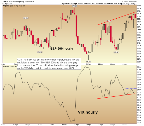
The chart above is anhourly chart the VIX vs. the S&P 500. It shows that theS&P 500climbed to a higher high, but the VIX failed to put in a lower low. The S&P 500 and the VIX are diverging from one another. This divergence could energize the bears, allowing the bullish falling wedge on the daily chart (second chart down). to eventually get a breakout and move the VIX above 40 percent. The 40percent area is where the falling trendline comes into play and the index will find major resistance. It is where declining and horizontal resistnace intersect.
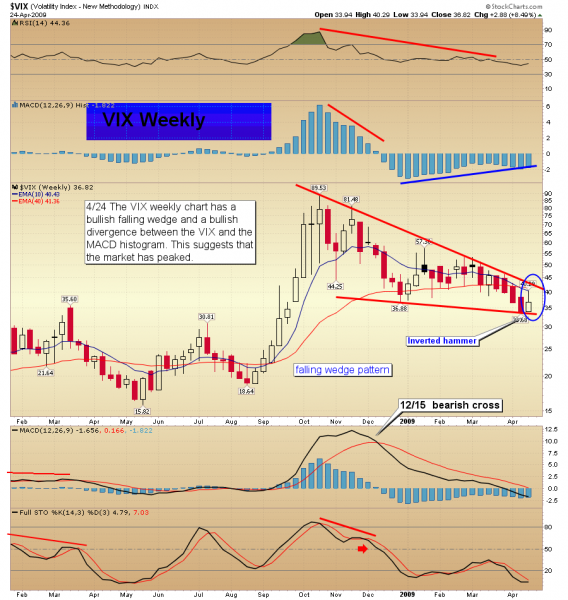
In the VIX weekly chart below, there is a bullish divergence between the MACD histogram and the VIX. However, the MACD is still falling and has moved below the zero. That may be inturpeted that the market may just have a corrective move rather than take out the March lows. But as the MACD histogram continues to rise it should move above the zero line putting in a lower peak than the histogram tower that formed during the last part of 2008. Once a lower tower forms on the histogram, and the histogram bars begin to move lower again, the sell off in the market should have concluded. Let’s watch for clues, that might reveal whether or not we have seen a bottom in the stock market.