
At the beginning of the pandemic and economic lockdown, crude oil prices temporarily went negative. This was an unprecedented event in the world economy. However, that short lived occurrence marked one of the most important bottoms in history as Crude Oil has sustained a huge unstoppable rally ever since. From its April 2020 low Crude Oil prices are UP 1,207%.
What makes the current economic climate so tense is we have the largest inflationary pressures in 40 years and Crude Oil testing its 7-year highs occurring simultaneously. Ironically, the profits for electronic vehicles and oil companies are both surging.
Over the past several years auto manufacturers have started to strategically position themselves towards electronic vehicles and move the production of their fleets away from gas-guzzling autos. Since automobiles are major consumers of gasoline, which is a byproduct of crude oil, this is part of the supply & demand equation which is changing in the petroleum complex.
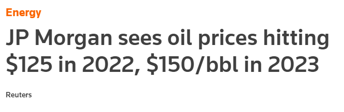
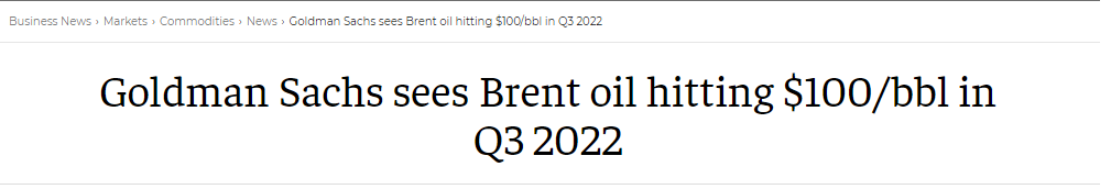
Over the past year Crude Oil prices are up 67%. This has led Wall Street Analysts to make some very bullish forecasts on Crude Oil. J.P. Morgan is looking for $125 a barrel in Crude Oil in 2022. Goldman Sachs is looking at a minimum price of $100 a barrel.
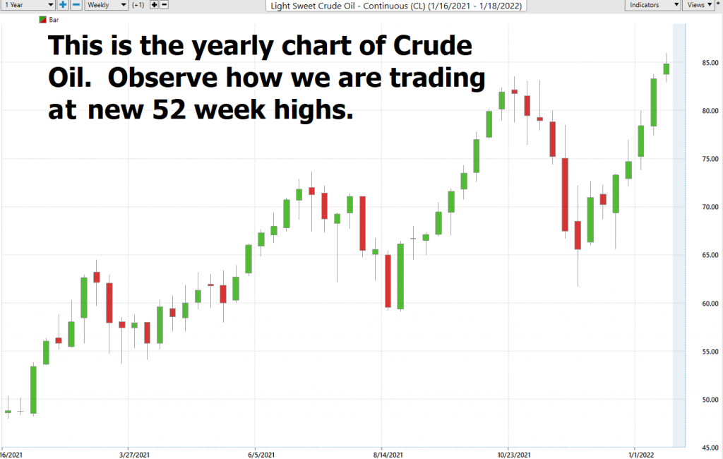
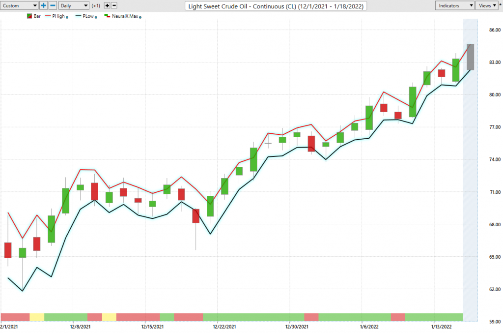
When you look at the annual chart of Crude Oil on a weekly basis you can quickly see how strong the trend has been. More importantly the market just made new 52-week highs which is one of the most powerful signals a market can make that it wants to go higher.
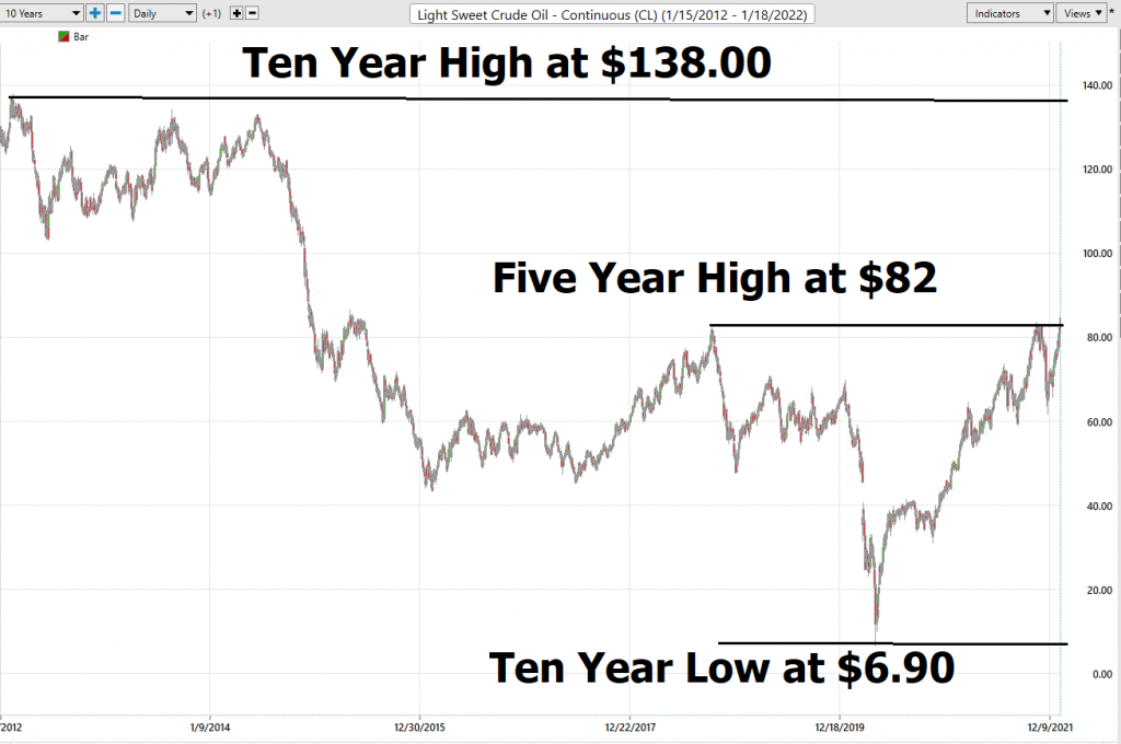
If we look at the longer-term ten-year chart it provides context of where Crude Oil can go based upon its history.
We are going to deviate a little from our normal analysis this week and work backwards. We decided to look at the Crude Oil market and find the ETF’s which are most closely correlated to Crude Oil price action. The result was Energy Sector SPDR ETF. Over the past year ENERGY SECTOR SPDR had a 93.10% correlation to Crude Price action. That means that when 93% of the time that ETF would mimic the price action of Crude Oil.
Then we sought to find an individual stock we wanted to find a gas and oil stock that was highly correlated to Energy Sector ETF. To our delight we located Imperial Oil ($IMO) They are Canada’s largest integrated petroleum company. They have a market cap of $28.4 billion and trade on average 406,000 shares per day. Our focus on $IMO is strictly based upon the reality that its price action is very tightly correlated with Crude Oil.
$IMO has a price/earnings ratio of 21.32 and a dividend yield of 2.11%. While we are not long-term investors this backdrop is very attractive for those who are, and we think it will help propel the stock higher. Also, revenue for $1MO is expected to grow by 4.2% next year while earnings are expected to increase 35% next year. With Canadian oil prices at 7-year highs $IMO will become a magnet for long-term investors with these very strong fundamentals.
In this weekly stock study, we will look at and analyze the following indicators and metrics which are our guidelines
- Wall Street Analysts’ Estimates
- 52-week high and low boundaries
- Vantagepoint A.I. Forecast (Predictive Blue Line)
- The Best Case – Worst Case Scenarios
- Neural Network Forecast
- Daily Range Forecast
- Intermarket Analysis
- Our trading suggestion
We don’t base our trading decisions on things like earnings or fundamental cash flow valuations. However, we do look at them to better understand the financial landscape that a company is operating under.
Wall Street Analysts’ Estimates
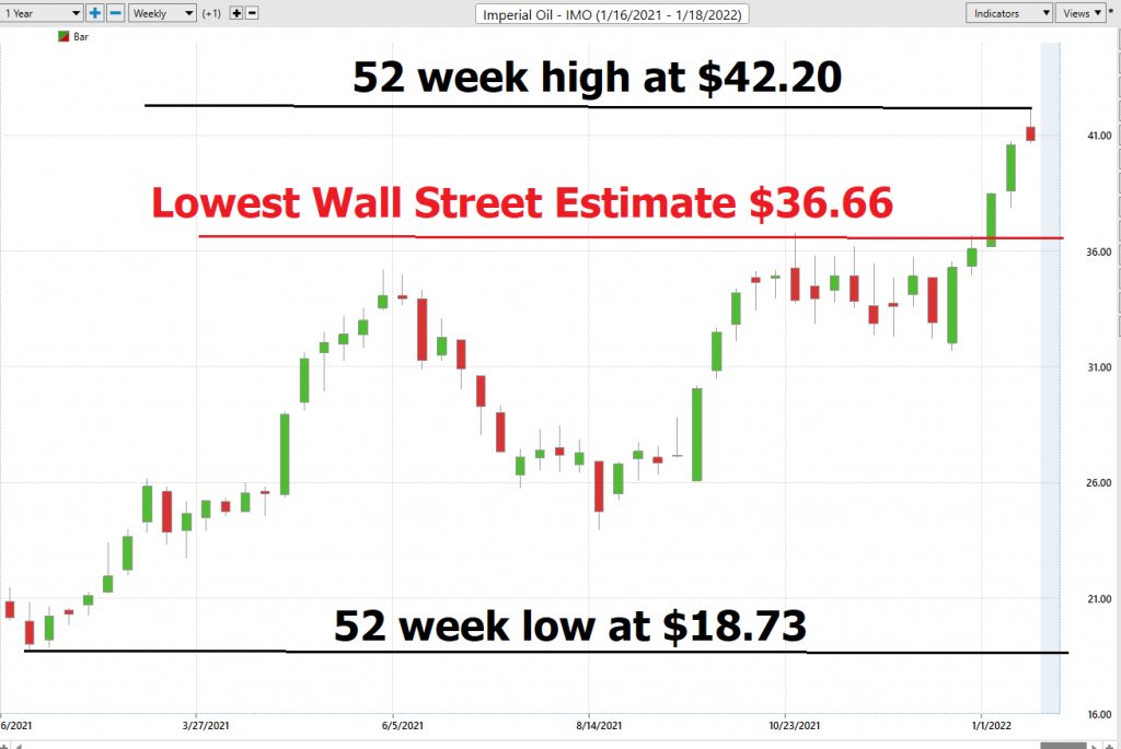
Based on 13 Wall Street analysts offering 12-month price targets for Imperial Oil in the last 3 months. The average price target is $41.65 with a high forecast of $47.00 and a low forecast of $36.66. The average price target represents a 2.18% change from the last price of $40.76.
The U.S. Crude Oil market has gone on to make new 5-year highs. Meanwhile, the Canadian Oil prices are trading at 7-year highs.
52-Week High and Low Boundaries
Over the past year we have seen $IMO trade as low as $18.73 and as high as $42.20. This tells us that the average weekly trading range for $IMO is $.45.
We also like to divide the current price of $40.76 by the annual trading range of $23.47 to get a broad-based estimate of trading volatility. This tells us that the volatility of $IMO over the past year has been 57.5%. This value also provides us a very basic estimate in letting us know that if the future is like the recent past, it would be normal for $IMO to trade in a range that is 57% higher and lower from the current price over the next year.
Here is the annual 52-week chart of $IMO so that you can see the powerful price journey it has taken over the longer term time frames.
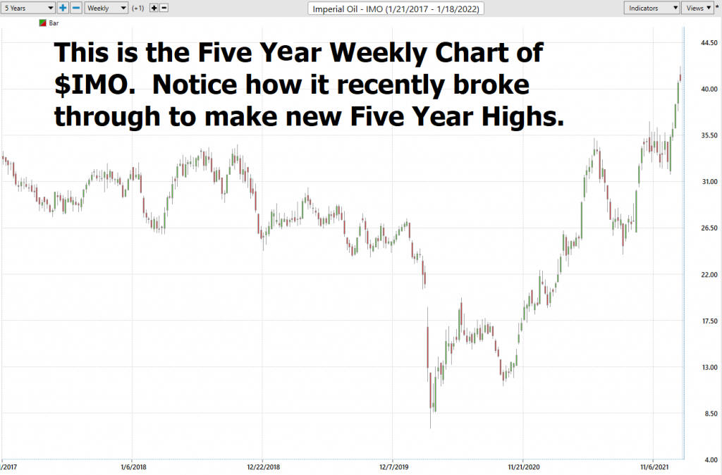
One of the most powerful trend indicators is simply a stock that continues to make new highs repeatedly. We like the reality that Crude Oil is in a powerful bullish trend and that $IMO is trading at 5-year highs. As we have said in previous analysis of stocks experienced traders learn how to buy high and sell higher when they understand that their only loyalty is to the trend.
We like to study the 52-week chart just so that we can get a feel for how the company has performed over the past year and compare that to other opportunities and the broader market indexes.
Best Case – Worst Case Scenario $SQ
Whenever we look at a trade or long-term investment opportunity to really understand what we are dealing with we need to compare the performance of the asset we are considering with the returns of the major market indexes.
But we also want to get an idea of the best case and worst-case scenarios have been in the asset.
Over the past year $IMO is UP -100.53%. This is tremendous in comparison to other assets.
The S&P 500 Index is up 21.1%
The Dow Jones Industrials are UP 14.68%
The NASDAQ is UP 10.71%
The Russell 1000 Small Cap Index is UP 18.08%
So, we can see that in $IMO we have an asset that has massively outperformed all the broader stock market indexes.
More importantly, the drawdowns have been quite large as well.
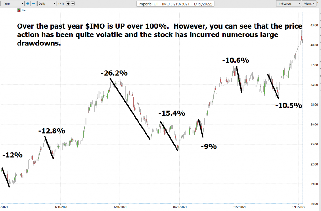
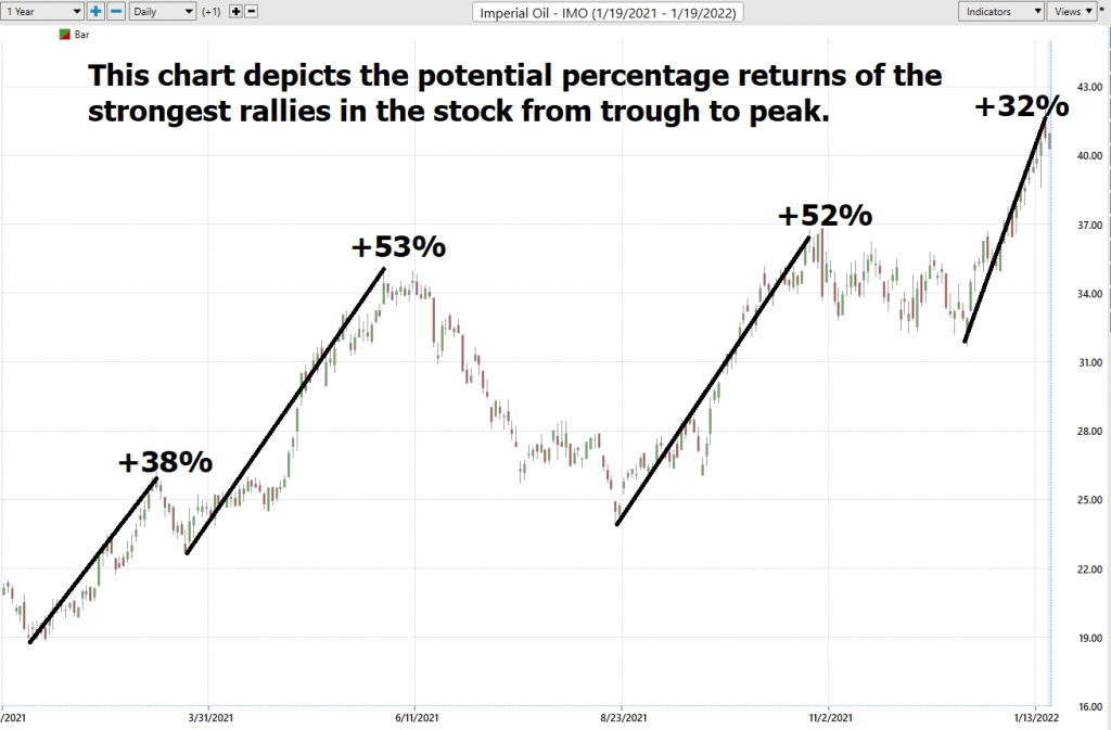
Observe how the largest rally from trough to peak is 53%. Earlier in this analysis we estimated that the annual volatility based upon the current price divided by the annual trading range is 57%. We think this is potentially an important upside boundary based upon the current rally that is underway.
Vantagepoint A.I. Forecast (Predictive Blue Line)
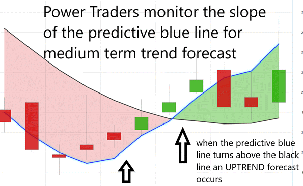
Let’s do some basic trend forecasting analysis based upon looking at the VantagePoint predictive blue line over the last year. On the following chart you will see the power of the VantagePoint Predictive blue line which determines the medium term trend price forecast.
The guidelines we abide by are as follows:
- The slope of the predictive blue line determines the trend and general direction of $IMO
- When the blue line turns above the black line an UP opportunity occurs
- When the blue line turns below the black line a DOWN opportunity occurs
- Ideally, the VALUE ZONE is determined to try and buy the asset at or below the predictive blue line
You will clearly see that the Vantagepoint Software does all the heavy lifting in clearly delineating the trends.
This is the power and effectiveness of the Vantagepoint A.I. forecast in assisting traders to stay on the right side of the trend at the right time.
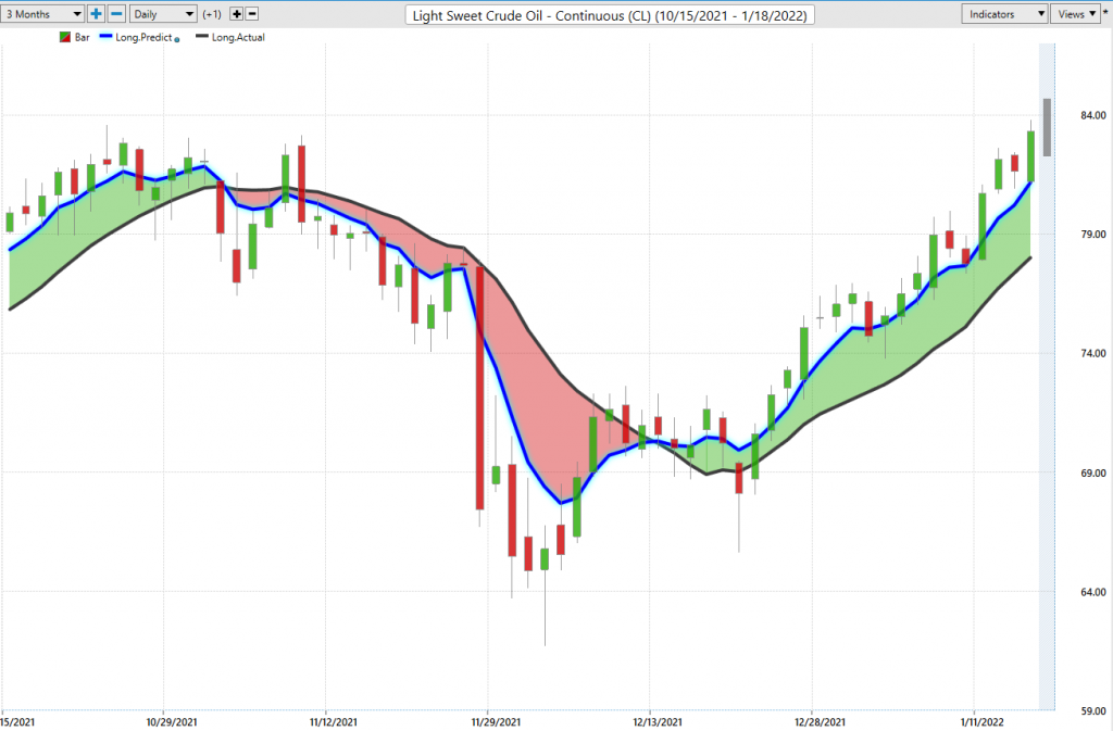
Neural Network Indicator (Machine Learning)
At the bottom of the chart is the Neural Network Indicator which predicts future short-term strength and/or weakness in the market. When the Neural Net Indicator is green it communicates strength. When the Neural Net is red it is forecasting short term weakness in the market.
A Neural Net is a computational learning system that uses a network of functions to understand and translate massive amounts of data into a desired output, consistently monitoring itself and improving its performance.
Whenever Power Traders are looking for statistically valid trading setups, they look for a DOUBLE confirmation signal. This signal occurs whenever the blue predictive line and the Neural Net at the bottom of the chart suggest the same future expected outcome.
We advocate that Power Traders cross-reference the chart with the predictive blue line and neural network indicator to create optimal entry and exit points. When the a.i. and the Neural Net are both pointing in the same direction we refer to these as very timely double confirmation entry setups.
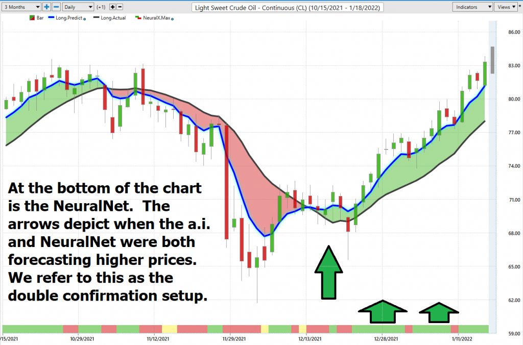
Traders look for confirmation on the Neural Net to position themselves for LONG or SHORT opportunities in the market. In other words, when the A.I. forecast is green, and The Neural Net is green, that presents a buying opportunity.
The inverse is also true, when the A.I. forecast is red and the Neural Net is red, that is a selling opportunity. The arrows on the chart below highlight the trading zones where Power Traders would’ve been using double confirmation to find a buying opportunity in cross referencing the A.I. forecast with the Neural Net.
Power Traders are always looking to apply both the Neural Network and A.I. to the markets to find statistically sound trading opportunities and improve their timing.
VantagePoint Software Daily Price Range Prediction
One of the powerful features in the VantagePoint Software which Power Traders use daily is the Price Range prediction forecast.
This forecast is what permits Power Traders to truly fine tune their entries and exits into the market.
Every day traders are faced with the anxiety and frustration of wondering where they should be looking for opportunities to buy and sell the market. VantagePoint’s A.I. makes this decision super easy with the Daily Price Range Forecast. This is where the rubber meets the road, so to speak.
Swing trades can last from several days to a few months. When swing traders are very narrowly focused on a short time frame, they very much rely upon the daily range forecast to isolate very short-term trading opportunities.
This chart helps traders decide where short term entry, exit and stop placement should occur. Observe how placing protective sell stops below the dark line on the chart was a powerful way to minimize risk on this trade.
See how the upper and lower bands of the price range forecast for a very clear channel of trading activity as well. Swing traders are always looking for opportunities to buy towards the bottom of the predicted channel and selling opportunities above the top band.
Intermarket Analysis
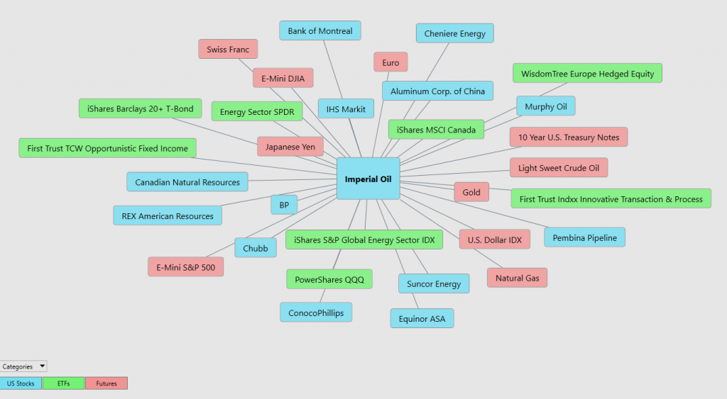
Power lies in the way we respond to the truth we understand. Earlier in this analysis we shared how we uncovered $IMO by looking at the best-performing stocks that were most closely correlated to Crude Oil. Based upon that
analysis the intermarket analysis highlighted that $IMO was a stock that had outperformed Crude Oil in terms of percentage returns and was widely owned by top-performing ETFs in the energy space.
One of the supremely important questions in trading is what is driving the price? Headlines often create interesting narratives. But these “stories” only capture the imagination. Traders want and need to understand the cause and effect of price movement.
The only way to get an answer to this important question is through intermarket analysis which looks at statistical price correlations of assets.
Intermarket analysis is a method of analyzing markets by examining the correlations between different asset classes. In other words, what happens in one market affects other markets. So, a study of the relationship(s) will prove to be beneficial to a trader.
We live in a global marketplace.
Everything is interconnected.
Interest rates, Crude Oil Prices, and the volatility of the Dollar amongst thousands of other variables affect the decisions companies must make to flourish and prosper in these very challenging times. Trying to determine what these factors are is one of the huge problems facing investors and traders.
You always have a choice. You can tune in to the talking heads in the media who spin talking points that promote fear. Or you can rely on facts to base your decision-making on.
Within the following Intermarket Analysis graphic, you will see the 31 markets that are the key drivers to $IMO’s price.
Our Suggestion
We think the bull market in Crude Oil has a long way to go on the upside.
Inflation is at 40-year highs. The oil companies shut down production during the pandemic and are slowly trying to ramp up production. The end result is that we have greater demand than supply.
Our only loyalty is to the trend and currently the trend is UP.
As we have outlined in the Worst-Case Analysis, the stock can quickly fall 10% or more very quickly. If a trader is practicing good money management, we think these declines will present tremendous buying opportunities.
Recently there were some drone attacks on Oil Fields in the UAE reported and as tragic as that circumstance is, it supports the thesis of lower supplies meeting increased demand. We are expecting higher prices throughout the oil and gas sector and think $IMO as Canada’s largest producer will continue to outperform.
However, you may want to put this stock on your trading radar and watch it closely. As Crude Oil marches higher, we think that $IMO will do even better.
Practice solid money management on all your trades.
We will re-evaluate based upon:
- New Wall Street Analysts’ Estimates
- New 52-week high and low boundaries
- Vantagepoint A.I. Forecast (Predictive Blue Line)
- Neural Network Forecast
- Daily Range Forecast
Let’s Be Careful Out There!
Remember, It’s Not Magic.
It’s Machine Learning.

IMPORTANT NOTICE!
THERE IS SUBSTANTIAL RISK OF LOSS ASSOCIATED WITH TRADING. ONLY RISK CAPITAL SHOULD BE USED TO TRADE. TRADING STOCKS, FUTURES, OPTIONS, FOREX, AND ETFs IS NOT SUITABLE FOR EVERYONE.
DISCLAIMER: STOCKS, FUTURES, OPTIONS, ETFs AND CURRENCY TRADING ALL HAVE LARGE POTENTIAL REWARDS, BUT THEY ALSO HAVE LARGE POTENTIAL RISK. YOU MUST BE AWARE OF THE RISKS AND BE WILLING TO ACCEPT THEM IN ORDER TO INVEST IN THESE MARKETS. DON’T TRADE WITH MONEY YOU CAN’T AFFORD TO LOSE. THIS ARTICLE AND WEBSITE IS NEITHER A SOLICITATION NOR AN OFFER TO BUY/SELL FUTURES, OPTIONS, STOCKS, OR CURRENCIES. NO REPRESENTATION IS BEING MADE THAT ANY ACCOUNT WILL OR IS LIKELY TO ACHIEVE PROFITS OR LOSSES SIMILAR TO THOSE DISCUSSED ON THIS ARTICLE OR WEBSITE. THE PAST PERFORMANCE OF ANY TRADING SYSTEM OR METHODOLOGY IS NOT NECESSARILY INDICATIVE OF FUTURE RESULTS. CFTC RULE 4.41 – HYPOTHETICAL OR SIMULATED PERFORMANCE RESULTS HAVE CERTAIN LIMITATIONS. UNLIKE AN ACTUAL PERFORMANCE RECORD, SIMULATED RESULTS DO NOT REPRESENT ACTUAL TRADING. ALSO, SINCE THE TRADES HAVE NOT BEEN EXECUTED, THE RESULTS MAY HAVE UNDER-OR-OVER COMPENSATED FOR THE IMPACT, IF ANY, OF CERTAIN MARKET FACTORS, SUCH AS LACK OF LIQUIDITY. SIMULATED TRADING PROGRAMS IN GENERAL ARE ALSO SUBJECT TO THE FACT THAT THEY ARE DESIGNED WITH THE BENEFIT OF HINDSIGHT. NO REPRESENTATION IS BEING MADE THAT ANY ACCOUNT WILL OR IS LIKELY TO ACHIEVE PROFIT OR LOSSES SIMILAR TO THOSE SHOWN.

