

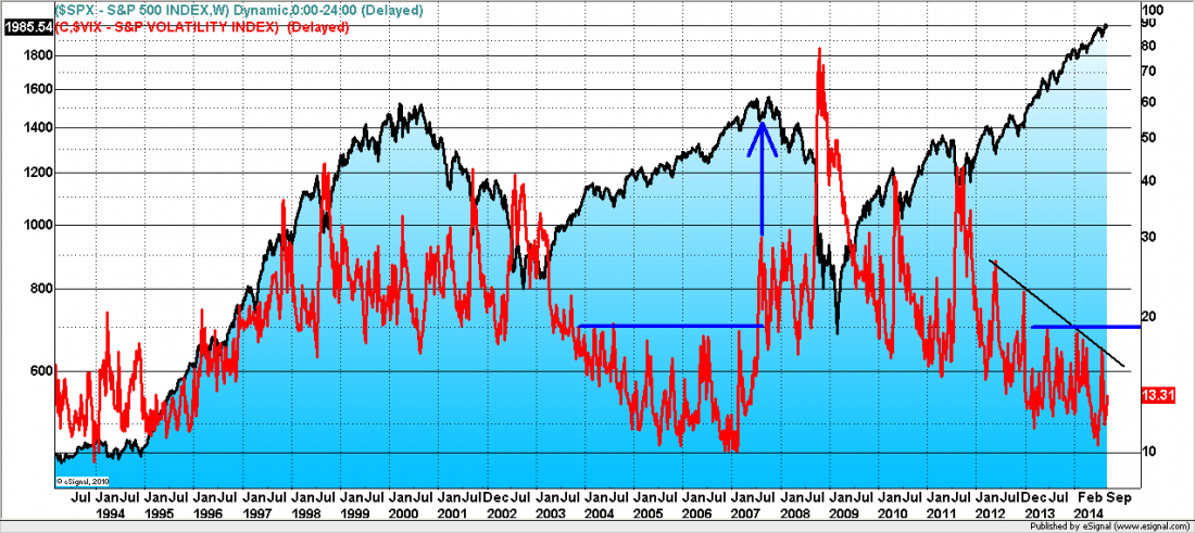
The chart below is a long-term look at volatility (the VIX, red line). The current low VIX readings are similar to the period of low VIX over the years of 2005, 2006, and into the beginning of 2007, which saw the S&P 500 index move from the 1200 level to north of 1500, a 25% gain (black line).
The picture in VIX continues to suggest that the current bull trend remains in force.
The last period of sustained low VIX (2005 – 07) preceded our last financial crisis but it is worth noting that prior to the index making its high in 2007 and rolling over, the VIX perked up and had moved to multi-year highs ahead of the price damage (blue arrow).
Only a VIX move above 20 now would be a similar signal and give us an indication of greater downside danger in stock prices. On any decline, we will be monitoring this chart to gauge if the pullback is typical of what we’ve seen over the course of the last year (spikes in VIX remaining below 20) or if something larger is developing.
= = =
If you would like to see more research and analysis from i10 Research and receive a 30-day free trial of our daily and weekly trading reports, visit our page here.

