Below is a chart comparison that we have been showing in one form or another for months. And months. While we often get bored writing about the same thing time and time again we have been making an exception in this case because… it continues to work.
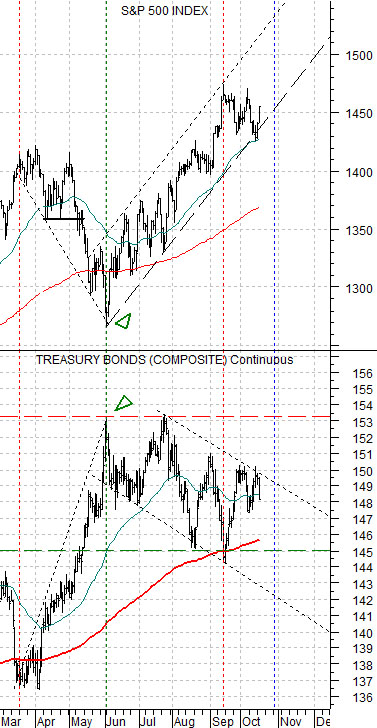
The chart shows the S&P 500 Index (SPX) and the U.S. 30-year T-Bond futures. The argument is that the bond market and stock market are trending in opposite directions.
Our initial presentation included the German bond futures as well as the Japanese yen futures. Our view was that money moving away from risk was heading into the long end of safe haven bond markets as well as both gold and the Japanese yen. If the S&P 500 Index was going to resolve higher then long-term bond prices had to stop rising and turn lower.
The TBond futures reached a peak at the end of May which created an upward pivot for the S&P 500 Index. The initial surge created a trading channel which we marked on the chart. Almost five months later nothing much as changed.
Along the way we have used this chart to show why the stock market was rallying and what would have to happen to break stock prices lower. A recent concern was based on the way the TBond futures turned higher in the final month of the first quarter (March) and then again at the end of the third quarter (September).
During April and May the TBonds continued to rise which put downward pressure on the S&P 500 Index. Yet the broad U.S. equity market held near the highs through the earnings reports of April in the hopes, we suspect, that some ‘bigger fool’ would drive prices upwards based on earnings-related optimism. With the bond market moving upwards the stock market went through a bit of a mini-crash with the lows being reached at the exact point in time when the TBond futures reached a top.
Another argument has been that as long as the TBonds remain below 153 and above the 200-day e.m.a. line (we are using 145 as support although the line is rapidly moving up towards 146) the equity markets will dip on bond price strength and surge on weakness with much of the heavy lifting being done by the defensive sectors (including health care and the consumer defensive names).
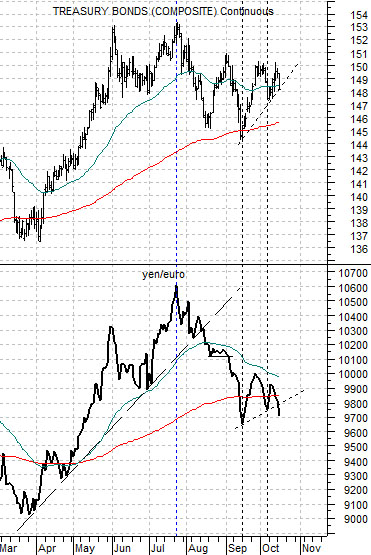
Below is a chart of the U.S. 30-year T-Bond futures and the cross rate between the Japanese yen and euro.
The page 1 ramble had to do with the thesis that we have been expounding upon for the past half year or so. Perhaps longer. One twist on the argument has to do with the relationship between the long end of the Treasury market (TBond futures) and the yen/euro cross rate.
Yesterday’s bond price weakness pulled the TBond futures back to a short-term support line that cuts up from mid-September. The bond market is still in a minor rising trend after dipping down to support. Fair enough. The yen/euro cross, however, is somewhat weaker as it holds below the moving average lines.
The point? Our sense is that the bond market likely won’t break until we get at least one ‘real’ U.S. weekly jobless claims report below 350,000 and for that we have to wait yet again until tomorrow.
The markets have shown a tendency in recent years to split into two six month themes. Cyclical growth and interest rates push higher from October through March and then turn lower from April through September. This fits nicely with the seasonal trend that creates the impression of weakness into the autumn and robust economic strength into the spring.
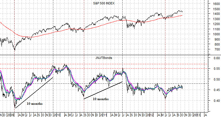
Below is a chart of the SPX and the ratio between Johnson and Johnson (JNJ) and the TBond futures.
Short-term the JNJ/TBond ratio has resistance at .48. Longer-term the number is closer to .55. In reality… we like the idea that once the ratio pivots higher- as it did in 2009 and 2010- it tends to continue to rise for about 10 months. A repeat of this tendency would put the ratio at some sort of peak at the end of March (along with the broad U.S. large cap stock market).