
How many times have you heard someone say “trading is an art, not a science”?
I have heard that for years and years and I have to say, it is probably the most ridiculous statement I have heard when it comes to trading and as we all know, there are some pretty ridiculous statements in the trading world.
IT’S A NUMBERS GAME
There is absolutely nothing artistic about trading at all. This is 100% a numbers game. How much willing demand and supply at each price level is what determines price movement. It’s the buy orders versus the sell orders and again, it all comes down to the numbers on both sides of that equation and nothing else. To think Picasso or Van Gough should be brought into this discussion is rather amusing if you think about it.
SUPPLY AND DEMAND
I began my career many years ago on the floor of the Chicago Mercantile Exchange (CME), facilitating institution and bank order flow. What I realized very quickly was the fact that the movement of price in any and all markets is a function of supply and demand.
Therefore, trading opportunity exists at price levels where this simple and straight forward equation is out of balance. You simply buy where the major buy orders are and sell where the major sell orders are.
After spending time on the trading floor and then looking at price charts online, I taught myself to identify these orders on a price chart, the picture that represents a major supply and demand imbalance. To make my point, let me share a very recent trade I setup for my students in our live trading room.
THE SETUP
While the strategy I am about to lay out for you works the same in any time frame and market, let’s focus on a short term trade for our example so we can see the entire strategy play out on one clear chart. About an hour before the stock market opened, I was sharing a chart of the NASDAQ with my students.
Notice the area shaded yellow, with the black lines extending right. According to supply and demand, that area shaded yellow was a key supply level. Meaning, institutions/banks had large orders to sell at that level, there was a significant supply and demand imbalance at that level.
We know this because price could not remain at that level and declined in strong fashion after a very short period of time. Think about it, if that statement was not true and supply and demand were in balance at that level, price would have remained at that level but, it couldn’t because supply and demand were very much “out of balance.”
THE CHART QUANTIFIES SUPPLY AND DEMAND
When I was at the CME and had the orders in front of me, I knew exactly what the supply and demand equation was. Most people think that because today, we look at price charts and don’t see the orders, we can’t truly quantify supply and demand and perhaps that’s where some of the “artsy” talk comes from but… think again… I would argue that we can quantify supply and demand by looking at a price chart.
In fact, I would argue that it’s easier than being on the floor of the exchange because the price charts represent all buyers and sellers. On the trading floor, you can only see what is in front of and around you. To quantify supply and demand on a price chart, I use what I call “odds enhancers.” While there are a few of them, let me go over two to help get you thinking in the right direction. I mentioned price spent very little time at that supply level above, this is a key point.
ODDS ENHANCER #1
The stronger the move in price away from a price level, the more out of balance supply and demand is at the level.
Price can move away from an area in one of three ways. It can be gradual, strong, or gap. The gap represents the strongest imblance. In our example here, notice the initial move away from the supply level was strong suggesting institutions were selling at that level.
ODDS ENHANCER #2
The less time price spends at a level, the more out of balance supply and demand is at the level.
Notice on that same chart, there was very little trading activity in the area shaded yellow. Trading books tell us when looking for key support and resistance levels, look for areas on the chart where there was lots of trading activity, many candles on the screen, above average volume, and so on… If you think the simple logic through, I think you will find the opposite to be true. At price levels in any market where supply and demand is most out of balance, you are going to get very few transactions (trades), not many. Therefore, that picture on a chart is going to be few candles on the screen, not many like most trading books say and this was the case in our trading opportunity above.
THE RESULT
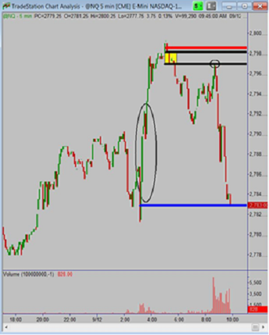
As you can see on the chart above, a bit into our trading session, the NASDAQ rallied up to the supply level, offering us an opportunity to sell short with a 2 point stop and a 14 point profit target. The 14 point profit target comes from that circled area on the chart. Notice there is no demand in that circled area. This means that price should have a very easy time falling through that area once price turned at our supply level.
Lastly, when price reached supply, we always want to know who we are selling to. We need to make sure we are selling to a novice retail trader. The way we answer this questions is this: Is the buyer in this case who is buying from us making the same two mistakes every novice trader makes? Specifically, is the buyer we are selling to buying after a rally in price (mistake number one) and into a price level where supply exceeds demand (mistake number two). If the answers are yes and the risk reward meets the minimum criteria we are looking for, we take the trade like a robot.
PLAN AHEAD
The mathematical equation we mapped out in ADVANCE played out as we thought and our profit target was achieved. If you think art had anything to do with this, I have a great piece of dessert property in Nevada I will sell you for half price. It’s really special sand that cleans your feet when you walk on it. It’s normally $10,000 a square foot but I will give it to you for $5,000 so hurry up. I’m kidding of course but you see when I was on the institution side of the trading business, it was very clear how and why price moved in any market.
BIDS AND OFFERS
At the CME, they didn’t have Monet’s or Picasso’s on the wall, they had bids and offers. If I wanted to see art, I would walk down Monroe Street to Michigan Avenue and go to the Art Institute.
Goldman Sachs doesn’t start out each trading day with a company meeting to discuss artistic opportunities in the market; every single decision is based on inventory, order flow, risk/reward, and so on. The key is to stick to the basic principles of how you make money buying and selling anything as that is exactly how you achieve profits speculating in the financial markets.
= = =

