
It’s no secret that the global economy and the financial markets were heavily hit by the credit crunch in recent years.
Presidents, policy makers and government officials tried to soften the devastating impact of the crises in recent years with extraordinary measures. The U.S. Federal Reserve and the European Central Bank constantly intervened in a desperate attempt to avoid a double dip recession.
Billions of dollars and euros have been thrown into the system in order to restore some confidence among investors and market players— but was it worth the pain? Many equity indices around the world surely recovered and kept going north after having touched the bottom around the second quarter of the 2009.
IS THERE A HANGOVER COMING?
However, everyone knows that every drug comes with a side effect. The present research will focus on what happened in the American market and therefore we will analyze its macroeconomic scenario but we will contrast it against the S&P 500 index.
ECONOMIC NUMBERS
Steady and real growth has to be based on robust macroeconomic figures and the aim of the present study is to identify whether the financial market has effectively followed the “real economy” or whether the continuous intervention of the Federal Reserve generated distortions and deviations.
Figure 1 below plots the quarterly performance of the S&P 500 Index against two important macroeconomic indicators: industrial production and GDP growth.
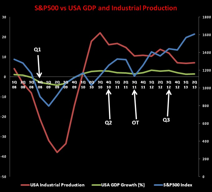
The white arrows indicate the quarters that have been characterized by the intervention of the Fed. The Q1, Q2 and Q3 arrows represent the period when the quantitative easing programmes have been released while OT is an acronym for Operation Twist (a subsidiary programme whose aim was to purchase $400 billion worth of Treasury Bonds with maturities ranging from 6 to 30 years).
FED MONEY BOOSTED STOCKS
The chart clearly displays that all the time the Federal Reserve decided to pour money into the market the S&P 500 moved higher. In particular, the Q1 took a bit longer (almost four to five months) before having an impact but all other programmes (Q2, OT and Q3) had an almost immediate positive effect on the American equity index.
IS THE RECOVERY AN ILLUSION
The most natural question, at this point, would be: Is the recovery stable or it is simply an illusion created by the Fed?
Let us have a look at the macroeconomic variables. The U.S. industrial production (red line) and the GDP growth (green line) obviously dropped in 2008 and mid 2009 but since the third quarter of 2009 they all moved higher until the third quarter of 2010.
Specifically, the macroeconomic figures here presented and the S&P 500 experienced a strong positive correlation (around 0.8 – 0.9) until June 2009 but after that point the relationship started to become weaker. It is clear that there was (and there is) an evident divergence between real economy and financial market performances.
In fact, even though the S&P500 Index kept moving higher, industrial production and GDP growth figures have been decreasing or moving laterally. The industrial production line kept dropping since the third quarter of the 2010 while the GDP growth curve is extremely sluggish. Did macroeconomic performances justify an S&P500 above the 1,200 points?
THE BIG QUESTION
Do current macroeconomic data justify an S&P 500 above the 1,600 level?
The actual divergence is even worse because the equity index is now trading around the 1,600 points but the industrial production has been in constant downtrend since mid 2012 and the GDP stopped growing too. Let us now compare the S&P 500 Index against non-farm payroll data, seen in Figure 2 below.
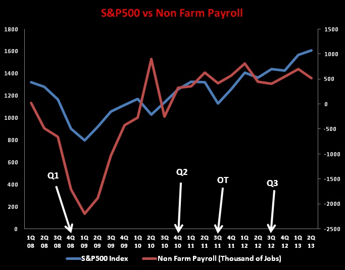
The correlation between the job market and the American Index is definitely higher (around 0.93 – 0.97 on average). Nevertheless, since the beginning of 2013 the relationship between non-farm payroll data and S&P 500 collapsed from 0.84 to 0.4 and ended to 0.2. The chart evidently shows that since the beginning of 2012 the job market added very few jobs, in fact, the non-farm payroll curve moves laterally and does not have a clear uptrend. However, the discrepancy between the red line (non-farm payroll) and the S&P 500 (blue line) becomes dramatic since January 2013 onwards.
IT’S BEEN POISONED
It is true that the S&P 500 also responds to other variables, expectations and macroeconomic factors but this mini–research highlights that the American equity index has been heavily influenced by Fed interventions. According to the present analysis the S&P 500 has been poisoned by exogenous factors because without the artificially injected money, the American equity index would have hardly violated the 1,300 threshold.
= = =
[What do you think? How much have the Fed’s programs in recent years helped to boost U.S. equities? Do you think the Fed has artificially inflated stocks? What could the implications be ahead for when quantitative easing is pulled back?]
= = =

