

Data visualization is a popular topic among traders.
As many traders are following multiple markets, data visualization can make it easier to discern market conditions. For example, a quote display can include a column of symbols and a column of net percent change for the day.
Using heat mapping, the markets with the largest percent gain can be highlighted in bright green and the weakest markets can be highlighted in bright red. With these tools, traders do not have to visually scan the percent change column and do the mathematical comparisons themselves. Their eyes are drawn to the extremes due to the coloring.
Not all market data and trading platforms have these data visualization formatting styles available; however, many market data and trading platforms support Microsoft’s RTD (RealTimeData) function for pulling market data and study values into Excel.
This means traders can broaden how they view market data, including expanding their use of data visualization formats that are available in Excel, such as heat mapping, histogram bar ranking, and sparklines.
SPARKLINES EXAMPLE
Sparklines are small charts. One of the ways they are used is to indicate recent history of a value, for example, correlation. Figure 1 displays a portion of a ten-day correlation matrix of futures markets. The markets are crude oil and gold traded on Globex (Symbols CLE and GCE), Russell 2000 traded on ICE (Symbol TFE), 10-year Treasury futures traded on Globex (Symbol TYA) and Euro STOXX 50 traded on Eurex (Symbol DSX).
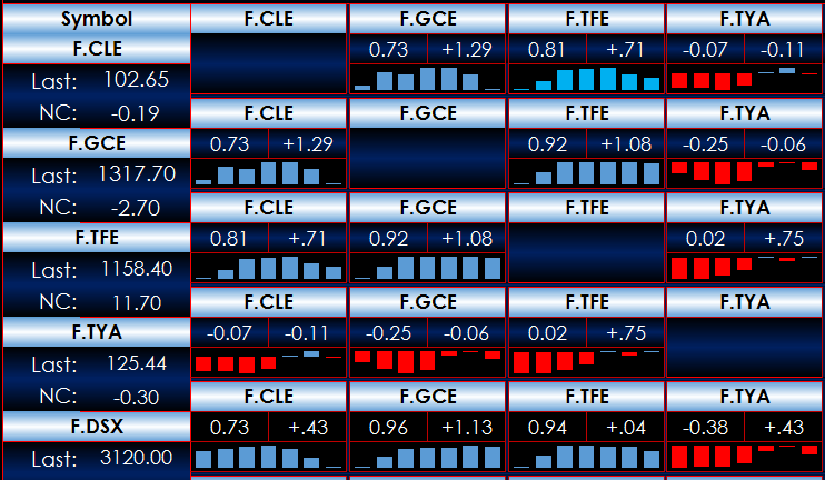
Comparing the column and rows for CLE, you see that the ten-day correlation to gold is 0.73 and has changed by 1.29. Right below the current and net change is a sparkline using seven histogram bars. You can see the current value is fairly strong, but the correlation has been falling over the last few days. Including the sparkline along with the current value and the net change provides key information in a minimal amount of space.
The steps to adding a sparkline are straightforward. Figure 2 shows Excel 2013. To begin, select the data you want plotted as a sparkline – here it will be correlation values displayed in cells D4 through D10. Then click the INSERT tab, then Sparklines, then Column to choose the style. This will place a sparkline in the chosen cell, which is cell E4 in this example.
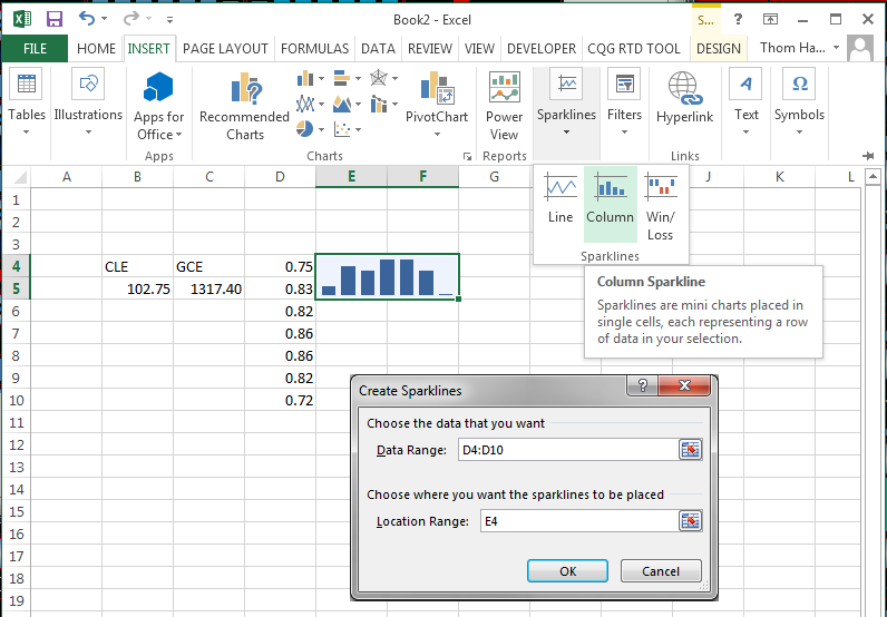
You can increase the size of the sparkline by selecting the cell and adjoining cells, then from the HOME tab, choose Merge & Center. The sparkline is not a typical chart that is on top of the cells, rather it is contained within the cells.
SOME TIPS
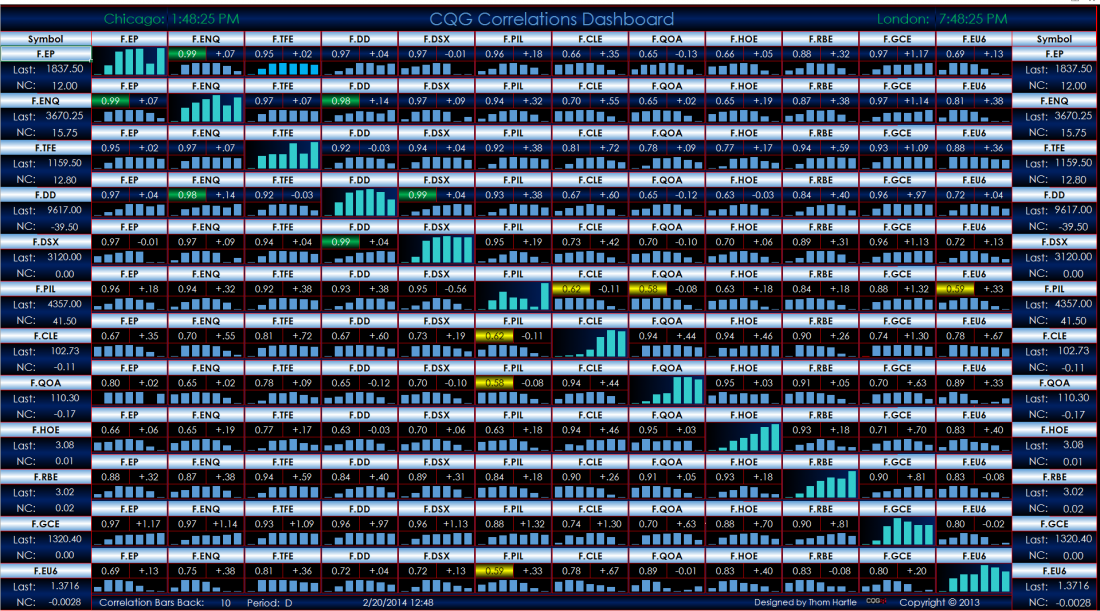
Collect the data somewhere else in the spreadsheet and then design the dashboard to be a composite of information. You can use heat mapping to highlight the most positively and negatively correlated markets. Figure 3 is an example. Here, bright green represents the top five correlated markets and gold is the bottom five correlated markets.
CONCLUSION
Combining Excel with your trading platform by using RTD syntax to pull in and study market data can both broaden and simplify your view of the markets, making your workflow a more seamless process.
= = =
Thom Hartle is director of product training for CQG
RELATED READING
Gain An Edge: New Ways To View Data On The Go by Thom Hartle

