
Today’s traders take a global view of the markets looking for opportunities. Canvassing the world requires monitoring a large amount of market data. In addition, traders need to track their favorite technical indicators and often use statistical analysis, such as correlation and standard deviation (volatility). All of these numbers in a typical display, using a white background with simple Arial black font, can be both eye wearing to view and challenging to do comparative analysis. There will be a lot of data to visually sort through. One way to better handle this process for Excel users is to heat map the values.
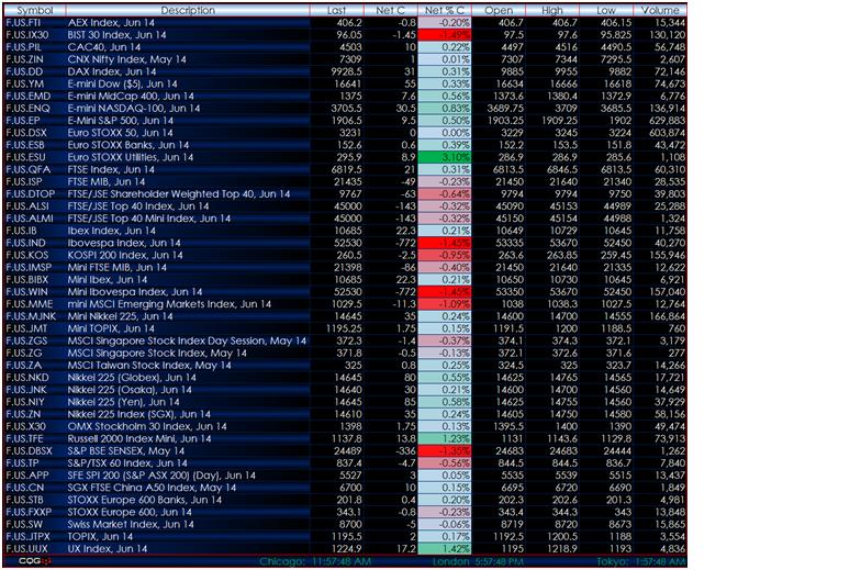
Figure 1 shows an Excel display of various equity index futures contracts from around the world. Most ISVs (including CQG, used here) support the ability to pull real-time market data into Excel. This display is alphabetically sorted by description to make it easy to find a particular index. Percentage net change is included for relative performance comparisons. Now, while it is easy to focus on one particular index to view today’s performance, it is difficult to make relative comparisons based on the percentage net change because there is too much data to review.
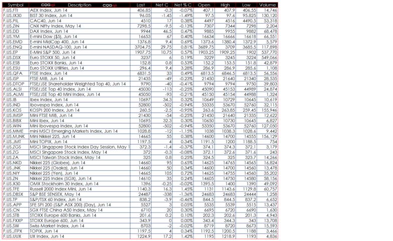
Figure 1: Using RTD syntax, Excel can pull in real-time market data.
In Excel’s Home tab, the Conditional Formatting feature allows you to apply color gradients to indicate where one cell’s value is relative to the range of data. You first select the net percentage change column, then click Conditional Formating to access the menu, and choose the Color Scales color scheme you like. Here, green is used for the most positive values, white for the mid-range values, and red for the most negative values.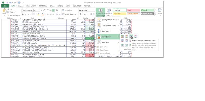
Figure 2: Apply conditional formatting to indicate relative values.
At this point, a conditional coloring format has been applied. Excel’s default is to use 50% as the midpoint for calculating the coloring; however, because we have negative values, using 0 as the midpoint increases the gradient coloring applied to the column.
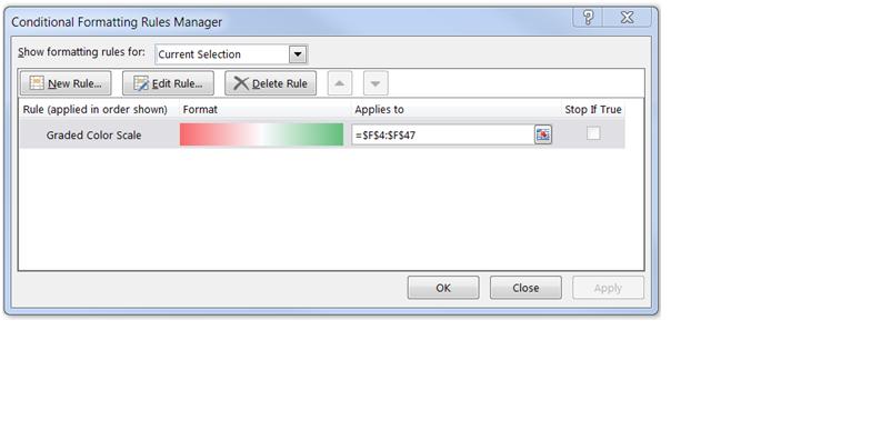
Figure 3: This dialog shows the conditional formatting rules currently in use for the selected area.
While the Conditional Formatting dialog (Figure 3) is open, select Edit Rule, which is displayed as Figure 4. Then change the midpoint to be a number and to use 0. In addition, you can select the red color and pick a richer red from the color palettes and do the same for the green color. Also, you could use a color, such as light blue, for the mid-range values.
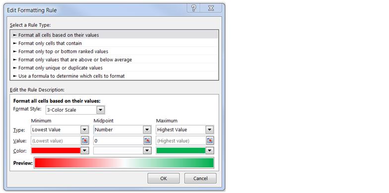
Figure 4: This dialog allows you to modify the midpoint parameters and select different colors.
Finally, to increase the highlighting of the heat mapping, you can use a black background and white fonts with gradient backgrounds to give the dashboard a more elegant look. Now, due to the heat mapping, your eyes are drawn to the top performers (highlighted in green) and the bottom performers (highlighted in red) without the necessity of doing comparative math in your head.
Conclusion
Heat mapping was used here to indicate performance based on percentage net change. This same data visualization technique can be applied to statistics. For example, use heat mapping applied to correlation analysis to indicate the top positively correlated markets and the most negatively correlated markets. Another example is to use heat mapping for identifying the most and least volatile markets using standard deviation.

