

Open up any finance article regarding stock market commentary and you will surely run into the term “risk preference.” But what does it mean exactly? Risk preference is simply an investor’s tendency to choose a risky or less risky option depending on current and expected economic conditions.
For instance, if economic growth is stalling but is expected to improve, broadly speaking, investors may find themselves more willing to take on riskier investments given the potential for more lucrative returns. Likewise, if growth is stalling but is expected to deteriorate, investors may find themselves more willing to jump into less risky assets in lieu of riskier ones given the expectations of a potential slowdown in the economy.
In other words, risk preference is another way to qualify investors’ expectations of future economic conditions; remember that the stock market itself is a leading indicator, which means that by monitoring various major asset classes, investors can gain some insights about the future based on how participants are allocating their money today.
But how exactly do you quantify risk preference so that you can analyze it? Thanks to the proliferation of exchange-traded funds, this chore has become significantly easier than it once was and the information is virtually accessible to anyone today. There are a number of broad-based ETFs out there that can serve as guides for gauging risk preferences across various corners of the market.
Simply put, by tracking the returns of these broad-based ETFs, investors can effectively quantify investors’ risk preferences regarding that specific asset class. When you compare the returns of two or more asset classes, you can get an even better sense of which way expectations are moving, which means you’re able to gauge if investors are favoring risky or less risky assets more.
Let’s consider an example that puts this concept to work. Consider the following ETFs and the insights they stand to offer:
• SPDR S&P 500 (SPY): This is the most popular ETF and it tracks the coveted S&P 500 Index; as such, this ETF provides a broad view of current risk preferences in the U.S. equity market. For instance, if SPY is down, we can infer that investors are dialing back their exposure to risky assets and vice versa.
• PowerShares S&P 500 High Beta Portfolio (SPHB): This ETF uses a quantitative methodology to select the 100 stocks from the broader S&P 500 Index that boast the highest sensitivity to market movements; as such, this ETF offers a good representation of how the riskiest securities out there are performing.
• PowerShares S&P 500 Low Volatility Portfolio (SPLV): This ETF uses a quantitative methodology to select the 100 stocks from the broader S&P 500 Index that boast the lowest realized volatility over the past year; as such, this ETF offers a good representation of the least risky securities out there are performing.
Now that we have a better understanding of what each ETF might reveal regarding risk preferences, let’s consider their recent performance and put it into context.
Figure 1 below compares the returns spanning from 6/24/2013 through 1/22/2014; this is meant to capture a period of “risk on” sentiment, spanning from the bottom of the “taper scare” correction up until before selling pressures hit Wall Street for the first time in 2014:
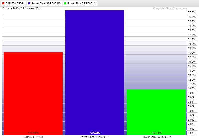
Given the benefit of hindsight in this example, we can see that this was in fact a “risk on” period seeing as how High Beta stocks (blue) outperformed their Low Beta (green) counterparts as well as the Broader index (red); this showcases investors’ willingness to take on more risk as evidenced by risky assets outperforming less risky assets by a fairly significant margin.
Figure 2 below compares the returns of these same ETFs during the January pullback, spanning from 1/22/2014 up until the bottom on 2/5/2014:
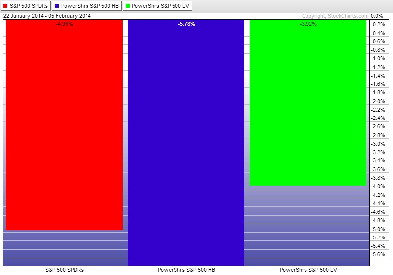
This time frame captures a “risk off” period in the market, seeing as how the High Beta securities lost more ground than their Low Volatility and Broad Index counterparts. Similarly, we also see that Low Volatility stocks held up the best during this short-lived pullback.
How can investors put this sort of analysis to work going forward?
By keeping track of these three ETFs on a regular basis, investors can get a better sense of how the market’s outlook is changing. For example, if all three are advancing higher but Low Volatility starts to outperform the High Beta as well as the Broad Index, investors may interpret this as a bearish signpost seeing as how participants are actively shifting to less risky securities without necessarily jumping out of the stock market entirely.
Related Reading
Read another story by this author.
Escape the Bear Market at Home with Emerging ETFs

