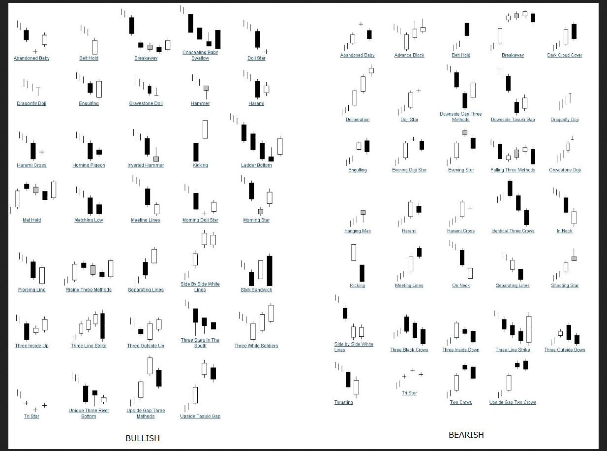
We often look at charts to find recognizable and repeatable patterns, hoping to take notice of a previous move that may have a high probability of happening again. In the universe of technical analysis, there are a plethora of technical patterns with setups for both bullish and bearish plays. You can find a nice sampling of those below. But the important takeaway from the analysis is to have an open mind without bias, identify a pattern and which way is most ‘likely’ and play it accordingly. We’re not always going to be right, but this is not a game of perfect. Below are some of the most identifiable candle chart patterns that I use. This from traderslaboratory.com, via Steve Burns.
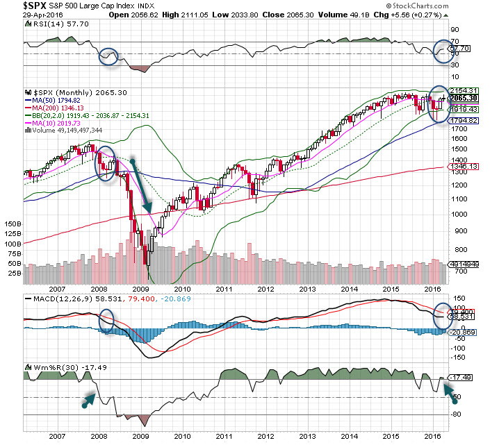
When someone asks me about the current condition and whether we are in bull or bear market territory, I refer them to the longer term monthly chart. Bull and bear markets are long term conditions, hence we need to see how patterns are constructed on these charts before making an assessment. A monthly chart has less noise and when in bullish is often a sign of more confidence among investors, especially large institutional money, who are mostly long term investors.
I’ve been saying for months we are still a bear market since Spring 2015 when the very important MACD indicator crossed to the bearish side. Now, a monthly chart is very slow, and it took many months to get this indicator to turn (see chart). However, we have seen some of the largest and most spectacular rallies within bear markets.
Identifying repeatable patterns put the odds in your favor, but since timeframes are always different and characteristics change, we have to analyze the entire picture. The SPX 500 just finished its fourth month of 2016, and here we have identified and identical pattern to early 2008. Now, we all know what happened later in 2008, and the chart shows the ominous outcome. This of course started with the Bear Stearns collapse in the Spring of that year and led to a near collapse of the financial system.
While we cannot argue with the identical candle patterns, they are indeed exact – other factors must be considered before we believe the markets will completely roll over. Interest rates today are at all-time lows, back in early 2008 that was not the case. Central bankers are easing with reckless abandon today, and given their aggressive nature it makes for big shocks to hit the traders and investors. You remember some of those big gaps up and down over the last few years after some words by ECB Chair Draghi or BOJ Premiere Kuroda?
Momentum indicators are in a ‘better’ place today than in 2008, and the relative strength is better. Yet, these indicators take a back seat to the price action, and that is where we must take notice of the identical patterns we see in 2008 and 2016. While there was a catalyst to the fall in 2008, clearly this pattern foretold the events that would follow, so we are now aware. We’ll not jump in front of the pattern yet as we don’t have a trend yet. As always, confirmation is needed, so a very dark candle this next month (as we had in 2008) would be the first sign that more downside could be on the horizon.