

The equity market may seem like a big behemoth but it is actually composed of various industry sectors. S&P identifies and categorizes the S&P 500 index into ten different industry sectors as well as a number of sub-sectors. Knowing what those sectors are doing can help in timing the market.
Typically, cyclical growth sectors (finance, energy, technology, etc.) are expected to outperform the broader market in an advancing market and under-perform in a declining market. Defensive sectors (utilities, healthcare, staples, etc.) are expected to do just the opposite. So what are these sectors telling us today as we get closer to the 2007 highs?
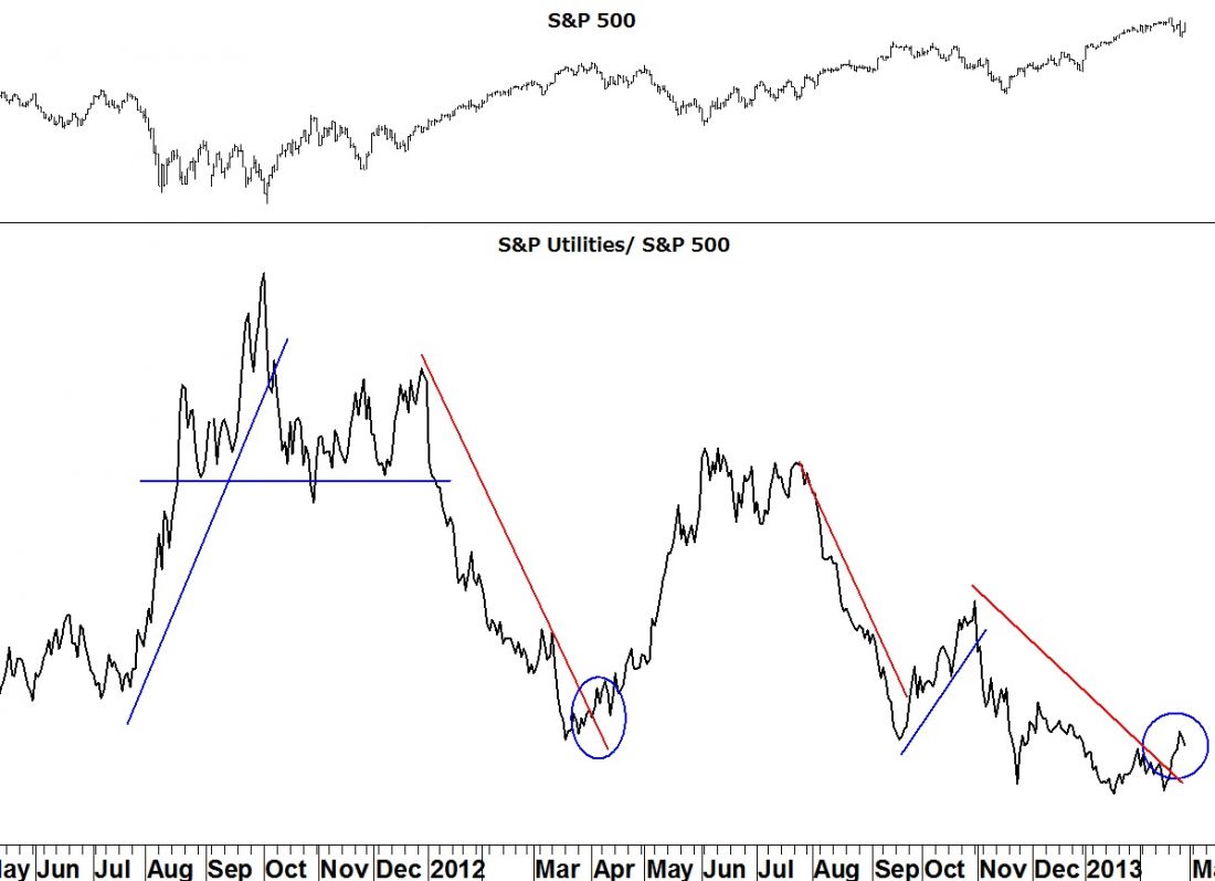
Utilities give the most obvious signal. The ratio chart below (utilities index/ S&P 500) advances as utilities out-perform and declines as they under-perform. Since even before the November low in the S&P 500, utilities have been underperforming even as the broader index advanced. But that decline appears to have ended with the ratio chart moving above its declining trend line.
Look at how the market has performed at previous changes in trend in the utilities ratio chart. It should make for pretty scary reading for the bulls.
= = =
[Editor’s note: Stocks are at a pivotal point. Read more here.]
Bond Yield Divergence Flashes Warning Signal For Stocks
Bernanke’s Bubble: Setting Up For the Next Bear Market
Want to hedge your bullish stock bets short-term? Here’s an E-mini Put Play
Take it a step further: Use Options To Protect Retirement Profits

