Our expectation has been that the year would start off with equity markets strength and end with a fairly significant amount of weakness. As expectations go, however, we were looking for more than a few weeks of rising prices.
Jan. 26 (Bloomberg) — Stocks and commodities retreated, while the dollar and Treasuries advanced, amid speculation lending restrictions in China and possible reductions in U.S. stimulus measures will stifle the economic rebound.
We have argued from time to time that we expect a major Asian equity market to lead to the down side with general asset prices turning lower roughly nine months later. The term ‘major Asian equity market’ includes virtually everything from the BRIC theme along with the commodity currencies.
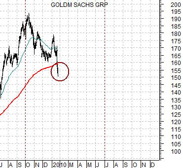
One of the burdens that we must bear is the tendency to look at one chart and recall the chart of something else from an earlier time frame. We spend quite a bit of time muttering that something that we are looking at reminds of something that we have seen at some point in the past. Such was the case with the chart of Goldman Sachs (GS) so we thought we would start things off today with a somewhat unsettling comparison.
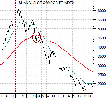
Below is a chart of China’s Shanghai Composite Index from July of 2007 through the end of 2008. Below right is a chart of Goldman Sachs beginning in July of 2009 and running through trading yesterday. In other words we are comparing GS today with the Shanghai Comp. from two years previous.
The comparison is somewhat eerie in that both peaked in October, spiked upwards at the start of the new year, and then broke down through the 200-day moving average line in late January. We are not sure what to think with regard to the implications for the broad U.S. stock market if GS spends the next few months following the same path as Chinese equities but… we suspect that it won’t be bullish.
Note that the Shanghai Comp. declined through into the end of June in 2008 before the major equity and commodity indices snapped to the down side. Is this a harbinger of a trouble-filled second half of the year? Our curiosity is indeed piqued.
Equity/Bond Markets
We devoted most of yesterday’s issue to the idea that Japanese stocks were set to rise up until such time as the Fed was ready to start raising the funds rate. Obviously our timing was less than exquisite given yesterday’s weakness in the Nikkei. However… this is a macro argument.
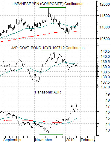
We mentioned that the rising trend for Panasonic (PC) could be the result of the start of a new quarter, a weaker yen, a weaker Japanese bond market, or relative weakness for energy prices. At right is a comparison between PC, the Japanese 10-year (JGB) bond futures, and the Japanese yen (JPY) futures.
The argument is that PC began to rise late last year as the JGBs approached a top. This was also concurrent with the peak for the yen. In trading yesterday the yen and the JGBs were higher so we have no clear idea whether the markets are keying specifically off of one or the other.
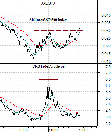
Below we compare the ratio of the CRB Index to crude oil with the ratio between the Airline Index (XAL) and the S&P 500 Index (SPX). The argument is that a rising CRB Index/crude oil ratio denotes relative weakness for energy prices and should be confirmed by strength in the XAL/SPX ratio. So far… so good.
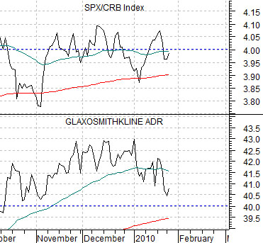
Below is a chart of an absolutely fascinating relationship. One, by the way, that we can not explain even if it has worked for the past 15 or so years.
The chart compares the ratio of equities (S&P 500 Index) to commodities (CRB Index) with the share price of GlaxoSmithKline (GSK). We show the longer-term view on page 7. This one is a bit of a mind bender.
Is the equity market ‘too high’? Is it ‘too low’? The chart argues that it is actually ‘about right’. Over time GSK tends to trade around 10 times the SPX/CRB ratio. If the ratio is 3 times then GSK is fair around 30 and if the ratio rises to 7 times then GSK is about right closer to 70. Today the ratio is very close to 4 times and GSK is within hailing distance of 40. In terms of equities versus commodities the chart suggests that the major pharma stocks are currently priced at reasonable levels.
