With the equity markets somewhat softer yesterday we thought that we would end the week with a number of bullish perspectives.
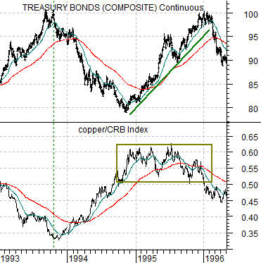
Below is a comparison between the U.S. 30-year T-Bond futures and the ratio between copper futures and the CRB Index from 1993 into 1996.
In general strong copper prices go with rising interest rates and falling bond prices. The question is… what happens when copper prices are strong even as bond prices trend higher? The answer is… an equity bull market.
One of the most powerful equity bull markets began in late 1994 when the TBond futures began to rise. The chart shows that a rising copper/CRB Index ratio put downward pressure on bond prices through 1994 but as the copper/CRB Index began to simply flatten out… the bond market swung higher which, in turn, helped lift the stock market.
From our point of view the key to rising equity prices in 1995 was the combination of cyclical strength (strong copper/CRB Index ratio) and rising bond prices. Any time you get cyclical strength AND expanding valuations equity prices will tend to do quite nicely.
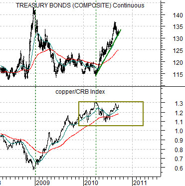
Further below is the current situation.
If we simply view the markets through the perspective of the interaction between the copper/CRB Index ratio and the bond market then one would be hard pressed to find too many differences between today’s situation and mid-1995. The bond market was under pressure from the end of 2008 through the first quarter of 2010 as the copper/CRB Index ratio tracked higher but once this ratio reached a peak the bond market began to rise in price. This has helped create what might very well be the best of all possible worlds for the equity markets as strong growth combines with expanding valuations.
There are always going to be risks associated with any markets trend but the argument would be that one of the current risks would be weakness in the copper/CRB Index ratio in the face of falling bond prices similar to 1996. The S&P 500 Index traded flat for much of 1996 until yields finally turned lower once again in the autumn.
Equity/Bond Markets
Sept. 23 (Bloomberg) — U.S. stocks fell, sending the Standard & Poor’s 500 Index lower for a third day, as a deteriorating profit outlook for banks and an increase in jobless claims overshadowed a rally in technology shares.
NEW YORK/LONDON, Sept 23 (Reuters) – Base metals scaled multi-month peaks on Thursday as investors bet fundamentals would continue to improve over the course of the year, with copper a particular favorite due to its dwindling supply base and robust Asian interest.
We have argued repeatedly that the markets are being pushed from two different directions as Asian growth puts upward pressure on interest rates while a slow U.S. economy adds downward pressure. The stock market has tended to rise when the focus shifts to Asian growth and copper prices with declines occurring on those days when investors fixate more on the domestic U.S. economy.
In any event… from a longer-term point of view it is hard to be anything but bullish at present. We suppose the bears have compelling points including the prospect of a double-dip recession, a deflationary asset price hole, and financial system chaos we but are a bit more inclined towards the ‘glass is half full’ perspective.
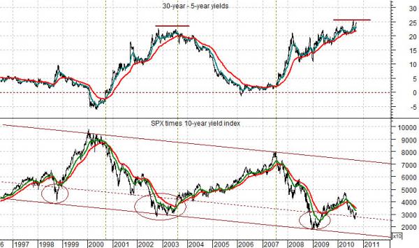
Below is a rather large chart comparison between… the spread between 30-year and 5-year U.S. Treasury yields and… the product or combination of the S&P 500 Index times 10-year yields.
Let’s start with the SPX times 10 year yields. The lower yields go the greater the upward push on valuations. To the extent that stocks are financial assets then a rising bond market and falling yields will always be a positive. The reason yields are falling is often a negative but the actual decline in yields is a positive as it supports and bolsters prices and valuations.
The chart shows that from roughly 1996 to the present time period the product of the SPX times 10-year yields has traded within a fairly well defined channel. When the product reaches the top of the channel- as it did in 2000 and 2007- it is time to head for the exits. When the product hits the low end of the channel- as was the case in 1998, 2002, 2003, and 2009- it is time to load up on long positions.
The spread between 30-year and 5-year yields is ‘low’ when it approaches the ‘0’ line. In other words when the yield curve flattens to the point where 5-year yields are equal to or higher than 30-year yields the stock market is likely at some kind of high. The comparison shows that this is exactly what happened in 2000 as well as through much of 2006 and 2007.
Conversely when the yield spread is ‘high’- as it was in late 2002 and much of 2003- the stock market tends to be ‘low’.
Our point is that the chart comparison argues that the yield spread is positive and will become significantly more so once it reaches a peak and turns lower. The combination of equities times yields remains in the lower portion of the declining channel suggesting that equity valuations have barely begun to expand in response to the recent decline in yields.
All in all the chart paints a fairly bullish picture for the long-term with the caveat that the shorter-term trend includes risk as long as the spread between 30-year and 5-year yields continues to grind upwards.