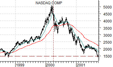
Some time close to mid-2008 we showed a comparison between the Nasdaq’s ‘bubble peak’ into 2000 and crude oil prices. The chart comparison seemed to resonate with our readers because we received more responses to that one image than to anything else that we have done over the years.
Given that we have recently compared gold futures prices to the 2008 crude oil futures market we thought that it might make sense to stack all three charts together.
Below is a chart of the Nasdaq Composite Index from 1998 through into late 2001.
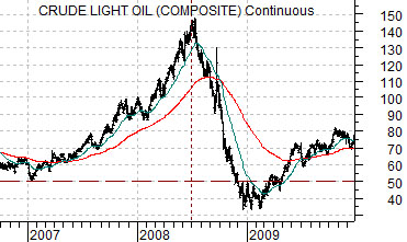
Next we show crude oil futures from late 2006 through 2009.
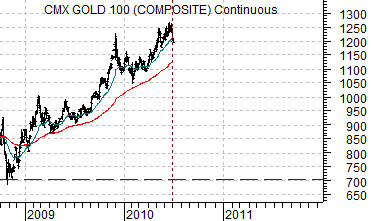
Lastly is a chart of gold futures from the start of the fourth quarter of 2008 up to the present time period.
The argument in 2008 was that crude oil futures looked quite similar to the Nasdaq from 2000. Crude oil futures had driven higher over the first half of 2008 in a manner reminiscent of the relentless surge in the Nasdaq between the start of the final quarter in 1999 and the end of the first quarter of 2000.
The point was that if crude oil prices followed a similar path we could see something close to 50 during 2009. For as negative as our arguments were they ended up paling in comparison with actual events as crude oil prices collapsed below 40 into the end of 2008.
One can argue that sentiment towards gold has never become one-sided enough to drive it into a bubble but from our point of view that really isn’t the issue. What is perhaps more important is WHY gold prices have been rising.
Our argument has been that gold is the offset to financial markets crisis which means that we are going to remain mired in a series of crises until gold prices finally turn lower. To be negative on gold at current levels is another way of arguing in favor of a positive outcome for the European sovereign debt crisis.
Equity/Bond Markets
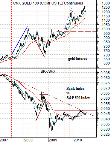
Below is a comparative view of gold futures and the ratio between the Bank Index (BKX) and the S&P 500 Index (SPX).
From this perspective at least some portion of the bull market for gold prices that began back in 2001 has been related to stress in the financial markets. When the BKX/SPX ratio peaked in 2007 gold prices were closer to 600- 650.
The argument is and has been that there will come a point in time when the BKX/SPX ratio recovers to an extent where gold prices will either stop rising or actually decline. Our thought is that the stronger the BKX/SPX ratio the greater the downward pressure on gold prices.
Put another way… if gold prices actually collapsed during the second half of this year in a manner similar to crude oil in 2008… what would the markets be ‘saying’ about the potential for financial markets crisis? The thought is that significant gold price weakness would be another way of showing that the storms had passed.
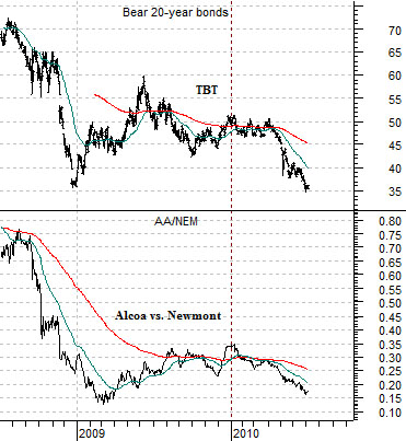
Alcoa traditionally leads off the quarterly earnings deluge and this month the market’s reaction to AA’s earnings might be important. Below we show the bearish bond etf (TBT) and the ratio between Alcoa and gold miner Newmont (AA/NEM).
The argument here is that the TBT began to decline as bond prices turned higher around the start of this year following weakness in AA’s share price in response to 2009’s final quarter earnings. If the stock market is due to recover on bond market price weakness then strength in AA relative to NEM would appear to be warranted.
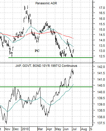
We continue to watch the Japanese bond market futures quite closely. The ‘hope’ is that the JGBs have finally reached a cycle peak and that this will lead to a sustained recovery in the kind of cyclical consumer names that populate the Japanese stock market. The chart comparison below right shows Panasonic (PC) and the JGB 10-year futures.