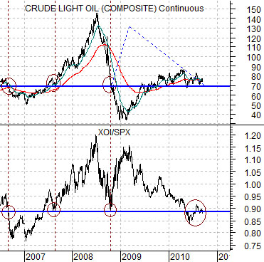
Below is a chart comparison between crude oil futures and the ratio between the Amex Oil Index (XOI) and the S&P 500 Index (SPX).
The argument is that there is a basic relationship between the relative strength of the oil stocks and crude oil futures prices. In other words if crude oil prices are trending higher we would expect to see the oil stocks rising in relation to the broad U.S. stock market.
In 2006 and 2007 the XOI/SPX ratio was just below .90 when crude oil futures prices were close to 70. In late 2008 the ratio declined once again to below .90 around the time that crude oil prices fell to 70. From there the two markets diverged markedly as the ratio rose sharply while crude oil prices moved down towards 35.
Our thought is that the relationship finally came back into balance this year as the ratio slowly declined back to below .90 while numerous sharp rallies for crude oil futures led to equally sharp declines. Based on the current position of the XOI/SPX ratio the equity markets are ‘saying’ that crude oil prices are ‘fair’ somewhere close to 70. There is nothing in the markets at this time that clearly argues that crude oil prices should be significantly lower or higher than current levels.
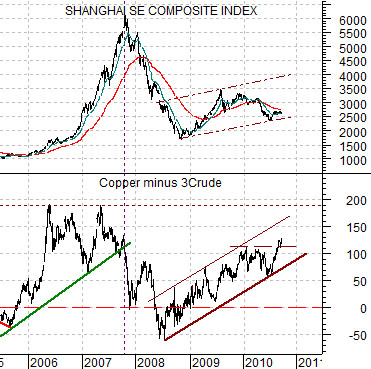
Below is a chart comparison between China’s Shanghai Composite Index and the spread between copper futures (in cents) and crude oil futures (in dollars times three).
Our argument over time has been that the spread will tend to swing back and forth through the ‘0’ line. In other words if crude oil is fair around 70- 75 then copper is fair between roughly 2.10 and 2.25.
Obviously copper is significantly higher than 2.25 and this reflects the health of the Asian growth trend. A rising spread represents positive Asian growth.
The point is that based on the relative strength of the oil stocks the price of crude oil appears to be fair at or just below current levels while copper prices remain stronger on Asian demand. To the extent that Asian growth is helping to overcome concerns about the health of the U.S. consumer the markets continue to favor a trend tilted towards cyclical growth and the cyclical sectors.
Equity/Bond Markets
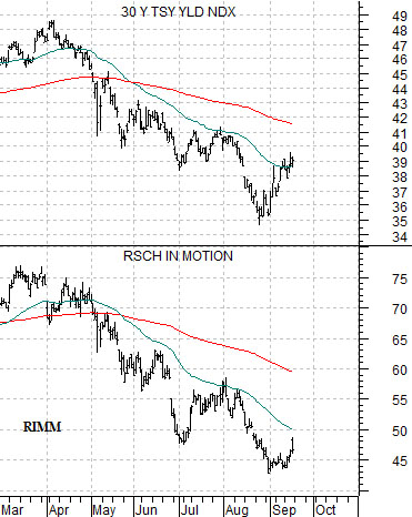
We are going to show three chart comparisons on this page. The first is a comparison between 30-year Treasury yields and the share price of Research in Motion (RIMM).
The weakest link so far this year has been the tech sector but even within this group there are apparent leaders, laggards, winners, and losers. RIMM is one of the ‘heaviest’ stocks in the group but to the extent that it has been trading with long-term yields any sustained stock price recovery should lead to weaker bond prices.
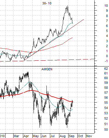
The chart below contrasts Amgen (AMGN) with the price spread between the 30-year and 10-year Treasury futures. The price spread goes with the bond market so when it is rising bond prices are rising and vice versa.
AMGN is a slightly stronger than many of the large cap tech names. It keeps rallying up to its 200-day e.m.a. line but has so far failed to push through. Our sense is that AMGN through 56 should go with a much weaker bond market.
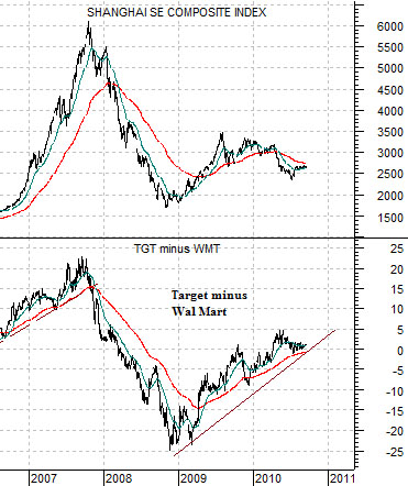
Below is a comparison between the Shanghai Comp. and the price difference between retailers Target (TGT) and Wal Mart (WMT).
In a positive growth environment TGT will rise relative to WMT. With the share price spread stuck between +5 and 0 over the last few months the markets appear to be consolidating within a positive Asian growth trend. A spread well above +5 would be bullish for the Shanghai Comp. and Hang Seng Index while a break well below 0 would appear to indicate that the trend is starting to turn negative.