The argument is that oil price strength this year has reflected the removal of roughly 1.5 million barrels per day of Libyan sweet crude. Through June this amounted to a reduction of around 190 million barrels offset this summer by the release of 60 million barrels from strategic reserves.
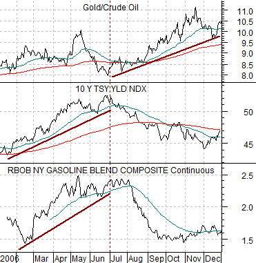
First is a chart from 2006 which compares gasoline futures, 10-year Treasury yields, and the ratio between gold and crude oil.
When energy prices are rising in a positive cyclical manner this should lead to an increase in long-term yields. This was most certainly the case through the first half of 2006. In general strong oil and gas prices go with an upward trend for yields.
The flip side to this is that when yields start to decline the ratio between gold and crude oil moves higher. Gold outperforms crude oil when yields are falling. The chart shows how this worked during the back half of 2006.
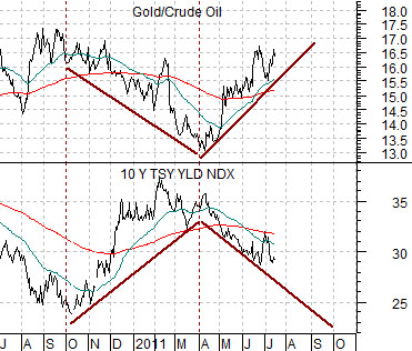
Now… let’s consider how things have progressed over the past year or so.
The argument is that, in a sense, the relentless strength in gold futures prices reflects two variables. First, energy prices moved higher because of a crisis-based reduction in supply. Second, the gold/crude oil relationship responded to yields in its usual fashion.
The chart below shows 10-year yields and the gold/crude oil ratio from 2010 into 2011.
As conditions began to deteriorate in Libya during the second half of February the price of crude oil futures (WTI) rose from around 85 up to 115. In response yields began to decline which led to a rising trend between gold and crude oil. The combination of rising oil prices and falling yields led to even stronger gold prices.
The end of this cycle may require some kind of resolution in Libya and a return to normal production. Ideally this would lead to a decline in oil prices, an upswing in long-term yields, and a period of time when gold underperforms crude oil even as energy prices move lower.
Equity/Bond Markets
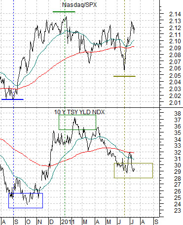
Just below is a chart of the ratio between the Nasdaq Composite Index and the S&P 500 Index along with 10-year Treasury yields.
The argument is that the Nasdaq rises relative to the S&P 500 Index when cyclical growth is positive and this goes with a concurrent rise in long-term yields. On the flip side when the Nasdaq is weaker than the SPX we would expect to see a downward tilt to the yields trend.
The question is… which one leads? Do we need to see rising yields before money starts to move towards the more cyclically sensitive Nasdaq or, perhaps, does the trend for the relative strength of the Nasdaq have something to say about the near-term trend for yields?
In general… we try not to argue with the bond market. However, we are also inclined to look for indicators that lead the trend for yields to give us a bit of a ‘leg up’ on the markets.
The chart makes a rather simple but compelling case. The idea is that over the past while the ratio between the Nasdaq and SPX has actually been a month or two ahead of the bond market. The lows for this ratio in August of 2010 preceded the October bottom for yields while the peak in January of this year was at least a month ahead of the top for yields in February.
So… what next? The problem is that the Nasdaq/SPX ratio can rise and fall fairly quickly and that true bottoms and tops become obvious with the benefit of hindsight. In other words the March lows for the ratio followed by the rise into May were simple ‘range trading’ instead of a trend-altering pivot.
Our sense is that the June bottom for the ratio may be important; especially if the ratio continues to rise through the earnings reporting period to new recovery highs. If the lead-lag behavior persists this would call for a return to a rising trend for yields some time during the second half of this month.
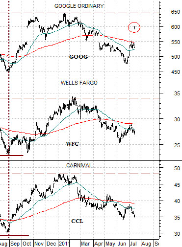
Below is a chart that shows one reason why it is very difficult to be bearish with respect to the equity markets at this time. It may be difficult to be bullish given all of the problems (Libya, Greece, U.S. debt ceiling, etc.) but it is also hard to be bearish.
We have lined up charts of Google (GOOG), Wells Fargo (WFC ), and cruise ship operator Carnival (CCL).
The argument is that the charts are virtually identical. Investors have been painting equities with very broad brush strokes as macro issues push money into and out of the equity markets. This has resulted in stock prices moving lower since the start of the year without much real thought about earnings and the prospect for ongoing businesses. In other words… in due course Libya will return to production, Greece will get sorted out, and investors will come to realize that even in the face of political gamesmanship the U.S. is never going to default on its debt. The 10% ‘gap’ to the upside for Google last Friday made the point fairly clearly that being short or out of this market only makes sense as long as there is no end to the crisis-related stream of news. If Google’s chart is effectively the same as a major bank (WFC) and an energy user (CCL) and it is capable of a 10% one-day ‘gap’… an argument can be made that there is a fairly short shelf-life to the bearish logic.