We are not sure exactly when we first introduced the argument regarding the ‘decade theme’ but we suspect that it was some time back around 2004. We recall adding a list of stocks in January of 2005 that we felt would do well into 2007 so it had to be some time before that.
In any event… the argument was that the markets keep repeating the same basic trends through the various decades. One of the key features was an asset price peak during the ‘0’ year similar to the commodity price highs in 1980, the bubble top in the Nikkei in 1990, and the frenzied Nasdaq ascent into 2000.
If the decade theme were to repeat then we would expect to see a major asset price peak some time this year. The twist is that while a number of sectors are certainly elevated there is no obvious candidate aside, perhaps, for Chinese real estate that would qualify as a ‘bubble’. We suppose that one might argue that energy prices into 2008 could fit the bill as well as the long end of the Treasury market into the start of 2009 but our ongoing thought was that it probably has something to do with those asset classes that tend to strengthen as an offset to dollar weakness.
We fear that we are digressing from the point that we wished to make today. The point is that weakness creates strength and strength creates weakness.
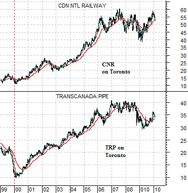
Below we show a comparison between two Canadian stocks- Canadian National Railway (CNR) and TransCanada Corp. (TRP). Notice how both bottomed in early 2000 at the peak for the Nasdaq. In fact the bull market for this theme (rails, pipelines, commodities, commodity currencies, etc.) began at the very moment that the Nasdaq started to implode.
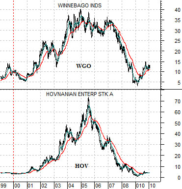
Next is a comparative view of Winnebago (WGO) and U.S. home builder Hovnanian (HOV). These two stocks began to rise towards the end of 2000 as the markets and the Fed started to ease credit conditions. They enjoyed a similar positive trend right through the equity bear market that extended from late 2000 through 2002.
The point? Weakness in the Nasdaq led to strength in a number of new themes. If we argue that a major asset class is due to turn lower this year then we are, in a sense, arguing in favor of a positive trend in offsetting sectors. Our challenge over the next few quarters is to determine where the next bull market is due to show up.
Equity/Bond Markets
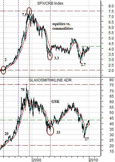
Below is a chart comparison between the share price of GlaxoSmithKline (GSK) and the ratio between equities (S&P 500 Index) and commodities (CRB Index).
The argument in broad terms is that pharma stocks like GSK tend to do better when equities are stronger than commodities. Obviously when commodities are stronger than equities money will shift from health care names over to the shares of companies that produce raw materials.
The detail that fascinates us relates to the similarity between the numbers at key points in time. In 1995, for example, the SPX/CRB ratio was around 2:1 while the share price of GSK was roughly 20. When the ratio peaked in 1999 around 7.5:1 the share price of GSK had risen to 75.
The point, we suppose, is that after several years of fairly wide swings we find the equity/commodity ratio close to 4:1 while GSK is last seen in the 38’s. There is nothing here that screams that equities are 10% or 20% or 30% ‘too high’ and nothing that suggests that they are also ‘too low’. Our sense is that prices are slightly on the ‘low side of fair value’ at the present time.
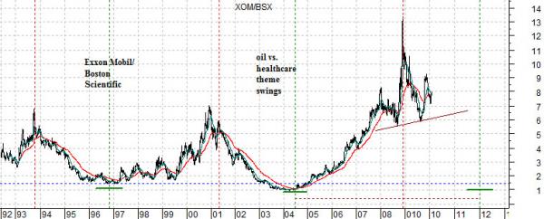
The chart below shows the ratio between the share price of Exxon Mobil (XOM) and that of Boston Scientific (BSX).
We have shown this chart on a number of occasions over the past few years. The idea is that over time the markets seem to swing from an energy theme that takes the XOM/BSX ratio to a peak and then back to a defensive or health care theme that pulls the ratio to a bottom.
Where this gets a bit more strange than usual is when we begin to consider the lengths of time between the various cycles. The time span between the ratio peak in 1993 the final high in 2001 is identical to the amount of time between the 2001 high and the end of 2008 peak. The low in 1996 was made 3 years after the 1993 peak while the bottom in 2004 was reached 3 years following the 2001 top.
The point? If the pattern were to be kind enough to persist- exactly- then the trend should be favoring BSX over XOM through into the end of 2011.