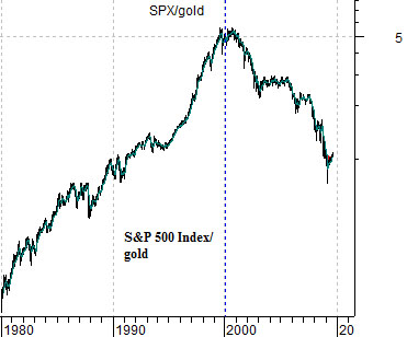
We are going to do another quick 3-chart comparison today starting off with the chart below t of the ratio between the S&P 500 Index (SPX) and gold futures.
From 1980 into 2000 equities outperformed gold. Over the past decade gold has risen relative to the equity markets. Our view seven, eight, and nine years ago was that the commodity sector had been left behind and needed to ‘catch up’.
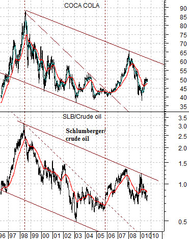
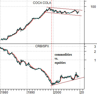
Below we show Coca Cola (KO) and the ratio between equities (SPX) and commodities (CRB Index). Same basic argument- after twenty years of underperformance the commodity sector has been stronger than the SPX through the last decade. This has gone with an equally long period of stagnation for the share price of KO.
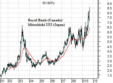
Below is a chart of the ratio between the share prices of the largest banks of Canada (Royal Bank) and Japan (Mitsubishi UFJ).
When the trend for commodity prices is stronger than the trend for equity prices- as has been the case through the past decade- then the banks of those countries exposed to commodity production (Canada) will outperform the banks of commodity-user countries (Japan). If the strong commodity trend remains intact then the RY/MTU will continue to rise. If, on the other hand, commodities begin to weaken relative to equities as the share price of Coca Cola moves higher then relative strength for the banks will shift from Canada back to Japan.
Equity/Bond Markets
The chart below offers a bit of thought provoking perspective on the investment markets. Why? Because it helps to explain why crude oil prices are actually relevant to the share price of Coca Cola.
The chart compares Coke (KO) to the ratio between the share price of oil service giant Schlumberger (SLB) and crude oil futures. The idea is that regardless of what oil prices are doing as long as SLB is stronger than crude oil (i.e. the ratio is rising) the share price of KO will rise. Obviously the easiest way to push the SLB/crude oil ratio higher is through falling energy prices while rapidly rising energy prices will tend to pull it lower.
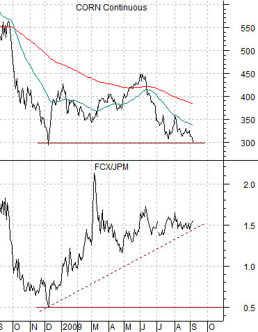
Below is a comparison between corn futures and the ratio of FreePort McMoran (FCX) to JPMorgan Chase (JPM).
The FCX/JPM ratio has trended with corn futures prices for so long that we take it almost as a given that the charts will be similar although… that has not been the case since the end of the second quarter this year. Corn futures prices have fallen back to the December lows which went with a FCX/JPM ratio of close to .5. In other words based on the action in the grains markets we would expect to see JPM’s share price close to double that of FCX instead of FCX being 50% higher and rising. The point? All things considered the intermarkets are making a strong case for either the banks or grains prices this autumn.
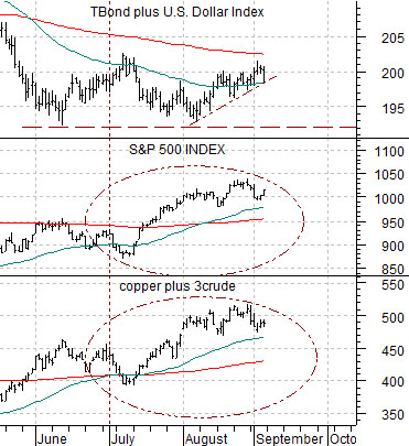
Below we have included a chart of the sum of the U.S. 30-year T-Bond futures and U.S. Dollar Index (DXY), the S&P 500 Index (SPX), and the sum of copper and crude oil futures (copper in cents plus 3 times crude oil in dollars).
The argument is that when the sum of the TBonds and dollar bottom it should mark the highs for the sum of copper and crude oil… which hasn’t happened so far this quarter. What is interesting is the way the S&P 500 Index’s short-term trend is almost identical- tick for tick- with the sum of copper and crude oil over the past three or four months.