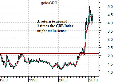
In theory… how far could gold prices decline? We think 600- 700 is still within the realm of the possible.
First is a chart of the ratio between gold and the CRB Index. From the early 1980’s into 2007 the price of gold wandered back and forth between roughly 1.2 times and 2.2 times the level of the CRB Index. With the index currently close to 330 the argument is that 600- 700 represents the top edge of the old relative strength trading range. In other words… gold wouldn’t be ‘low’ on an historical basis at these prices but would, in fact, be somewhat ‘high’.
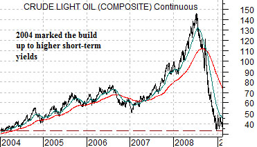
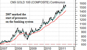
Next is a chart of crude oil futures from 2004 into early 2009 along with a chart of gold futures from 2007 to the present day. Notice that we are comparing the trend for gold with that of crude oil from 3 years previous.
The argument is that when crude oil prices broke to new highs towards the middle of 2004 it initiated the start of rising short-term interest rates. Increasing rates marked the beginning of monetary tightening which, three years later, led to severe downward pressure on the banking system. In other words the rise in crude prices in 2004 helped create the problems in 2007 that hammered at the financial sector and led to the flight of capital towards gold. This reaction is fairly clearly shown on the gold/CRB Index chart as the ratio exploded up through the top of the old trading range.
When crude oil prices reached a peak at the end of the second quarter in 2008 the trend shifted back to negative. Over the final six months of the year the price of oil declined all the way back to the original starting point in 2004.
The idea is that if gold is trailing three years behind crude oil then a mid-year peak would be somewhat appropriate. If gold were to follow the same path as crude oil during the second half of 2008 then the decline would bring prices back to the starting point in 2007. The chart shows that this lines up with something in the vicinity of 600- 700.
The argument is not that gold prices will decline and never rise again; after all, we have recently witnessed triple-digit levels for crude oil prices. Instead the argument would be that current gold price levels represent banking system concerns which were triggered, years ago, by a rapid increase in energy prices. Gold price weakness, therefore, would likely represent the start of a more bullish back drop for the financial sector.
Equity/Bond Markets
The problem with arguing for a significant decline in the price of a major commodity is that we only have to look back to 2008 to see what this might mean for the equity markets. After all, when crude oil prices collapsed three years ago… virtually all asset markets followed. Why, then, would weaker gold prices lead to a bullish outcome?
The gold bulls might argue that gold prices were artificially depressed for years due to manipulation by the banks and central bank gold lending. The break out by the gold/CRB Index ratio described on the first page was an inevitable consequence of a market held down too far and too long by artificial means. We acknowledge some of the merits of the arguments even as we approach the topic from a slightly different angle. In other words we are not going to suggest that the gold/CRB Index ratio is going to decline back to the old trading range but instead are attempting to make the point that it is at the high end of a new trading range between roughly 2.2 times the CRB Index up to 5 times.
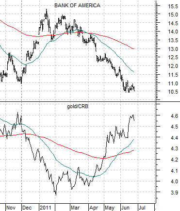
Just below is a chart of the Bank of America (BAC) and the gold/CRB Index ratio.
The idea here is that the two markets move in opposite directions. A bearish trend for BAC goes with a rising gold/CRB Index ratio… and vice versa.
Our view is that the prospect of a substantial decline for gold prices both on an absolute and relative level indicates an equally substantial trend change for the banking shares. Our conviction is that gold price weakness goes with banking share strength and to date we have not found any cracks in our arguments. What is missing, of course, has been actual and sustained gold price weakness. We got a nice trial run from December into February as the share price of BAC rallied up from around 11 to over 15 only to slump back into the same trend that has dominated the markets since 2007.
Our point? The charts make a compelling case that may or may not be proven out if, as, or when gold prices start to slide. With the end of the quarter fast approaching the best we can write at this time is that Friday of last week may have been Day 1 of the trend change.
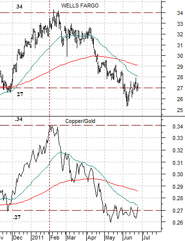
Below is a comparative view of the share price of Wells Fargo (WFC) and the ratio between copper and gold futures.
We have been running this chart in the back pages for some time. The observation was that from November of last year through to the current time frame the price of WFC was almost ‘dead on’ the level of the ratio between gold and copper. We have no idea why this apparent coincidence has been able to hold for the past six to seven months but… until something changes it makes some sense to at least keep it in mind.
When the copper/gold ratio (copper in cents divided by gold in dollars) was .27 back in November the price of WFC was around 27. The ratio rose to .34 and WFC rallied to 34. Now the ratio is back just above .27 and WFC has settled in around 27.
The high point of the ratio was reached in 2006 between .55 and .60. Chart-wise a move above .34 could extend up to .45 which, it would appear, would go with a fairly strong rally for the banking shares.