One of the reasons the markets are usually so challenging is that the reactions to ‘news’ are often in unexpected directions. If something is intuitively obvious… chances are the markets have already discounted it.
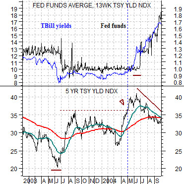
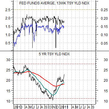
Below is a rather complicated chart comparison of 5-year U.S. Treasury yields and an overlaid chart of U.S. TBill yields (in blue) and the Fed funds target rate (in black) from 2003 into 2004.
The scale for TBill yields is different than that of the Fed funds rate so a level of ‘10’ for TBills is equivalent to 1% while ‘1’ for the Fed funds rate also signifies 1%.
The argument is that long-term yields lead short-term yields. In other words the Fed not only lags the long end of the bond market but also moves in response to changes in short-term yields.
5-year yields bottomed in mid-2003 and rose to a top around the end of August that year. By early 2004 the trend for 5-year yields turned higher once again with new highs being reached towards the end of April.
As 5-year yields pushed to new recovery highs 3-month TBill yields began to rise. By May of 2004 TBill yields moved above the Fed funds rate which, we have argued, is the signal for a Fed rate hike. At the conclusion of the June FOMC meeting the Fed funds rate was lifted for the first time since the Nasdaq’s melt down in 2000.
Intuitively one might expect that an increase in the Fed funds rate would lead to higher long-term interest rates but, in fact, the markets responded in the exact opposite direction. After pushing higher in front of the Fed meeting 5-year yields reversed back to the down side.
Next is the current situation. Following a slump from April of last year into November the bond market has started to push longer-term yields higher once again. Notice, however, that TBill yields are still lower than the Fed funds rate suggesting that we may need to see ‘new highs’ for 5-year yields north of either 2.8% or even 3.0% before the short end of the yield curve begins to lift. If, as, or when TBill yields rise up through .25% look for the Fed to raise the funds rate at the next meeting which, if history were to repeat, would lead to a period of correction for longer-term yields.
Equity/Bond Markets
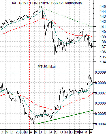
Below is a chart of the Japanese 10-year (JGB) bond futures and the ratio between Japanese bank Mitsubishi UFJ (MTU) and the Nikkei 225 Index from the autumn of 2002 into the spring of 2004.
We have argued that MTU tends to outperform the Nikkei when bond prices are falling while the Nikkei has tended to outperform the SPX. The opposite has tended to occur when bond prices are rising as the Nikkei weakens against the SPX while MTU underperforms the Nikkei.
The point is that MTU has tended to be a very strong stock in a weak bond price trend and a thoroughly miserable stock in a strong bond price trend.
The chart shows that the MTU/Nikkei ratio bottomed as the Japanese bond market peaked in 2003.
Next is the current situation. In a sense the markets appear somewhat similar to the second half of 2003 as Japanese bond prices weaken even as the MTU/Nikkei ratio works back up through the 200-day e.m.a. line.
Our thought has been that as the cyclical recovery continues we will see ongoing downward pressure on Japanese bond prices and further upside in MTU relative to the Nikkei 225 Index.
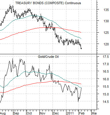
Last is a chart comparison between the U.S. 30-year T-Bond futures and the ratio between gold and crude oil futures.
The basic argument is that the gold/crude oil ratio tracks generally with the long end of the bond market. When bond prices are weak and falling then the gold/crude oil ratio should be working lower either through strength in crude oil or… weakness in gold prices. Recent weakness in crude oil prices without much in the way of corresponding weakness in gold prices has helped lift the ratio somewhat although the trend is still appears be heading lower.