The expectation is that the Fed will decide to purchase around $500 billion of longer-term Treasuries over the next six months while stating its intention to continue this process if conditions warrant. How the markets react to the actual news is anyone’s guess. We suspect that prices will be volatile however.
Our basic presumption with respect to the markets has been that the cyclical trend will slowly expand to include some of the lagging sectors. The ‘tightest’ groups will always react first during a rally followed in due course by sectors that still have to work through some amount of slack. If there is a problem with our view- and we are not sure that there is- it may be that the weaker sectors will eventually pull the leaders lower instead of the other way around. We will attempt to address this point in today’s issue.
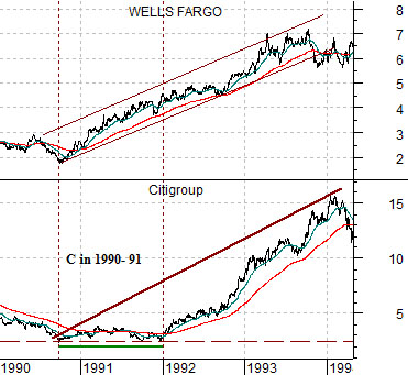
Below we show the comparison between Citigroup (C) and Wells Fargo (WFC) from 1990 into early 1994.
The idea here is that WFC represented the recovering trend while C represented the financials that lagged the recovery. For those old enough to recall the decline in housing prices in 1990 did considerable damage to many of the banks along with the savings and loan industry. It took C close to 15 months to work through its recession-related issues.
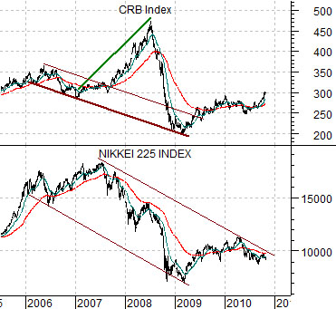
Next is a chart of the Nikkei 225 Index and the CRB Index from 2005 to the current time frame.
The Nikkei represents the weak cyclicals that started to decline in 2006. The CRB Index, on the other hand, represents the strongest cyclical theme which pushed to a peak into 2008.
The point is that in the early 1990’s the strong cyclical trend pulled the share price of Citigroup higher while in the last part of the previous decade the weak cyclical trend pulled commodity prices lower. To make the case that the laggards will rise similar to 1992 rather than the leaders falling as was the case in 2008… we have to introduce another variable or two. We will do so on the next page.
Equity/Bond Markets
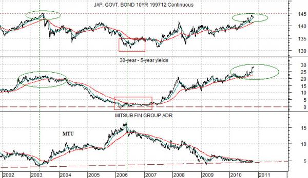
Below is a chart of the Japanese 10-year (JGB) bond futures, the spread between 30-year and 5-year Treasuries, and the stock price of Japanese bank Mitsubishi UFJ (MTU).
The reason the current time period is similar to 2003 instead of the cyclical peak in 2006 can be seen through this chart. The share price of MTU bottomed in 2003 around the time that the Japanese bond market reached a price peak and as the spread between 30-year and 5-year yields began to flatten out near the highs. In 2006 the share price of MTU reached a top as the Japanese bond market approached a bottom and as the yield spread flattened out to the point where 30-year and 5-year yields were almost identical.
Our argument is that the laggard themes- in this case the banks and Japan or, perhaps most particularly, a Japanese bank- should turn positive when the Japanese bond market stops rising in price and when the yield spread reaches some kind of peak. While this has obviously not happened as of yet it still appears that we are at least within the same area code as a trend change.
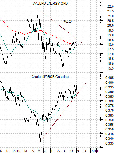
Further below is a comparison between oil refiner Valero (VLO) and the ratio between crude oil and gasoline futures.
The intermarket argument is that the refiners do better when the crude oil/gasoline ratio is declining. Our thought is that this might not happen until some time early in 2011. Why? Two reasons. First, the energy themes tend to do better during the first six months of the calendar year. Second, we can imagine a situation where above-average inventories of heating oil lead to reduced refinery runs which, in turn, lead to somewhat tighter gasoline inventories. Gasoline tends to dominate the energy trend over the first half of the year in front of the summer driving season.