Having forecast 23 out of the last… zero… tops for gold we are going to prove once again that our learning curve is, in fact, a flat line. However we are going to wait until today’s fifth page before pulling together the various arguments that we are going to make first.
To start out with we are going to tackle the ‘laggard banks’ argument through a rather imaginative comparison. Keep in mind that the trend for the ‘laggard banks’ is basically the inverse of gold with weakness in the banks going with gold price strength.
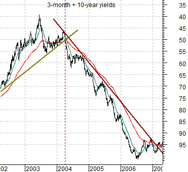
To confuse matters we begin with one of our infamous ‘upside down’ charts. At top right is a chart of the sum or combination of 3-month and 10-year U.S. Treasury yields. Scaled upside down.
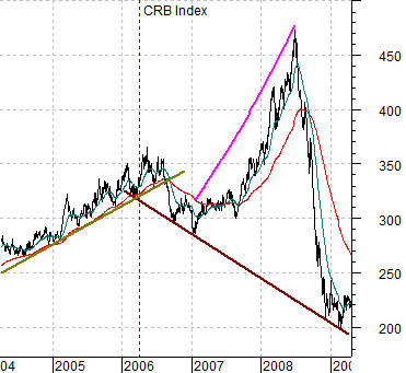
Below is a chart of the CRB Index. Note that the two charts show different time periods with yields starting in early 2002 and the CRB Index two years later in 2004.
The 2-year lag argument is based on the premise that major changes in the direction of yields impacts the cyclical trend two years later. In actual fact yields bottomed in 2003 before starting to trend higher in the spring of 2004 but to make the trends for both yields and commodity prices move in the same direction we have turned the yield chart over.
The trend change for yields in the spring of 2004 was supposed to alter the cyclical trend around the spring of 2006. To the extent that commodity prices were an integral part of the cyclical trend… the argument suggested that around the second quarter of 2006 commodity prices should start to decline.
The trend line running UNDER the CRB Index from 2006 into 2009 represents two things. First, it defines the negative trend that we were forecasting. Second, it defines the actual trend that occurred. The problem was that over the 18-month time period between the start of 2007 and mid-2008 the CRB Index trended parabolically higher only to collapse back ‘on trend’ through the second half of 2008.
The point? The CRB Index is a reasonable example of a ‘lagged response’ to a negative trend. It is also an excellent example of just how painful and frustrating ‘lagged responses’ can be.
Equity/Bond Markets
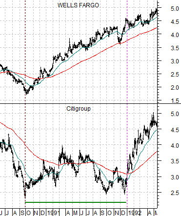
Below is a chart from 1990- 92. It compares the trend for Wells Fargo (WFC) with the stock price of Citigroup (C).
Through the late 1980’s Japanese asset prices were rising at a torrid pace. Given that real estate prices are based largely on ‘comparables’ it was only a matter of time before someone decided that if a building or golf course in Japan was ‘worth’ 10 times or 100 times more than a similar property in the U.S. perhaps it made sense to buy U.S. assets instead. We recall, for example that at one point in time the Imperial Gardens in Tokyo had an imputed land value in excess of either the states of Florida or California which suggests that the combination of liquidity and momentum can do strange things to markets prices.
In any event… in due course Japanese asset prices collapsed which led to a similar albeit smaller decline in U.S. real estate prices. The end result was a flirtation with bankruptcy for Citicorp and a broad decimation of the saving and loan industry.
The next chart shows that the recovery began in the autumn of 1990 once crude oil futures prices finally started to weaken ahead of the Gulf War. With the benefit of hind sight we ‘know’ that the recovery began in the autumn of 1990 because the stock market started to rise even though the related recession did not formally begin until the first quarter of 1991.
So… the point is that the stock market anticipated the recession by declining and discounted the recovery by rising. The problem was that weak real estate prices continued to put pressure on the banking system as the Resolution Trust Corporation struggled with the underwater mortgages that had bankrupted much of the S&L industry.
The base trend turned bullish in the fourth quarter of 1990 while the share price of C continued to hold near the lows through the end of 1991.
In 1991- 92 the equity markets had a rising trend even though the share prices of many of the financials remained negative. We will argue that between 2006 and 2008 the commodity markets had a negative trend even though many commodity prices remained positive. In both instances there was a period of time when the response to ‘the trend’ lagged. In both instances prices eventually worked through the excess negatives or positives and turned- rather abruptly- back ‘on trend’.
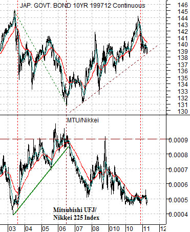
There are a number of sectors that we suspect are ‘lagging’ the recovery including major financials and the Japanese stock market. In fact we also could argue that the trends for both the Nikkei and the ‘laggard banks’ are similar enough that the any argument in favor of one applies equally to the other.
At bottom is a chart of the Japanese 10-year (JGB) bond futures and a chart of the ratio between Japanese bank Mitsubishi UFJ (MTU) and the Nikkei 225 Index.
The quick point here is that when Japanese bond prices are falling (i.e. long-term yields are rising) MTU outperforms the Nikkei. When bond prices are rising MTU does worth than the Nikkei. A broad recovery in the Japanese stock market, the major banks, and perhaps especially the major Japanese banks is based on a continued down trend in longer-term bond prices.