We hate to get bogged down with fundamentals but every now and then it helps to show a somewhat different perspective. From Bloomberg yesterday, “The world’s largest economy expanded at a 1.5 percent annual rate in the second quarter, with inventories contributing 0.32 percentage point to gross domestic product, according to data from the Commerce Department… Lumber companies, which were particularly stung by the U.S. housing slowdown, are starting to report increased demand.
“We are beginning to see real improvement in housing activities; excellent affordability, positive moves in home values in many metro markets,” said Rick Holley, president and chief executive officer of Plum Creek Timber Co. Inc. in Seattle, Washington. “As the economy and housing activity continues to recover, this will ultimately translate into higher prices for timber and growth in our income and cash flow.”
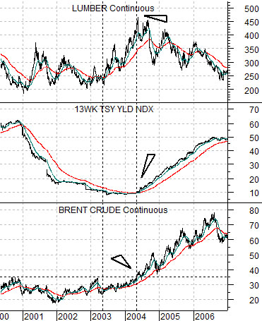
Below is a chart of Brent crude oil futures, U.S. 3-month TBill yields, and lumber futures from 2000- 2006.
During the previous cycle lumber prices peaked in 2004. This was the point in time when Brent crude futures broke to new all time highs which, in turn, started to push TBill yields higher. Long-term Treasury yields had begun to move upwards a year earlier in mid-2003.
Lumber prices tend to do better when economic growth has started to improve but not to the extent that short-term yields are moving higher. There is a pocket of time before long-term interest rates swing higher through until the Fed begins to tighten credit that seems to favor lumber futures.
Next is a chart of lumber futures from the present time frame.
If history were to repeat then- at most- the trend for long-term yields turned higher a week or two back. Between the start of rising long-term yields to the beginning of upward pressure on short-term yields seems to take very close to 12 months so the argument would be that lumber prices look higher into the summer or autumn of next year. On page 7 we have included a comparison between lumber futures and U.S. home DR Horton to show that, as usual, the home builders are following the same basic trend as lumber.
Equity/Bond Markets
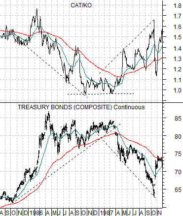
We are going to borrow from 1987 once again as we attempt to show the status of the current markets trend.
Below is a rather messy looking comparison between the U.S. 30-year T-Bond futures and the ratio between the share price of Caterpillar (CAT) and Coca Cola (KO).
Caterpillar is an economically sensitive or cyclical stocks while Coke is more of a consumer-oriented growth or defensive name. In general Coke will do better during those time frames that include pressure on cyclical growth while CAT will be favored when economic activity is expanding at a reasonable pace.
One way to tell whether the cyclical trend is positive or negative is to look at the direction of the trend for long-term Treasury prices.
We have written on occasion in the past that one should NEVER argue with the bond market. Of course we do exactly that almost all of the time but, in general, it makes more sense to accept what the bond market is ‘saying’ than to take the other side of the trade. In other words if bond prices are strong and rising then accept that cyclical growth is under pressure and takes positions accordingly.
The ratio between CAT and KO acts as a bit of a ‘check’ on the bond market’s trend. If the TBond futures are moving higher then one should expect to see the CAT/KO ratio moving lower. And vice versa.
In 1985- 87 there were three fairly separate bond market price trends. The TBond futures soared from 1985 into 1986 on collapsing crude oil prices. The trend then went flat through the end of 1986 and into 1987 as the negative cyclical pressures eased. By the end of the first quarter of 1987 the bond market was tumbling in price as the CAT/KO ratio moved briskly higher.
We have waded through all of this in the hopes of making a somewhat minor point. The TBond futures did not shift directly from ‘up’ to ‘down’ in 1986 but instead went through a period of somewhat choppy consolidation with prices finding support at the rising 200-day e.m.a. line.
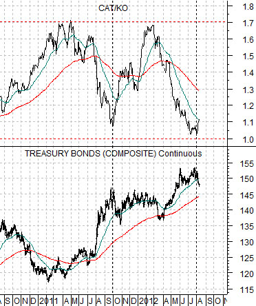
Below is a chart of the same comparison from the current time frame.
The CAT/KO ratio has been swinging higher and lower in an expected fashion. When bond prices are rising the ratio declines as money moves from Caterpillar to Coca Cola. When bond prices stop rising money very briskly runs back to CAT. Rinse and repeat.
Another intriguing detail here is the absolute level of the CAT/KO ratio. Notice that the ratio bottomed around 1:1 in 1987 and topped out around 1.7:1.
The two extremes- 1:1 at a high point for bond prices and a low point for cyclical growth along with 1.7:1 closer to bond price lows and periods of cyclical optimism- seem to be intact today. What this means- to us- is that the equity markets are likely inclined to view the glass as half full (i.e. favor CAT over KO) but until the U.S. 30-year T-Bond futures actually break below the rising 200-day e.m.a. line we will have to view this as more of a trading swing than the start of an enduring trend.